You’ve spent hours choosing colors you genuinely love. The burnt orange felt bold and warm. The deep teal cushions looked perfect against it in the store. The charcoal throw was exactly the right weight. The patterned rug tied everything together on the product page. And yet, standing in your finished living room, something is wrong. Not dramatically wrong, nothing is ugly, nothing is broken. But the room doesn’t sit still. It vibrates. Your eye doesn’t know where to land, and after twenty minutes in the space, you feel subtly overstimulated rather than settled. You’ve done everything right by individual item, and the whole is somehow less than the sum of its parts.
This is one of the most common and least-discussed frustrations in home design, and it has a specific cause: an absence of proportion. Most people approach room decoration as a collection of individual decisions, this chair, that cushion, this rug, rather than as a system where each color’s share of the visual field is deliberately managed. When every color you love gets an equal share of the room, they compete rather than collaborate. The room ends up feeling like a conversation where everyone is talking at once. The fix isn’t removing anything you love. It’s organizing those colors into a hierarchy: a dominant, a supporting, and an accent, and it’s precisely this hierarchy that the 60-30-10 Rule in interior design codifies.
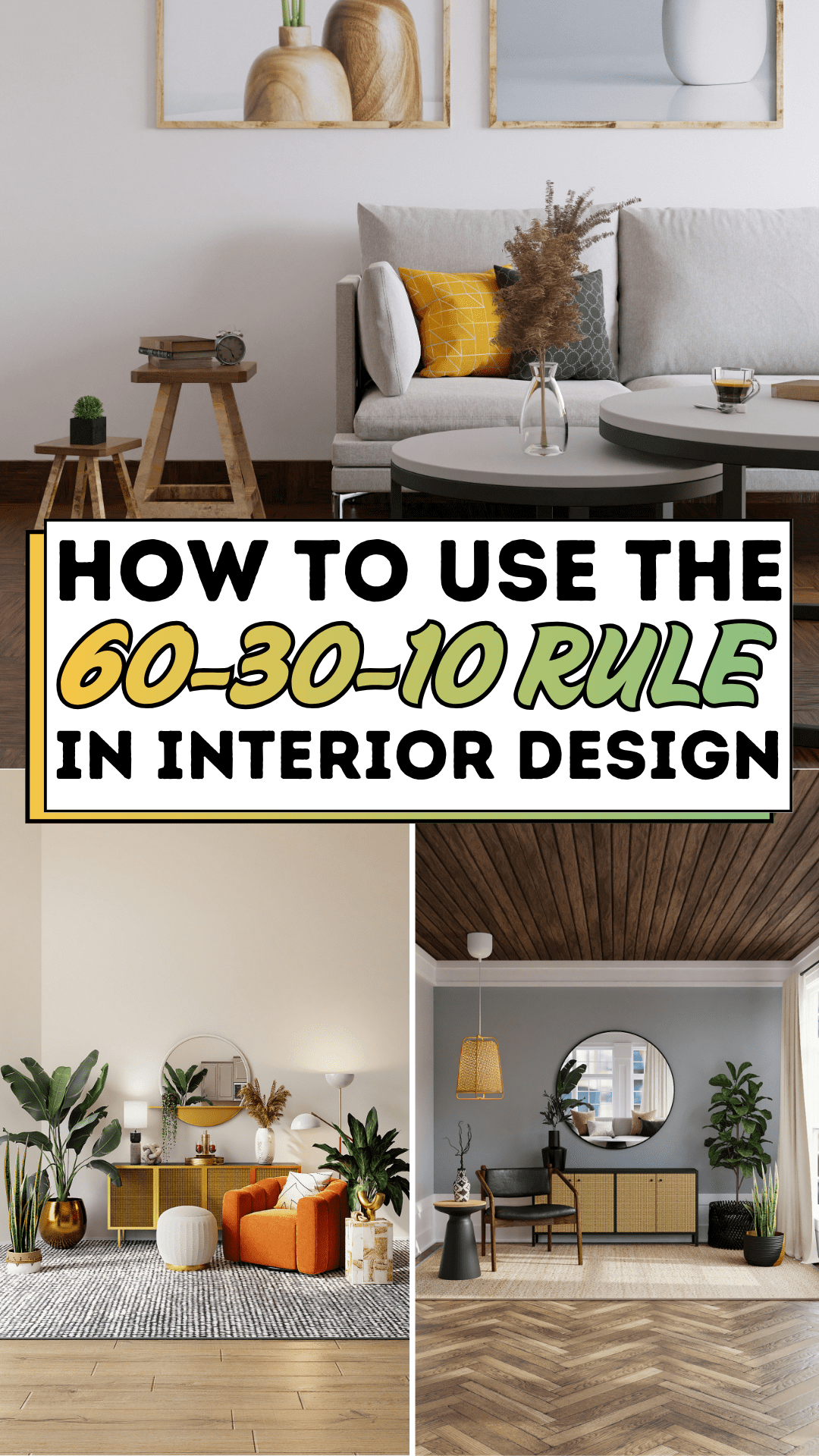
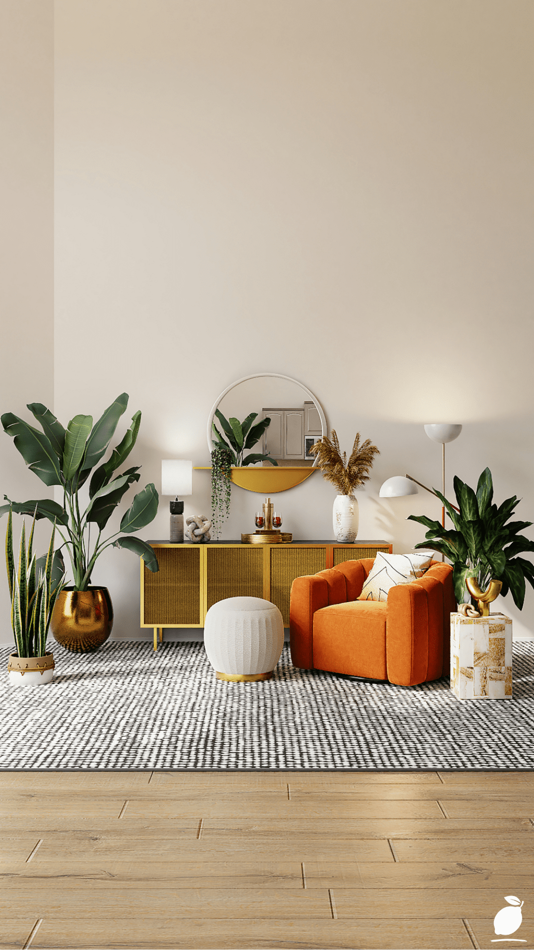
The living room in the image above demonstrates the 60-30-10 Rule executed with quiet authority. The dominant color, soft white across walls, ceiling, and the round pouf, claims the majority of the visual field. The warm wood tones of the sideboard, the striped rug, and the light plank flooring form the secondary layer. The burnt orange velvet armchair, the gold-framed mirror, the metallic planters, and the greenery of the fiddle leaf fig and snake plants serve as the considered accents. Everything is present. Nothing is competing. The room is warm, layered, and visually settled in the specific way that only a proportionally organized space can be. This guide shows you exactly how to replicate that result in your own home.
The 60-30-10 Rule Blueprint
Step 1: Understand What the 60-30-10 Rule Actually Does
Before applying the 60-30-10 Rule to your space, it’s worth understanding precisely what the rule accomplishes because it is more than a color ratio. The 60-30-10 Rule is a visual weight management system. It organizes a room’s color palette into three distinct roles: dominant, secondary, and accent, and assigns each role a proportional share of the visual field that creates hierarchy rather than competition.
The dominant color at 60% establishes the room’s overall character and emotional tone. The secondary color at 30% creates depth, transition, and the visual interest that a single color cannot generate alone. The accent color at 10% provides the deliberate focal point that the element the eye finds, rests on, and registers as the room’s defining statement. Together, the three proportions create the visual equivalent of a well-composed piece of music: a clear melody, a supporting harmony, and punctuating moments of color that give the whole composition its memorable quality.
The 60-30-10 Rule works because it mirrors the proportional instincts of the human visual system. Research in Gestalt psychology, the study of how humans perceive visual compositions, consistently identifies proportion and hierarchy as primary drivers of perceived visual harmony. A room without proportion creates the low-grade cognitive load of an unresolved composition; a room organized by the 60-30-10 Rule removes that load entirely, which is why well-proportioned rooms feel restful even before you’ve consciously registered what’s in them.
Step 2: Identify Your 60% — The Dominant Color
The 60% dominant color is the shade that covers the largest surface area in your room. In most interiors, this is the wall color, and in the featured living room, it is the soft white that covers the walls, ceiling, and the round pouf, establishing a clean, light-reflective field against which everything else operates. But dominant color doesn’t have to be a wall color. In rooms with very dark or richly colored walls, the floor covering can function as the 60%. In rooms with significant built-in furniture, the cabinetry color may claim the dominant proportion.
When selecting your dominant color in the 60-30-10 Rule framework, apply three criteria. First, it should be a color you can live inside comfortably for extended periods, not one that excites you on a paint chip but exhausts you as a room-scale presence. Second, it should have enough neutrality or restraint to recede visually rather than advance, allowing the secondary and accent colors to be perceived in front of it rather than alongside it. Third, it should reflect the room’s primary function: warm and restorative tones for bedrooms, energizing but calm tones for living spaces, clean and appetite-neutral tones for kitchens and dining rooms.
Practical 60% candidates across common design palettes: soft whites, warm off-whites, and light greiges for maximum light and versatility; warm mid-toned sage greens and dusty blues for rooms where enclosure and calm are the primary goals; warm caramel and sand tones in rooms anchored by natural wood and earthy materials. The featured living room’s soft white is among the most reliable 60% choices available precisely because of its neutrality; it neither competes with nor constrains the 30% and 10% colors it contains.
Step 3: Identify Your 30% — The Secondary Color
The secondary color at 30% in the 60-30-10 Rule is where the room’s warmth, texture, and design personality live. It appears across the large furniture pieces, the primary floor covering, significant built-in elements, and the major textile layers, collectively creating the visual mass that gives the room its weight and character. In the featured living room, the warm wood tones of the sideboard, the horizontal plank flooring, the striped rug, and the warm brown undertones in the arrangement collectively form the 30% a cohesive warm-toned layer that grounds the white-dominant space and prevents it from reading cold.
The 30% secondary color should be chosen in deliberate relationship to the 60% dominant, not as a match but as a complement. The most effective 60-30-10 Rule secondary colors either contrast the dominant in temperature (warm secondary against cool dominant, or vice versa), contrast in value (light dominant with mid-tone secondary), or contrast in texture without significant color contrast (smooth dominant wall color against the visual texture of a woven rug or natural wood grain). All three contrasts are present in the featured image: the warm wood against cool white walls, mid-tone against light, and the varied textures of wood, fabric, and plant foliage against the smooth painted wall surface.
When applying the 60-30-10 Rule to your secondary color selection, inventory the items that will hold this proportion: your largest seating piece or sofa, your primary floor covering, and your main storage furniture. If these items already exist in your space, the secondary color is already partially determined. If you’re selecting new pieces, choose the secondary color relative to the dominant one you’ve identified, using the contrast principles above.
Step 4: Identify Your 10% — The Accent Color
The accent color at 10% in the 60-30-10 Rule is the smallest proportion and the most powerful statement. It appears in cushions, decorative accessories, a single statement chair, lamp shades, artwork, plants, and the small, deliberate details that give a room its visual signature. In the featured living room, the burnt orange velvet armchair is the loudest accent element, supported by the metallic gold of the mirror frame, the gold-toned planters, and the deep green foliage of the fiddle leaf fig and snake plants, multiple accent elements working within a shared 10% proportion to create a rich, layered accent layer without any single element overwhelming the composition.
The accent color should be chosen with two qualities in mind: it should be the color you genuinely love most in the palette, the one that represents your personal aesthetic statement, and it should contrast sufficiently with both the 60% and 30% colors to be visible as a distinct element rather than absorbed into either layer. In the featured image, the burnt orange succeeds on both counts: it’s distinctive against the white dominant and warm-wood secondary, and it reads immediately as a considered, personal choice rather than a default.
The 60-30-10 Rule allows for more than one accent color within the 10% proportion, but constrains them to a shared 10% total rather than each claiming an independent share. The featured room’s gold, orange, and broad green accents all coexist within the 10% because they share a warm-toned character that reads as a family rather than a collection of competing statements. When mixing accent colors within the 10% proportion, choose shades that share at least one quality temper: hue, saturation level, or material association to ensure they read as coordinated rather than incidental.
Step 5: Map the 60-30-10 Rule Proportions Onto Your Actual Room
With your three colors identified, map them onto the specific surfaces and elements of your room before making any purchases or paint decisions. Create a simple room inventory: list every surface and major element in the room and assign each to the 60%, 30%, or 10% category based on its visual area. Walls and ceiling go to 60%. Large floor covering, primary seating, and major furniture go to 30%. Cushions, decorative accessories, plants, artwork, and accent chairs go to 10%.
Then assess: is your mapped distribution actually producing the correct proportions? If your room inventory shows more than 40% of elements in the accent category, you have too many competing focal points and need to edit and consolidate accent elements into a coherent family rather than adding more. If the secondary category is underrepresented, the room will look sparse between the dominant and accent. Add a floor covering, introduce a second furniture piece in the secondary tone, or bring in textile layers that carry the secondary color. The mapping exercise makes visible what the eye senses but the mind can’t always articulate: where the proportion is off and what specifically needs adjustment.
Step 6: Apply the 60-30-10 Rule to Existing Rooms Without Starting Over
The most practical 60-30-10 Rule application for most homeowners is not a full room redesign but a recalibration of what already exists. Start by assessing which of your current rooms’ colors claims the majority of your de facto 60% of and decide whether it’s the right dominant color. If it is, work with it. If it’s not the color commanding 60% is one you don’t want as the room’s dominant character, identify the single change that shifts the proportion: repainting the walls, changing the floor covering, or replacing the largest furniture piece.
Then audit your current accent colors. The 60-30-10 Rule most commonly fails in existing rooms through over-accumulation in the 10% category, too many accent colors competing for the same proportion as individual pieces are added over time without reference to the whole. Edit accent elements down to a coherent family: remove items that don’t share the accent color’s temperature or character, regroup what remains, and assess whether the edited collection reads as a deliberate 10% statement or still feels scattered. In most rooms, removing three to five accent items produces a more striking and visually settled result than adding three to five new ones.
Expert Secrets for Success
Pro-Tips for a Better Result
Apply the 60-30-10 Rule vertically as well as horizontally. Most designers apply the rule to the horizontal visual field, wall colors, furniture, and accessories distributed across the floor plan. Apply it vertically too: the 60% dominant color at ceiling and upper wall level, transitioning to the 30% secondary in mid-room furniture and floor covering, with the 10% accent concentrated at eye level and below where the decorative detail layer lives. Vertical proportion creates a room that feels grounded rather than top-heavy or floating, and produces the specific quality of settled calm that the featured living room demonstrates.
Use a pattern to carry multiple 60-30-10 Rule colors simultaneously. The striped rug in the featured image carries both the 60% white and the 30% warm wood tones simultaneously within a single element, bridging the dominant and secondary layers and visually connecting the floor to the walls. A well-chosen pattern in the 30% zone that incorporates both the dominant and accent colors in its repeat creates visual cohesion across all three proportion layers without additional design elements. This is one of the most efficient single-item applications of the 60-30-10 Rule available.
Test the 60-30-10 Rule proportions by photographing the room. A photograph flattens the three-dimensional experience of the room into a two-dimensional composition and makes proportion visible in a way that the eye, adjusting continuously to the lived space, sometimes misses. Take a photograph from the doorway, the same viewpoint from which most people will initially perceive the room, and assess whether the 60%, 30%, and 10% colors are reading in their intended proportions. An accent color that felt balanced during decoration often reveals itself as over-represented in a photograph; this is the most reliable assessment tool available without professional review.
Introduce the accent color in at least three separate locations. The 60-30-10 Rule accent achieves its full effect when the 10% color appears in at least three distinct locations in the room, creating the visual rhythm of a repeated element that the eye follows through the space. A single accent item, however beautiful, reads as accidental rather than intentional. Three or more accent items in the same color, the burnt orange armchair, a burnt orange cushion on the sofa, a small burnt orange ceramic on the sideboard, read as a decision, which is the difference between a decorated room and a designed one.
Common Mistakes to Avoid
Don’t apply the 60-30-10 Rule to pattern and texture as well as color simultaneously for the first time. The 60-30-10 Rule operates on color proportion, not pattern, texture, or material variety, each of which adds its own layer of visual complexity. Adding high-contrast pattern distribution, dramatic texture variation, and multiple material types simultaneously while also trying to balance color proportion creates a composition too complex to manage intuitively. Apply the 60-30-10 Rule to color first, stabilize it, then layer pattern and texture within the established proportional framework.
Don’t confuse the dominant color with the favorite color. The 60% dominant color in the 60-30-10 Rule is not the color you love most; it is the color that creates the best backdrop for the colors you love most. The burnt orange in the featured room is the accent, not the dominant, precisely because its intensity makes it a perfect 10% focal point and a difficult 60% environment to live inside. The color you love most almost always belongs in the 10% accent position, where it reads at maximum intensity without overwhelming the room.
Don’t treat the 60-30-10 Rule as a rigid formula for every design decision. The 60-30-10 Rule is a proportional guideline, not a mathematical requirement. A room where the distribution is 58-32-10 is not a failed room; it’s a room where proportion has been considered, which is the actual goal. Apply the rule as a framework for decision-making and as a diagnostic tool for identifying proportion problems. Use it to guide large-scale decisions and to evaluate accumulated additions to an existing room. Treat deviations as information if the room doesn’t feel right; the proportion map tells you where to look rather than as failures that require exact correction.
Don’t forget that white, black, and metallics count toward the proportions. Crisp white woodwork, black-framed windows, and gold hardware are colors in the 60-30-10 Rule framework, and their visual weight contributes to the proportion totals. A room where the counted color distribution looks balanced but features extensive black metal framing, white ceiling beams, and gold hardware may be significantly more visually complex than the proportion map suggests, because the uncounted architectural colors are competing with the tracked palette. Include every visible color in the proportion assessment, regardless of whether it appears in paint, fabric, or fixed architectural elements.
Why the 60-30-10 Rule Matters
Home design decisions accumulate over the years, a cushion here, a new lamp there, a piece of art brought back from a trip, a plant added for some green in the corner, and the result is a room that reflects genuine personal history but doesn’t function as a unified visual environment. Living in a room that feels visually unresolved has a cost that accumulates the same way the decoration did: gradually, beneath conscious awareness, as a low-grade restlessness that makes the home feel like a space you occupy rather than one you truly inhabit. The 60-30-10 Rule doesn’t change what you love or remove what matters. It simply organizes what’s already there into a proportional hierarchy that allows the room to rest and allows you to rest within it.
For households with multiple people contributing to a shared space, the 60-30-10 Rule provides something even more practically valuable: a shared language for design decisions. Instead of disagreements about whether a specific item belongs in the room, the conversation becomes about which proportion layer it occupies and whether that layer has room for it. The rule transforms what is often an intuitive and therefore subjective process into a framework with clear criteria, which reduces friction in shared design decisions in a way that “I just don’t think it looks right” never can. A room designed by two people using the 60-30-10 Rule as a shared reference is a room that belongs to both of them equally.
Easy Peasy Life Matters is built on the belief that the home is one of the most powerful environments a person can design with intention. The 60-30-10 Rule is one of the most accessible, most immediately effective tools available for designing a principle that requires no professional training, no large budget, and no starting over. It requires only the willingness to look at what’s already in your home with the question of proportion in mind, and the patience to adjust until the room stops vibrating and starts to settle. That settled quality the room that feels right without your being able to say exactly why is what the 60-30-10 Rule produces, and it is fully within your reach.
Frequently Asked Questions
Can the 60-30-10 Rule work for rooms with open-plan layouts?
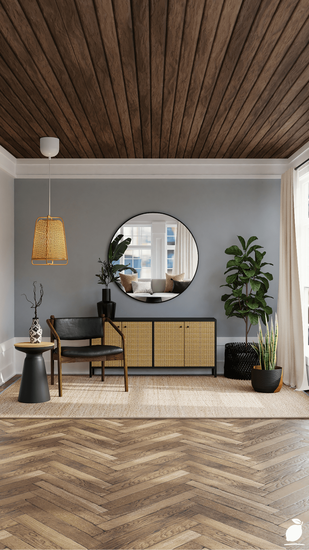
Yes, but the proportion framework is applied to each defined zone within the open plan rather than to the entire floor plate as a single room. A kitchen-dining-living open plan typically functions best when a single dominant color (the 60%) runs continuously across all zones, maintaining visual cohesion, while the secondary and accent colors shift subtly between zones to define each area without breaking the overall palette. The striped rug in the featured room’s living area is a perfect example of a zone-defining element that uses the room’s proportional colors without introducing a competing palette.
Does the 60-30-10 Rule apply to small rooms differently from large ones?
The proportional framework of the 60-30-10 Rule applies equally regardless of room size, but small rooms have specific light considerations that affect which colors are appropriate for the dominant 60% proportion. In small rooms, high-LRV (light reflectance value) colors in the dominant position maximize perceived space and prevent the room from feeling compressed. The accent color’s 10% proportion is especially powerful in small rooms because the limited floor area means accent items are physically closer to the viewer. Choose accent colors that read well at close range without feeling intense or overpowering in a compact space.
How do I apply the 60-30-10 Rule to a room I can’t repaint?
In rental properties or rooms where repainting isn’t possible, work with the existing wall color as the fixed 60% dominant and build the secondary and accent proportions around it. If the existing wall color is not one you’d have chosen as your dominant, counterbalance it by introducing a large-scale floor covering in your preferred dominant tone, a light rug over dark flooring, for example, that shifts the visual weight of the dominant color toward the floor rather than the walls. Large-scale art and textiles can also reclaim significant visual territory from wall colors you don’t want as the dominant, effectively reassigning proportion without paint.
What happens if I have more than three colors in my room?
Multiple colors in a room don’t violate the 60-30-10 Rule; they need to be organized within it. Colors that share sufficient similarity in temperature, saturation, or value can be grouped into a single proportion layer: multiple warm wood tones treated as a single secondary layer, multiple muted greens and warm oranges treated as accent colors within a shared 10% proportion. The key is whether colors that appear in the same layer read as a family or as competitors. If they read as competitors if your eye moves between them without settling, they need to be consolidated rather than expanded.
How do I use the 60-30-10 Rule with patterned wallpaper?
Patterned wallpaper carries multiple colors simultaneously and requires identifying which color in the pattern is most dominant, most prominent in the area, to determine where the wallpaper sits in the 60-30-10 Rule framework. If the dominant color in the pattern aligns with your intended 60%, the wallpaper can function as the dominant layer, with solid secondary and accent colors chosen from the secondary colors in the pattern. If the wallpaper’s dominant color is more intense and accent-like, treat the wallpaper as a feature wall within the 10% accent proportion rather than the full-room 60%, keeping the remaining three walls neutral, as the pattern’s background tone suggests.