You didn’t set out to have a beige house. Somewhere between the landlord-white years and the bold-color experiments that felt right on Pinterest and completely wrong by Tuesday, you landed on something safe, a wall color that isn’t quite warm and isn’t quite cool and doesn’t feel like anything at all. You know the shade. It’s the one that makes your furniture look slightly off, your art look slightly dim, and your living room look like a stage set waiting for someone to make a decision. You’ve repainted twice. The first attempt came out pink in the afternoon light. The second read lavender at dusk. Every time you reach for something warmer, it drifts. Every time you reach for something grayer, it chills. You are not bad at choosing colors. You are choosing the wrong neutral.
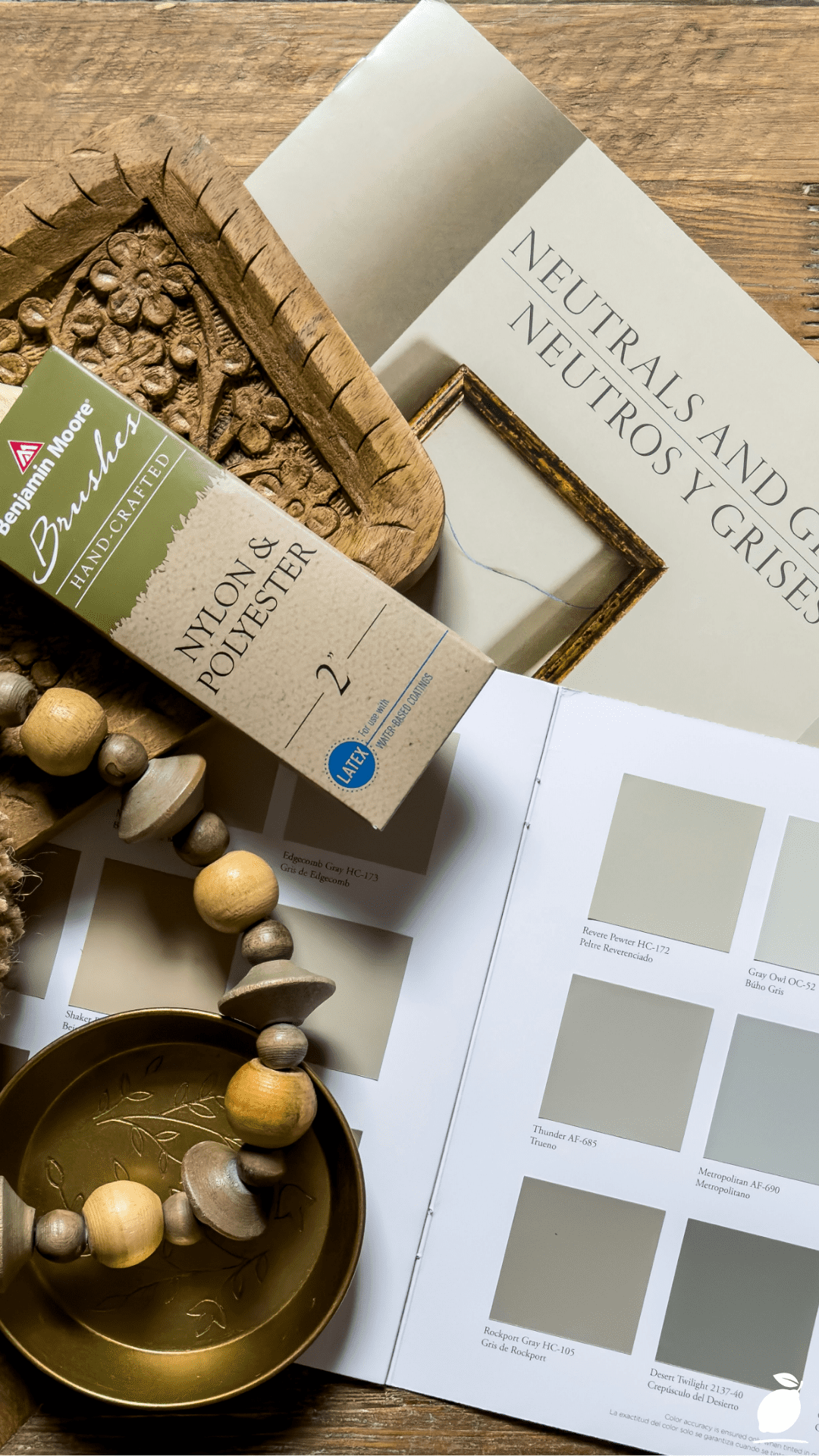
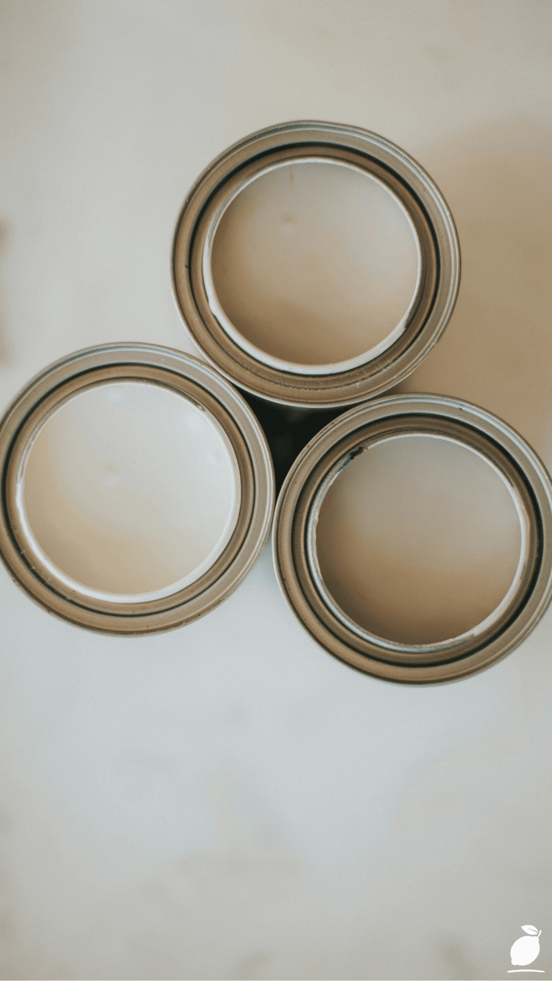
The problem is not the concept of warm neutral, it is the execution. Taupe paint exists precisely in the territory where warm and cool negotiate a ceasefire, where gray borrows just enough brown to feel grounded and brown borrows just enough gray to feel sophisticated. Done right, taupe paint does something that almost no other neutral can: it makes a room feel settled. Not safe in the way that avoidance is safe, but settled the way a room feels when every decision in it makes sense. The swatch book in the image above is open to exactly that conversation, a curated grid of gray-beige tones arranged with the deliberateness of someone who has learned to see the difference between shades that simply coexist and shades that genuinely resolve a space.
Benjamin Moore has spent decades refining this territory, and their taupe paint range sits at the center of the most-requested, most-recommended, and most-returned-to neutral palette in residential interior design. The colors discussed in this guide are not trends. They are proven formulations that have survived enough real rooms, real lighting conditions, and real second-guessing to have earned the kind of reputation that gets passed between neighbors, recommended by decorators, and repurchased without hesitation. If your walls have been waiting for a decision that sticks, this is the guide that helps you make it.
The Taupe Paint Blueprint
Step 1: Understand What Taupe Paint Actually Is
Taupe paint is not beige with a gray name, and it is not gray with a warm undertone; it is a specific mixture of both, and the ratio between them is what determines whether a taupe paint reads warm, cool, or balanced in your particular room. Benjamin Moore formulates their taupe paints across a spectrum: some lean unmistakably warm, drawing on red-brown and yellow-brown pigments that make a room feel like late afternoon light; others sit closer to the gray end, with just enough warmth to prevent the coldness that straight gray delivers under certain lighting conditions.
Before you select a taupe paint, identify where on that spectrum your room needs you to land. A room with north-facing windows and cool natural light benefits from a taupe paint with a visible warm lean, a shade that compensates for the blue cast of indirect light and prevents the wall color from reading as flat. A room flooded with warm afternoon sun needs a taupe paint with a stronger gray component so the warmth in the light doesn’t push the walls toward orange-pink. This calibration is the single most important step in selecting a Benjamin Moore taupe paint that will work consistently across all lighting conditions, rather than surprising you at the paint-reveal moment.
Step 2: Pull and Test the Right Benjamin Moore Taupe Paint Swatches
The Benjamin Moore taupe paint range is extensive, and the five shades most consistently recommended across designer resources, interior design forums, and professional decorating consultations are worth testing before any other options. Each occupies a distinct position on the warm-to-cool taupe paint spectrum.
Revere Pewter (HC-172) is the most recognized Benjamin Moore taupe paint in existence, a warm gray-green-brown that was, for a period, the best-selling Benjamin Moore color across all categories. It has a chameleon quality: in warm light, it reads definitively warm and brown; in cool light, it reveals its green-gray component. It works best in rooms with mixed lighting and medium to high ceilings.
Pale Oak (OC-20) sits at the lighter end of the Benjamin Moore taupe paint spectrum, a barely-there warm greige that reads almost white in bright light and settles into a soft, sandy warmth in evening conditions. It is the taupe paint for rooms that need lightness without the starkness of pure white.
Edgecomb Gray (HC-173) is the more refined, less discussed sibling of Revere Pewter, a true balanced greige that leans neither warm nor cool with the same assertiveness as its neighbor on the fan deck. It performs exceptionally in rooms with consistent natural light and pairs with both warm wood tones and cool gray furnishings without conflict.
Fieldstone (AC-7) moves toward a deeper, more saturated taupe paint, a dusty brown-gray that carries enough pigment to read as a true color rather than a neutral backdrop. It is the Benjamin Moore taupe paint for rooms that want presence rather than recessive calm.
Manchester Tan (HC-81) completes the range with a decisively warm taupe paint, more tan than gray, more honey than beige, that works in rooms with limited natural light where warmth needs to be built into the wall color rather than borrowed from the light source.
Order full-size paint samples for every shade you’re considering. Paint them on foam board rather than directly on the wall so you can move the sample around the room and observe it at different times of day. Assess each taupe paint sample in morning light, afternoon light, evening lamp light, and overcast natural light before committing.
Step 3: Consider Undertone Compatibility With Your Existing Room Elements
Every Benjamin Moore taupe paint carries a dominant undertone, the secondary hue that reveals itself under certain lighting conditions and in proximity to certain materials. Selecting a taupe paint without accounting for the undertones already present in your room’s fixed elements is the primary reason taupe paint projects fail.
Check your flooring, cabinetry, and large furniture pieces for their dominant undertones. Warm honey-oak flooring pulls toward yellow and orange, and a taupe paint with a strong purple or pink undertone will appear to conflict rather than complement, while a taupe paint with a warm yellow-brown base will appear continuous and intentional. Cool gray stone countertops or blue-gray upholstery call for a taupe paint that sits closer to the gray end of the spectrum, so the wall color speaks the same temperature language as the fixed elements.
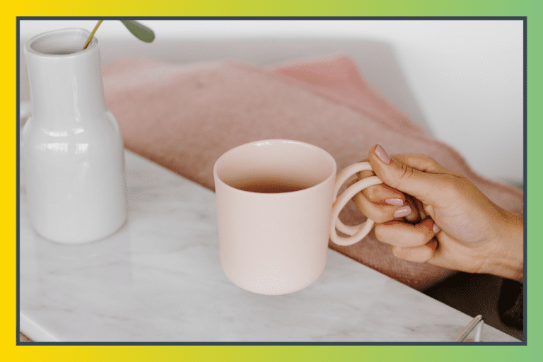
The decorative wooden bead necklace and natural bristle paintbrush in the image above both demonstrate this undertone harmony in practice; the warm brown and cream tones coexist without conflict because they share the same temperature register. Apply that principle to your taupe paint selection: warm undertones to warm room elements, cool-leaning taupe paint to cooler fixed elements, and balanced greige to rooms where warm and cool materials are already in conversation.
Step 4: Select the Right Finish for Your Taupe Paint Application
Benjamin Moore taupe paint performs differently depending on the sheen level applied, and the finish decision affects both the visual result and the practical durability of the painted surface.
Matte or flat finish is the most flattering sheen for taupe paint on walls; it absorbs light rather than reflecting it, which allows the taupe paint color to read as its truest self without the visual distortion that reflection introduces. Matte is ideal for living rooms, bedrooms, and dining rooms where walls are touched infrequently, and the priority is color depth over wipe-clean practicality.
Eggshell finish is the most versatile taupe paint finish for residential walls. It has just enough sheen to be wipeable without the reflectivity that makes undertones shift noticeably across a surface. It is the Benjamin Moore-recommended finish for most living and sleeping spaces and the best starting point for a first taupe paint application.
Satin finish suits taupe paint in hallways, children’s rooms, and kitchen areas that require frequent cleaning. It introduces a soft luminosity that can make taupe paint colors feel slightly lighter and cooler than in matte, which is worth accounting for when selecting the shade.
Reserve semi-gloss for trim and architectural detail work, such as skirting boards, window casings, door or frames, rather than walls. A Benjamin Moore taupe paint in eggshell or matte on the wall paired with a complementary white or soft-contrast trim in semi-gloss creates the layered, polished finish that professional interior design results consistently demonstrate.
Step 5: Prepare Walls Properly Before Applying Taupe Paint
Taupe paint, especially the mid-value taupe shades that Benjamin Moore specializes in, is unforgiving of surface imperfections in a way that dark paint (which reads as shadow) and bright white (which reads as light) are not. Mid-value taupe paint reflects light obliquely, which means every raised edge, patch seam, and roller texture is visible in the finished surface under raking light. Surface preparation is not optional for a taupe paint application that will satisfy in every lighting condition.
Fill all holes and indentations with a quality lightweight filler and sand flush when dry. Sand any existing drips, texture ridges, or brush marks on previously painted surfaces until the surface reads smooth to the back of your hand in raking light. Wipe the entire wall surface with a damp cloth to remove dust, grease, and fingerprint residue. Taupe paint applied over a contaminated surface will show adhesion variation once dry. Apply a Benjamin Moore primer appropriate to your wall material and previous paint type before the taupe paint topcoats, especially if you are painting over a significantly different color or an uneven previous application.
Apply Benjamin Moore taupe paint in a minimum of two full coats, allowing each coat to dry a minimum of four hours completely in standard temperature and humidity before assessing coverage and applying the next. Evaluate the taupe paint color only when fully dry, as Benjamin Moore taupe shades dry consistently darker and more settled than they appear when wet.
Step 6: Coordinate Taupe Paint With Trim, Ceiling, and Accent Colors
Taupe paint on the walls performs at its highest level when it is part of a considered whole-room palette rather than an isolated wall color decision. The ceiling, trim, and any accent colors in the room all interact with your Benjamin Moore taupe paint to determine the final atmospheric result.
For the ceiling, apply the taupe paint color at full strength for a continuous, enveloping warmth. This works particularly well in rooms with lower ceilings, where you want to dissolve the boundary between wall and ceiling. Alternatively, use a ceiling white that shares the taupe paint’s undertone temperature: a warm white ceiling like Benjamin Moore White Dove (OC-17) or Chantilly Lace (OC-65) with warm taupe walls, a pure-cool white with cooler greige taupe selections.
For trim, bright white trim against taupe paint creates the sharpest contrast and the most conventional result, clean, legible, and universally appropriate. A tonal trim, slightly lighter or darker than the wall taupe paint and in the same color family, creates a softer, more unified look that feels contemporary and considered. A deep-toned trim in charcoal, warm black, or forest green against a mid-taupe paint creates a sophisticated, layered result that elevates the taupe paint from a neutral backdrop to a design anchor.
Expert Secrets for Success
Pro-Tips for a Better Result
Test taupe paint on foam board, not directly on the wall. The ability to move your taupe paint sample around the room to observe it against the flooring, beside the sofa, near the window, and in the corner that gets the least light reveals color behavior that a fixed wall swatch cannot. Benjamin Moore taupe paint colors shift measurably across different positions in the same room, and the foam board method lets you catch conflicts before they are committed.
Order the Benjamin Moore color sample in the actual finish you intend to use. Matte and eggshell samples of the same taupe paint color look visibly different from each other on the wall, and the sample that convinced you to commit was probably painted in a different sheen than the one you applied. This single mismatch is responsible for a significant proportion of taupe paint disappointments that decorators diagnose after the fact.
Paint all four walls before making a final taupe paint judgment. One wall of Benjamin Moore taupe paint looks different from four the color bounces between surfaces, and the room fills with a warmth or coolness that a single painted wall cannot demonstrate. If a taupe paint sample on one wall looks borderline, paint all four before reordering; the result is frequently decisive in either direction.
Work with the 60-30-10 proportion rule. Treat your Benjamin Moore taupe paint as the 60 the dominant neutral that covers walls and establishes the room’s temperature. Choose a secondary tone for upholstery and major textiles in 30% of the visual field. Add a 10% accent warm brass, aged oak, terracotta, or deep navy to anchor the taupe paint palette and prevent it from reading as undifferentiated warmth. The earthy palette of the image above demonstrates this instinctively: the wood tones, neutral swatches, and dark bead accents create depth without displacing the quiet authority of the neutral center.
Common Mistakes to Avoid
Don’t select a Benjamin Moore taupe paint based on the fan deck alone. Fan deck swatches are approximately 5cm × 2cm, a size at which color behavior is entirely unrepresentative of the same color scaled to a full wall. The yellow that reads like a faint undertone on a swatch becomes the room’s most noticeable quality at wall scale. Every Benjamin Moore taupe paint decision deserves a full-size painted sample before it deserves a gallon order.
Don’t apply taupe paint over a dark or strongly saturated previous color without primer. Benjamin Moore taupe paints are mid-value; they do not have the opacity of deep dark colors or the coverage power of bright whites. Applied directly over a dark navy, forest green, or deep red previous color, even multiple coats of taupe paint will carry the ghost of the previous color in its undertones. A quality primer coat is not optional in this situation; it is the difference between a true taupe result and a muddy one.
Don’t assess taupe paint color under contractor-grade lighting. The temporary work-light bulbs and bare overhead fixtures present during most painting projects cast a harsh, often blue-white light that makes Benjamin Moore taupe paint colors look cooler, flatter, and more gray than they will appear under the room’s actual finished lighting. Always evaluate taupe paint color under the light sources the room will actually use. Install your final bulbs and lamps before making the color verdict.
Don’t ignore the floor’s contribution to the taupe paint result. The floor is the largest surface in the room that you are not painting, and it communicates constantly with your Benjamin Moore taupe paint walls. A medium-toned wood floor with strong orange-red undertones will push a balanced taupe paint toward warmth; a cool gray stone or concrete floor will pull it toward cool. Failing to account for the floor’s undertone is the most common source of “it looked perfect in the showroom” taupe paint disappointment.
Why Taupe Paint Matters
The decision to commit to a wall color feels trivial until you are living in a room where it went wrong. Then it is not trivial at all; it is the low-grade environmental stress of a space that never settles, that catches your eye at the wrong moment, that makes guests glance at the walls in a way you’ve learned to read as discomfort rather than admiration. Color is not decoration. It is the most pervasive environmental condition in a room, present every hour the room is occupied, shaping the quality of the light, the mood of the occupants, and the sense of the home as an intentional place rather than an assembled one.
Benjamin Moore taupe paint occupies a specific and important role in residential wellbeing because it is among the few neutral categories that recede without disappearing. Pure white walls are present; they broadcast their neutrality with a brightness that never quite disappears into the background. Dark accent walls are dramatically present. Taupe paint is quiet in the best sense of the word: it creates conditions in which the room’s furnishings, art, and inhabitants become the subject rather than the wall. Research in environmental color psychology has documented the consistent association between warm neutral environments and reduced perceived stress, the kind of background calm that accumulates across hundreds of hours spent in a room that simply feels right.
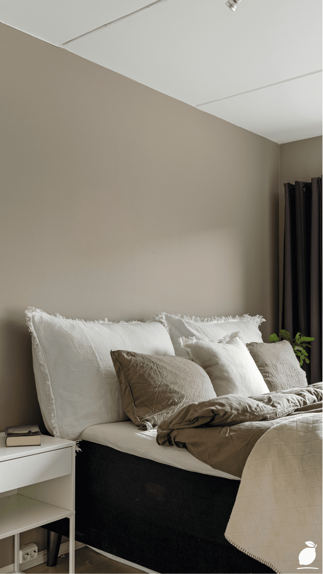
Easy Peasy Life Matters exists for exactly this kind of decision: the one that seems like it is only about a paint color and turns out to be about the feeling of coming home. The image above captures that feeling in a palette of earthy, grounded, unhurried, warm, without being loud, settled without being boring. The right Benjamin Moore taupe paint delivers that feeling to your walls, and through your walls, to every room you occupy. It is among the most consequential small decisions a home can make. This guide is how you make it correctly, once, and not have to make it again.
Frequently Asked Questions
What is the most popular Benjamin Moore taupe paint color?
Revere Pewter (HC-172) has historically been the most-purchased Benjamin Moore taupe paint, with a warm gray-green-brown formulation that performs across an exceptionally wide range of lighting conditions and architectural styles. For a lighter result, Pale Oak (OC-20) is the most frequently recommended Benjamin Moore taupe paint by interior designers for spaces that prioritize airiness. Edgecomb Gray (HC-173) is the most balanced option for rooms where undertone predictability is the priority. It shifts less dramatically between lighting conditions than either Revere Pewter or Pale Oak.
How do I know if a taupe paint color has a pink or purple undertone?
The most reliable method for detecting unwanted undertones in a Benjamin Moore taupe paint is the white card test: hold a sheet of pure white paper next to the paint sample on the wall and observe what color appears to shift in the taupe paint by contrast. If the taupe paint looks pink or lavender next to the white card, it carries a pink or purple undertone that will become more pronounced at wall scale and in certain lighting conditions. Test your Benjamin Moore taupe paint sample both in natural daylight and under the actual bulbs the room will use, as incandescent and warm LED sources amplify warm and red undertones while daylight bulbs reveal cool undertones.
Can taupe paint work in a dark or north-facing room?
Yes, and Benjamin Moore’s warmer taupe paint formulations are specifically well-suited to north-facing and limited-light rooms precisely because their warm undertones compensate for the cool blue cast of indirect natural light. Manchester Tan (HC-81) and Revere Pewter (HC-172) both perform well in darker rooms. The key adjustment for dark rooms is finish selection: choose an eggshell or low-sheen satin rather than matte so the taupe paint reflects the available light rather than absorbing it, and pair the taupe paint with warm-temperature bulbs (2700K–3000K) to support the color’s warm component.
What trim color works best with Benjamin Moore taupe paint?
The most versatile trim color for Benjamin Moore taupe paint walls is a warm white Benjamin Moore White Dove (OC-17), which is the most frequently paired trim choice, providing clean contrast without the blue-cool sharpness that bright optical whites introduce against taupe. For a softer, more tonal result, Chantilly Lace (OC-65) provides a crisper, brighter white that still sits within the warm register. For a contemporary high-contrast approach, a deep charcoal or warm black trim Benjamin Moore Black Iron (2120-20) or Kendall Charcoal (HC-166) against a mid-value Benjamin Moore taupe paint creates a layered, editorial result that has become increasingly popular in modern transitional interiors.
How many coats of Benjamin Moore taupe paint do I need?
Most Benjamin Moore taupe paint colors require two full coats for complete, even coverage over a properly primed surface. Lighter taupe paints, Pale Oak, Edgecomb Gray, and Pale Smoke may require a third coat over mid-tone previous colors because their lighter formulation has less pigment per volume than deeper shades. Deeper taupe paints like Fieldstone typically achieve satisfactory coverage in two coats over primer. Always allow each coat to dry fully before assessing coverage. Benjamin Moore taupe paint colors that look patchy when wet frequently achieve complete coverage when dry, and a premature third coat applied over an incompletely dry second coat risks adhesion issues and uneven sheen.