The white paint decision was supposed to be the easy one. I had spent weeks choosing the furniture, the hardware, the floor stain color, and the tile, and when all of those were finally decided, the walls were supposed to be simple. White. Just white. I went to the paint store and discovered that Benjamin Moore alone offers over one hundred white paint colors, each with a name that communicates a specific and distinct atmospheric quality and a chip that communicates approximately nothing when held under fluorescent store lighting.
Chantilly Lace versus White Dove versus Simply White versus Decorators White. Each of these is described in language that suggests they are meaningfully different from each other, and in the paint store, they look identical, and on the wall, they are not identical at all. I painted a test patch with three different whites and spent four days observing them in different lights before understanding that I had been approaching the white paint colors selection the way I approached all neutral decisions: as though there were a correct answer that I was failing to identify, rather than as a specific preference about light quality that I needed to articulate to myself before any chip would be useful.
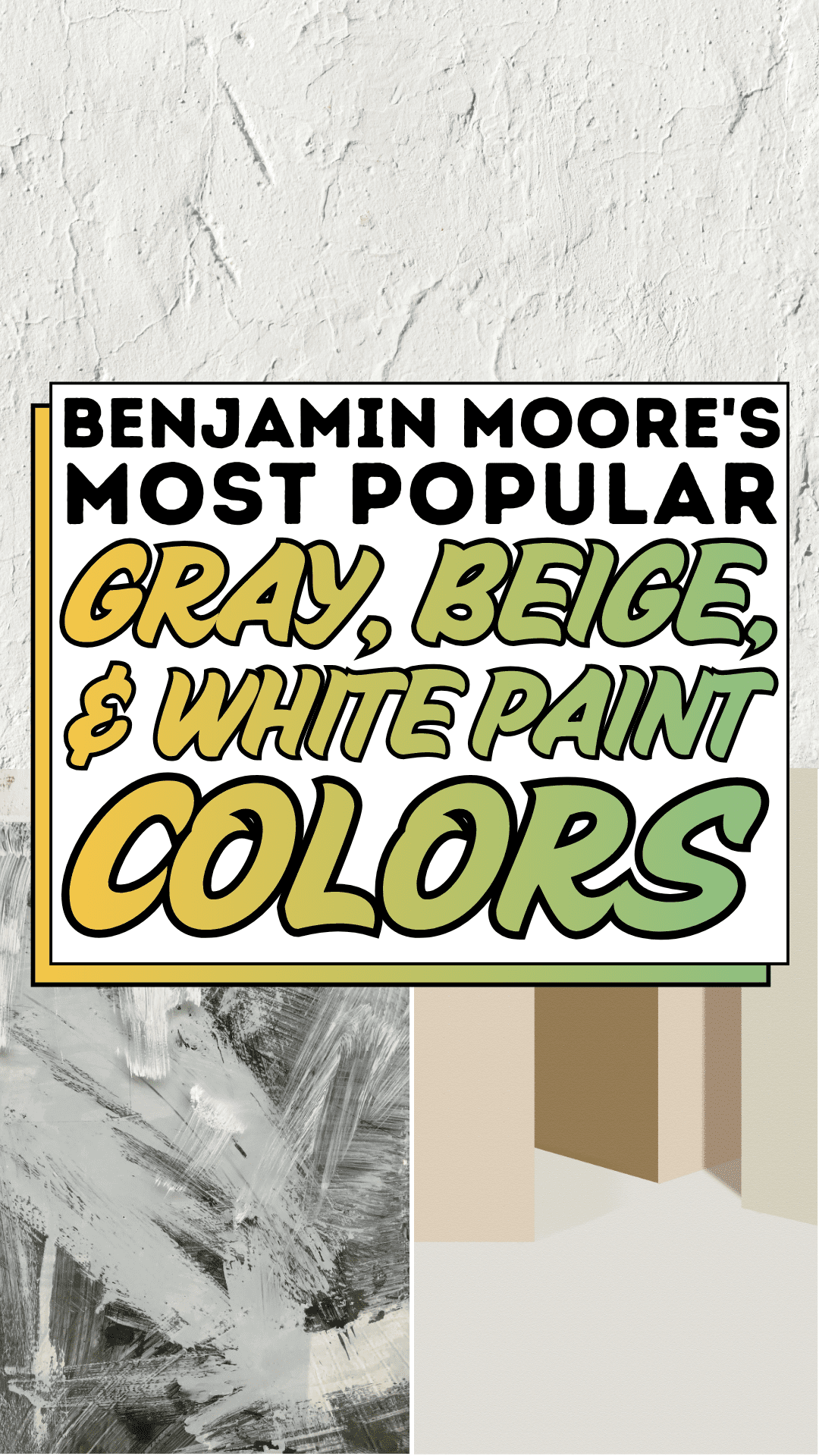
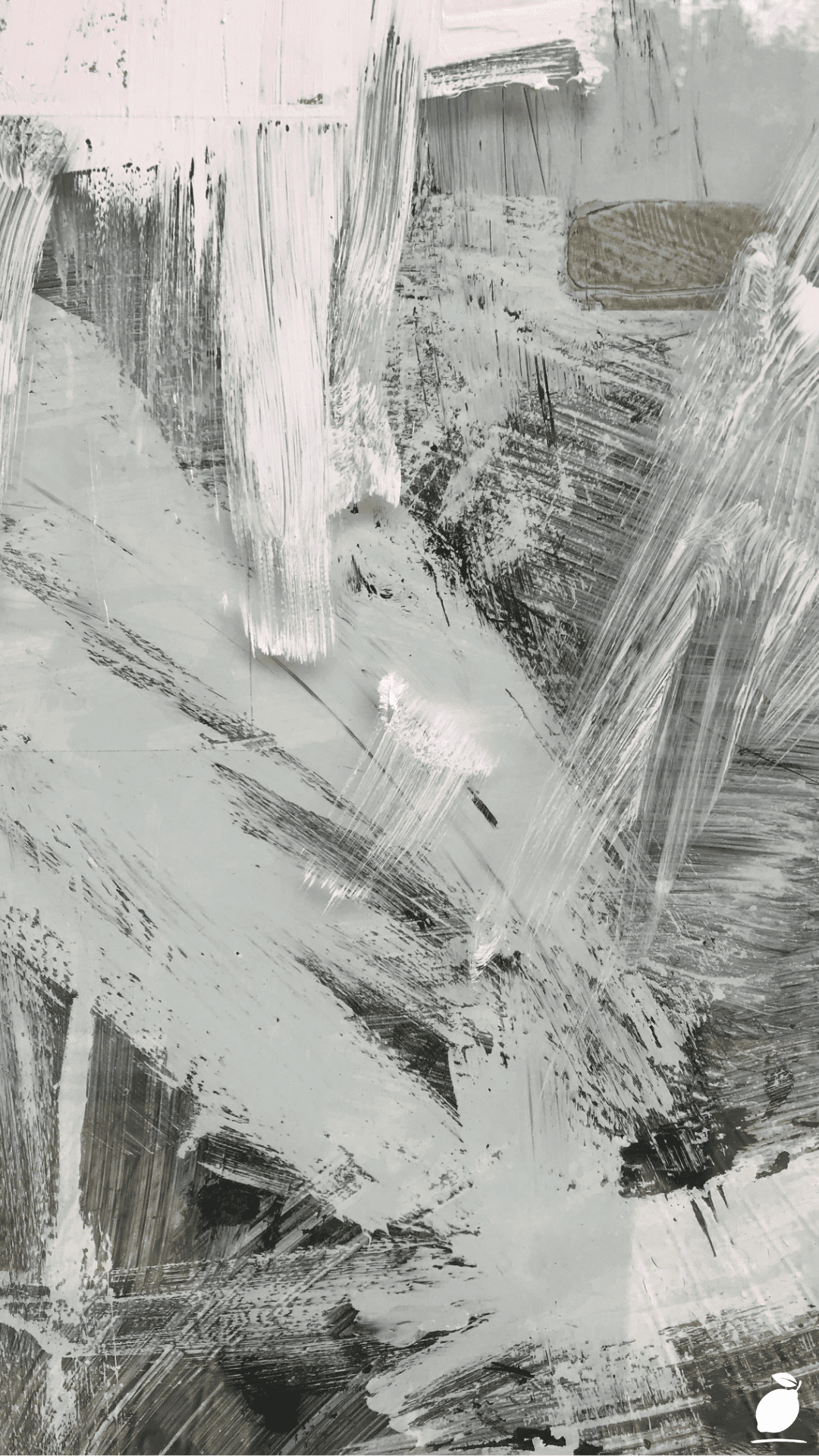
The abstract painting in the image above is the most honest representation of what white paint colors actually are: not a single color but a dynamic field of whites, grays, beiges, and blacks that coexist and interact in a way that produces the specific quality of a surface at a given moment of light and observation angle. The painting’s rough gestural brushstrokes white against light gray, dark gray and black marks creating contrast, visible impasto texture where the paint is thick enough to cast its own shadow demonstrate in concentrated form the same phenomenon that white, gray, and beige walls demonstrate in a room: the color you see depends entirely on the light falling on it, the colors adjacent to it, and the angle from which you observe it. Benjamin Moore’s most popular gray, beige, and white paint colors are popular precisely because their multi-pigment formulations produce exactly this kind of dimensional, light-responsive quality rather than the flat, static single-tone appearance of cheaper formulations.
The Benjamin Moore gray, beige, and white paint colors in this guide are organized around the understanding that the painting communicates: these are not simple colors but complex atmospheric fields, and choosing among them correctly requires understanding what each one does with light rather than what it looks like on a chip. This guide documents the specific Benjamin Moore white paint colors, gray paint colors, and beige paint colors that have achieved their popularity through real-world performance rather than marketing, with specific color names, codes, undertone descriptions, and room-application guidance for each. The white paint decision you have been putting off resolves here.
The White Paint Colors Blueprint
Step 1: Understand the Benjamin Moore White, Gray, and Beige Color Families
Before any specific Benjamin Moore white paint colors can be evaluated or chosen, the three color families addressed in this guide need to be understood as distinct categories with different atmospheric qualities, different undertone behaviors, and different room-type suitability rather than as three points on a single spectrum from white to gray.
Benjamin Moore white paint colors are paints with a Light Reflectance Value (LRV) above approximately 80, meaning they reflect 80 percent or more of the light that falls on them. At this LRV level, white paint colors read as definitively white in most light conditions, but the specific undertone of the white, the hint of yellow, pink, gray, or green in the pigment base, determines whether the white reads as warm and inviting, cool and crisp, or subtly colored in a way that is not immediately identifiable but is consistently perceptible. Benjamin Moore white paint colors at this LRV level include Chantilly Lace (OC-65), Simply White (OC-17), White Dove (OC-17), and Decorator’s White (PM-1), the four most-specified whites in the brand’s portfolio and four whites that look nearly identical on a chip and behave quite differently on a wall.
Benjamin Moore gray paint colors exist on a spectrum from the palest barely-gray (Pale Moon, OC-108) through the complex mid-range grays that read as warm or cool depending on the light (Revere Pewter HC-172, Gray Owl OC-52) to the deep charcoal grays that read as almost-black in low light (Kendall Charcoal HC-166). The painting’s dark gray and black paint marks demonstrate this gray spectrum at its full range, from the barely-there light gray background to the deep black strokes that read as the painting’s darkest value.
Benjamin Moore beige paint colors occupy the warm-neutral territory between true white and warm gray paints with enough yellow, red, or orange pigment to read as warm but not saturated enough to read as a specific color. Accessible Beige (SW 7036, a Sherwin-Williams reference point), Pale Oak (OC-20), and Manchester Tan (HC-81) are the Benjamin Moore beige-adjacent standards. The painting’s subtle hints of beige in specific areas demonstrate the quality that makes beige paint colors so specifically useful in domestic interiors: the warmth they introduce is perceptible but not declarative.
Step 2: Choose Between Benjamin Moore White Paint Colors Based on Undertone
The most consequential choice among Benjamin Moore white paint colors is the undertone selection, the specific color bias embedded in the white’s pigment base that determines how the white reads in the room’s specific light conditions. Benjamin Moore’s most popular white paint colors can be organized into three undertone groups that behave distinctly from each other.
Cool-undertone Benjamin Moore white paint colors those with blue, gray, or green undertones read as crisp, clean, and contemporary in rooms with warm direct light (south and west-facing rooms where the warm sun compensates for the white’s coolness) and as slightly cold or clinical in rooms with cool indirect light (north-facing rooms where the cool ambient light amplifies the cool undertone). Benjamin Moore Chantilly Lace (OC-65) is the most popular cool-undertone white, the white that photographers and interior stylists specify when they need a white that reads as definitively white in photographs without any visible color cast. Benjamin Moore Decorator’s White (PM-1) provides the same quality with slightly more gray in the undertone for rooms where pure brilliant white would be too stark.
Warm-undertone Benjamin Moore white paint colors those with yellow, pink, or cream undertones read as inviting and softly warm in rooms with cool indirect light and as slightly creamy or off-white in rooms with warm direct light. Benjamin Moore White Dove (OC-17) is the most popular warm-undertone white, the white that most consistently produces the “not quite white but not cream” quality that warm-undertone rooms require when they need something brighter than a beige but softer than a cool white. Benjamin Moore Simply White (OC-17) provides slightly more warmth at the same LRV level and suits rooms with very cool light where White Dove alone would feel slightly too cool.
Neutral-undertone Benjamin Moore white paint colors those with balanced undertones, that prevent them from reading as either warm or cool, are the most versatile and the most reliably correct across a wide range of light conditions. Benjamin Moore Chantilly Lace at certain application depths and Benjamin Moore Super White (PM-1) occupy this territory, along with Benjamin Moore Cotton Balls (OC-122) at a slightly lower LRV.
Step 3: Understand Benjamin Moore Gray Paint Colors and Their Undertones
Benjamin Moore gray paint colors are notoriously variable in their undertone behavior. A gray that reads as a sophisticated warm taupe in a furniture showroom can read as a distinctly purple-lavender in a north-facing bedroom, because the gray’s subtle purple undertone is amplified by the cool indirect light without the warm ambient light that compensated for it in the showroom. Understanding the specific undertone of any Benjamin Moore gray paint color before purchasing is non-negotiable.
Benjamin Moore Revere Pewter (HC-172) is the most discussed gray paint color in the brand’s history — a warm, beige-leaning gray that reads as a sophisticated neutral in warm-light conditions and as a slightly muddy greenish-gray in cool-light conditions. Its popularity peaked when open-plan interiors were at their height and has since been challenged by cleaner, cooler grays for contemporary applications, but it remains the standard reference point against which other Benjamin Moore gray paint colors are frequently compared. For rooms where Revere Pewter reads correctly (warm light, traditional furnishings, wood-toned floors), it produces the most consistently beautiful warm gray result in the portfolio.
Benjamin Moore Gray Owl (OC-52) is the cool, clean gray paint color that the contemporary design context most consistently calls for, slightly lighter than Revere Pewter, with a blue-gray undertone that reads as sophisticated and modern in a wide range of light conditions. Benjamin Moore Stonington Gray (HC-170) provides a slightly darker, more complex version of the same cool gray quality. For rooms where a gray paint color needs to read as clearly and cleanly gray without any warm, yellow, or purple drift, Gray Owl and Stonington Gray are the Benjamin Moore gray paint colors that deliver most reliably.
Benjamin Moore Pale Smoke (2116-60) and Silver Half Dollar (2121-40) provide the gray paint colors at the lighter end of the medium-gray range, which read as atmospheric and spatially expansive rather than grounding and enclosing, suited to rooms where a gray paint color is desired but where dark or heavy gray would compress the space.
Step 4: Select Benjamin Moore Beige Paint Colors for the Right Warmth Register
Benjamin Moore beige paint colors occupy the warmest register of the three color families. They are the paints that introduce warmth into a neutral room without the commitment of a specific saturated color, and they perform best in rooms where warmth is the primary atmospheric requirement but where a clearly warm-toned color (a terracotta, an ochre) would be too committed.
Benjamin Moore Pale Oak (OC-20) is the most specified pale beige in the portfolio, a warm, barely-there beige with just enough yellow pigment to read as warm without reading as cream or ivory. Its popularity stems from its versatility: Pale Oak works equally well as a full-room wall color, a ceiling color paired with white walls, or a trim color paired with a slightly deeper beige or gray wall. At its LRV of 73, it reflects enough light to feel fresh and airy while providing enough warmth to distinguish it from the cooler white paint colors on adjacent walls.
Benjamin Moore Manchester Tan (HC-81) is the most specified medium beige, a warm, golden-inflected beige that reads as definitively warm without reading as yellow or honey-toned. In rooms with good natural light and warm wood tones in the flooring or furniture, Manchester Tan produces the specific quality of a room that feels settled and inhabited rather than freshly painted. Benjamin Moore Linen White (OC-146) provides the warmest and most cream-adjacent beige paint color in the portfolio’s accessible range, suited to rooms with traditional furnishings, warm lighting, and a design direction that wants the warmth of an off-white without the flatness of a standard neutral.
Step 5: Test Benjamin Moore White, Gray, and Beige Paint Colors Correctly
The paint chip and the Peel & Stick sample are the two Benjamin Moore testing tools available for white, gray, and beige paint colors, and they behave differently. The chip provides accurate relative undertone comparison (which of two whites is warmer, which gray has more purple) but does not provide accurate LRV or wall-scale behavior assessment. The Peel & Stick sample ($6 to $8 at Benjamin Moore retailers) provides a 10cm × 10cm actual paint sample that can be moved around the room and observed in different light conditions.
For Benjamin Moore white paint colors testing, apply the Peel & Stick sample on the wall where the largest window is positioned AND on the wall directly opposite the window. The same white reads differently on a sun-facing wall versus a shade-facing wall in the same room, and both readings are part of the daily experience of living with that white. Observe at morning, midday, afternoon, and evening lamp light and note whether the white’s undertone becomes visible (yellowing, pinker, lavender) in any specific light condition that would read as objectionable in daily use.
For Benjamin Moore gray and beige paint colors, the critical test is the north-wall application under cool indirect light, where warm gray paint colors shift toward green or purple, and where beige paint colors that read as warm in warmer light conditions can read as dingy or muddy. Test in the room’s least-favored light condition first and work back from acceptability there rather than from beauty in the most favorable light.
Step 6: Apply Benjamin Moore White, Gray, and Beige Paint Colors for Maximum Quality
Benjamin Moore white paint colors, particularly the cooler, higher-LRV whites like Chantilly Lace, are unforgiving of surface preparation shortcuts because their high light reflectance amplifies surface imperfections through the same mechanism that makes them bright: any variation in the surface’s texture, repair patch, or primer consistency reads as a micro-shadow under raking light that would not be visible under the same raking light on a deeper-toned wall.
For Benjamin Moore white paint colors application, prime with a Benjamin Moore Fresh Start Primer tinted to approximately 50 percent of the planned topcoat for Chantilly Lace, this means a very pale gray primer that reduces the topcoat count from three to four (white over unpainted drywall) to two (white over tinted primer). Apply two full topcoat applications of Benjamin Moore Aura or Regal Select in the chosen finish, Matte for atmospheric feature walls, Eggshell for full-room applications that require cleaning durability.
For Benjamin Moore gray and beige paint colors, the primer tinting is even more important because the gray and beige undertones require the substrate to be neutral before the topcoat’s specific undertone can read correctly. A white primer beneath a warm beige consistently produces a slightly cooler reading of the beige than a warm-tinted primer, because the cold white primer’s influence bleeds through thinner topcoat areas. Tint the primer warm for beige paint colors and neutral-gray for gray paint colors.
Expert Secrets for Success
Pro-Tips for a Better Result
Compare Benjamin Moore white paint colors against a pure white reference card rather than against each other. The white paint colors comparison failure that sends most people to the store multiple times is comparing whites to each other without a reference point. Two whites examined side by side look similar; the same two whites examined against a pure bright white reference card reveal their undertones immediately and dramatically. Request a plain white piece of paper from the Benjamin Moore retailer and hold it next to each chip; the yellow, pink, or gray bias of each white paint color becomes unmistakable within seconds.
Use Benjamin Moore’s fan deck rather than individual chips for gray and beige paint color selection. The Benjamin Moore Color Fan Deck (available for purchase at retailers or for consultation at paint stores) arranges gray paint colors in undertone families: the warm grays together, the cool grays together, the green-gray family together, which makes the undertone comparison between adjacent colors far easier than comparing individual chips. The fan deck’s arrangement also shows each gray paint color in context with its value-adjacent neighbors, helping identify whether a specific gray paint color is at the right depth for the intended application.
Apply Benjamin Moore white paint colors to the ceiling in a specific ceiling white rather than the wall white. Ceiling whites are specifically formulated with higher-than-normal LRV and a slightly flat or matte finish that makes the ceiling recede visually and appear brighter qualities that standard wall white paint colors do not optimize for. Benjamin Moore’s Ceiling White and Chantilly Lace at flat finish are the two ceiling white options that most consistently produce a visually receding, bright-white ceiling above a gray, beige, or slightly colored wall below.
Order Benjamin Moore white, gray, and beige paint colors in the same finish level from the same paint line for all surfaces being painted simultaneously. Two rooms painted with the same Benjamin Moore color code but from different paint lines (one from Aura, one from Regal Select) can show a subtle but perceptible sheen difference that is immediately apparent when the two rooms’ doors are open simultaneously. Use the same paint line throughout all rooms painted in the same project phase.
Common Mistakes to Avoid
Don’t choose Benjamin Moore white paint colors under the store’s fluorescent lighting. Fluorescent store lighting has a strong cool-blue quality that strips warm undertones from white paint colors, chips, and makes even warm-yellow whites read as cool and neutral. A white paint color chip that reads as neutral or slightly cool-gray under the store’s fluorescent lighting will often read as noticeably warm-yellow in the room’s natural or incandescent light, producing the “where did this warmth come from” surprise that is among the most common white paint color disappointments. Always evaluate white paint colors under the room’s actual light condition using a Peel & Stick sample.
Don’t apply Benjamin Moore gray paint colors without confirming the undertone in the specific room. The purple-lavender undertone of certain popular grays, including some of the mid-range cool grays frequently specified by designers, reads as imperceptible in warm-light rooms and as distinctly purple in north-facing rooms with cool indirect light. Confirm the specific gray paint color’s undertone behavior under the room’s actual light condition before committing. If the gray’s undertone is reading as visibly purple or green in the room’s cool light, shift to a warmer-undertone gray or to a beige paint color that provides warmth without the undertone drift problem.
Don’t use the same Benjamin Moore beige paint color on walls and trim. Beige paint colors on trim, particularly in eggshell or satin finish, read significantly warmer and darker than the same color on walls in flat or matte finish, because the increased reflectivity of the trim finish changes how the light interacts with the pigment. Trim in the same beige as the walls consistently produces an undifferentiated, monochromatic wall-and-trim reading that flattens the room’s architectural detail. Use a lighter or cooler adjacent color, a white or pale cream, for trim in beige paint colors, rooms to maintain the architectural distinction between wall and trim.
Don’t skip the gray paint colors undertone family check when specifying for multiple rooms. Gray paint colors from different undertone families, a warm gray in the living room, and a cool gray in the adjacent dining room will read as significantly different colors when both rooms are visible simultaneously through an open-plan layout. This undertone mismatch produces the specific open-plan paint color failure of a home that appears to have two separate and slightly clashing paint color decisions rather than a cohesive palette that travels through connected spaces. Choose all gray paint colors for an open-plan space from within the same undertone family.
Why White Paint Colors Matter
White paint colors, gray paint colors, and beige paint colors matter as a design category because they are the surfaces that most consistently determine the daily quality of the rooms they occupy, more so than any other color category, precisely because of their prevalence. Most homes use white, gray, and beige paint colors for the majority of their interior surfaces: the walls and ceilings that constitute the largest visual surface area in every room. Getting these paint colors right does not produce the immediate visual impact of a navy accent wall or a terracotta kitchen; it produces something subtler and more pervasive: the specific quality of light in every room, the specific warmth or crispness of every white surface, the specific atmosphere that occupants experience every moment they spend in the space.
Research in environmental color psychology has identified the quality of ambient background color, the neutral surfaces of walls and ceilings that constitute the visual field of a room’s primary occupation zone, as a significant predictor of daily cognitive restoration, stress reduction, and the subjective quality of “home feeling” that strongly correlates with overall residential satisfaction. White paint colors with warm undertones consistently produce higher reported feelings of comfort and psychological ease than either pure optical whites or cool-undertone whites in the same residential test conditions. Benjamin Moore’s white paint colors, gray paint colors, and beige paint colors are the formulations specifically designed to produce these ambient background color qualities at the depth and consistency that real room conditions require, and their long-standing popularity is the accumulated endorsement of millions of homeowners who have experienced the specific daily quality difference that correct neutral paint colors produce.
Easy Peasy Life Matters is built on the conviction that the neutral paint colors, the whites, grays, and beiges that constitute the majority of any home’s wall surface deserve as much informed attention as any other design decision in the home. The abstract painting in the image demonstrates in artistic form what the best white, gray, and beige paint colors demonstrate in architectural form: the rich, dimensional, light-responsive quality of surfaces that have been painted with genuine complexity. These steps are how to choose Benjamin Moore’s version of that complexity for your specific rooms, your specific light, and your specific daily experience of home.
Frequently Asked Questions
What is the difference between Benjamin Moore White Dove and Chantilly Lace?
Benjamin Moore White Dove (OC-17) and Chantilly Lace (OC-65) are the two most frequently compared Benjamin Moore white paint colors, and they differ primarily in undertone and LRV. White Dove has a warm, slightly yellow undertone and an LRV of approximately 83. It reads as a soft, warm white that is particularly beautiful in rooms with cool indirect light, where the warm undertone compensates for the ambient light’s coolness. Chantilly Lace has a cool, barely-there gray undertone and an LRV of approximately 92. It reads as a crisp, near-perfect white that is particularly beautiful in rooms with warm direct light, where its coolness prevents the room from reading as creamy or yellow. In practice: White Dove for northern-light rooms seeking warmth; Chantilly Lace for southern-light rooms seeking crispness.
Which Benjamin Moore gray paint color is most popular and why?
Benjamin Moore Revere Pewter (HC-172) remains the most discussed and historically most specified gray paint color in the portfolio, popular for its warm, accessible quality that reads as sophisticated rather than cold. However, for contemporary applications, Benjamin Moore Gray Owl (OC-52) has largely replaced Revere Pewter as the gray of choice among designers. Its cooler, cleaner undertone reads as more contemporary, more versatile across different furniture styles, and more reliably neutral across different light conditions. Both are worthy of their popularity; the choice between them is primarily a light-condition and design-direction decision rather than a quality one.
Can Benjamin Moore beige paint colors work in a modern or contemporary interior?
Yes, specifically, the lighter and more muted Benjamin Moore beige paint colors (Pale Oak OC-20, White Sand OC-10, Shaker Beige HC-45) work effectively in contemporary interiors when they are paired with the right companion elements: clean-lined furniture without decorative detail, minimal accessories, and white or light gray trim that prevents the beige from reading as traditional or dated. The key distinction for contemporary beige paint color applications is the specific beige shade’s proximity to white. The lighter, more muted beige paint colors read as a warm alternative to white in contemporary spaces, while deeper or more saturated beige paint colors read as traditionally warm and require more traditional furnishing contexts to succeed.
How do I know if a Benjamin Moore paint color is truly white versus off-white?
The clearest indicator of whether a Benjamin Moore paint color is truly white versus off-white is its Light Reflectance Value (LRV). Benjamin Moore provides LRV data for all colors in its portfolio. True white paint colors have LRVs above 80 (reflecting 80 percent or more of light) and read as white across most light conditions. Off-white and beige paint colors have LRVs between 60 and 80 and will read as visibly warm or tinted in most light conditions, particularly when placed adjacent to a true white trim or ceiling. Benjamin Moore’s color specification sheets (available at all retailers and online) include LRV data for every color in the portfolio.
What is the best Benjamin Moore white for trim and millwork?
Benjamin Moore Decorators White (PM-1) is the most specified Benjamin Moore white paint color for trim, millwork, and architectural details. It’s cool, bright, slightly blue-tinted quality reads as definitively white against warm or neutral walls and provides the crisp architectural definition that trim details require. Benjamin Moore Semi-Gloss in Decorators White on trim against an Eggshell wall in White Dove or Chantilly Lace produces the most consistent professional-quality interior painting result the trim’s higher sheen distinguishes it from the wall’s lower sheen at the same undertone family, providing architectural legibility without color competition.