The fall wedding date was set eighteen months in advance, and the color scheme conversation began approximately eighteen minutes after the venue was booked. And then it continued. For months. Because every time a direction felt settled “we’ve decided on burgundy and gold” someone would send a link to a burnt orange and cream inspiration board that opened everything back up again. The mood board on the laptop had grown to four hundred and twelve images, and none of them agreed with each other. The florist needed a decision. The stationery designer was waiting. The bridesmaids needed to know what color they would be wearing to a fall wedding seven months from now, and the answer was still technically “some kind of warm tone, we’re almost certain.”
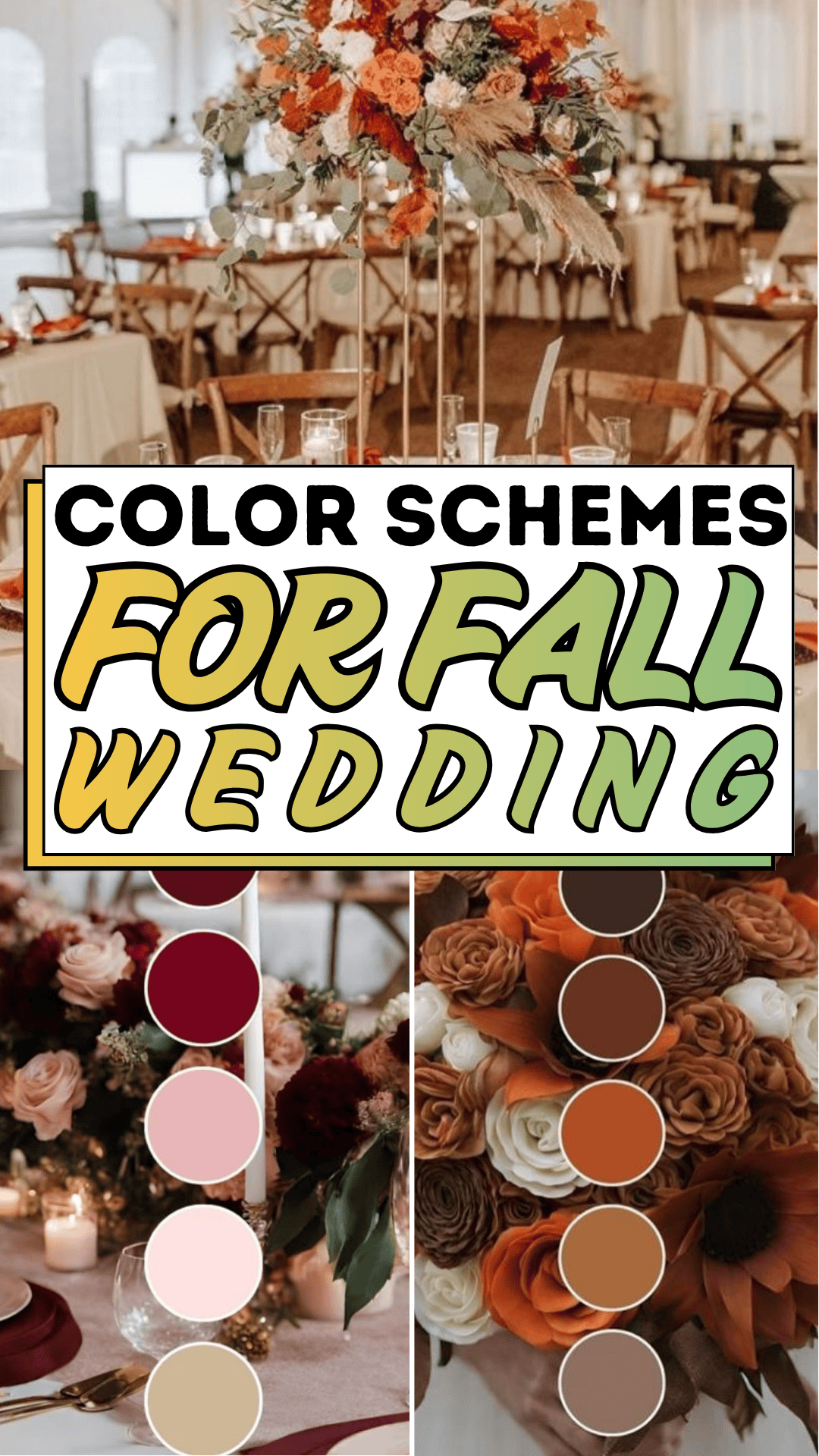
The problem with fall wedding color planning is that autumn is the most visually generous season; it offers every warm tone simultaneously, and all of them are genuinely beautiful. Burnt orange, chocolate brown, terracotta, burgundy, deep plum, mustard yellow, forest green, warm cream every one is appropriate, every one photographs well, and every one looks perfect in isolation on an inspiration board. The difficulty is that not all of them belong together in the same fall wedding, and the path from “I love all of these” to “this is our palette, and we are committed to it” requires a framework that inspiration boards, however beautiful, do not provide. The framework is what turns a collection of autumn colors into a cohesive fall wedding color scheme.
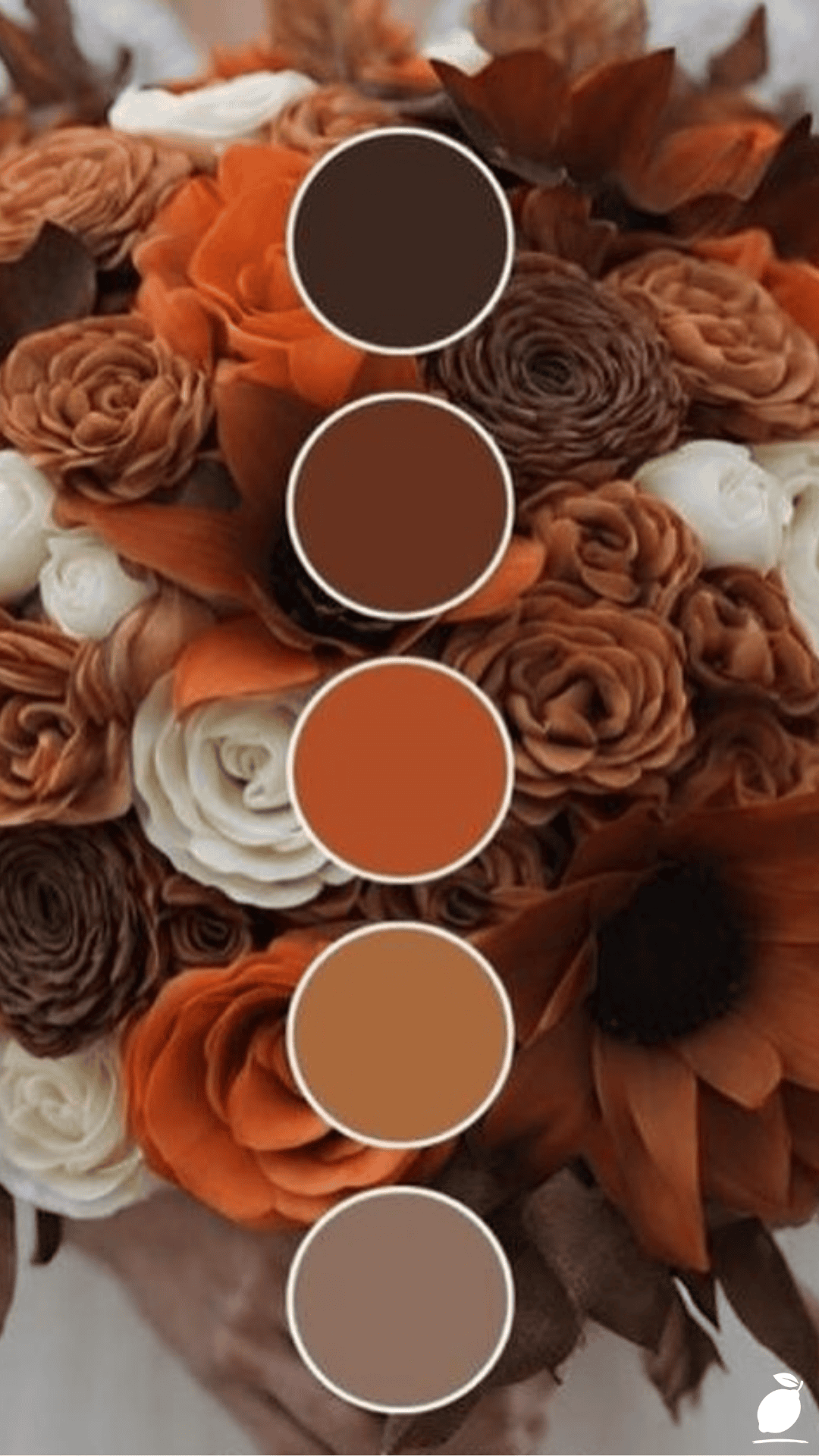
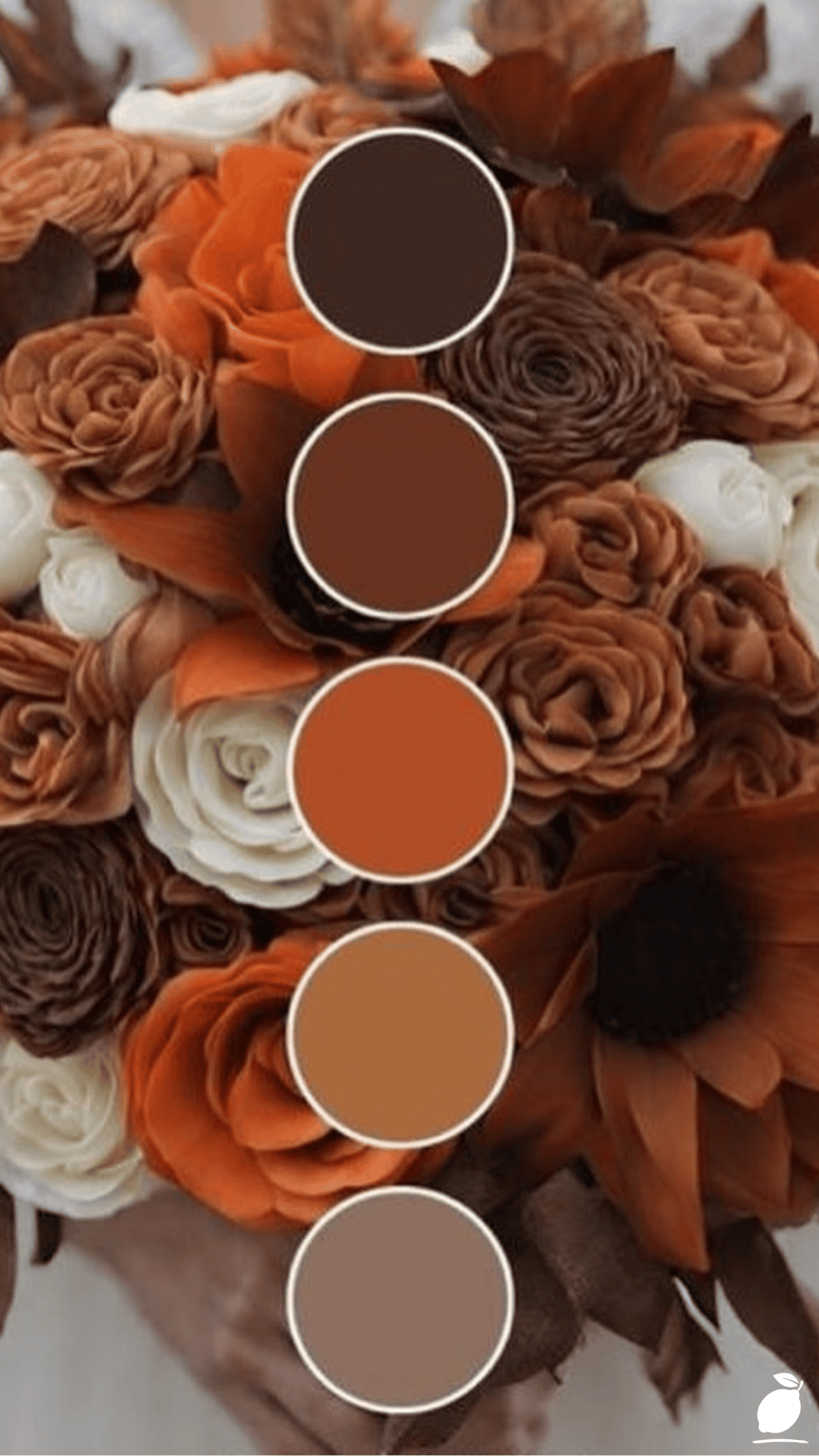
The image above makes the framework visible in a single photograph: a cascading bouquet of white roses, orange flowers, and chocolate-brown roses alongside a formal color swatch showing the five tones extracted from the arrangement: deep chocolate, medium brown, warm orange, light tan, and cream. This is what a fall wedding color scheme looks like when it has been designed rather than accumulated. Every tone present. Each one earning its proportion. The palette complete without conflict. That design process from seasonal tone selection through proportion, application, and the specific decisions that translate a five-swatch palette into a full fall wedding is the blueprint that follows.
The Fall Wedding Blueprint
A fall wedding color scheme is designed in stages: choosing the right seasonal tones, establishing their proportions, and then applying them consistently across florals, fabrics, stationery, and décor. Each stage builds on the last.
Step 1: Choose the Emotional Register of Your Fall Wedding Palette
Before selecting specific fall wedding colors, define the emotional register of the occasion the feeling the color palette should create for guests arriving and being photographed throughout the day. Fall weddings occupy a significant range:
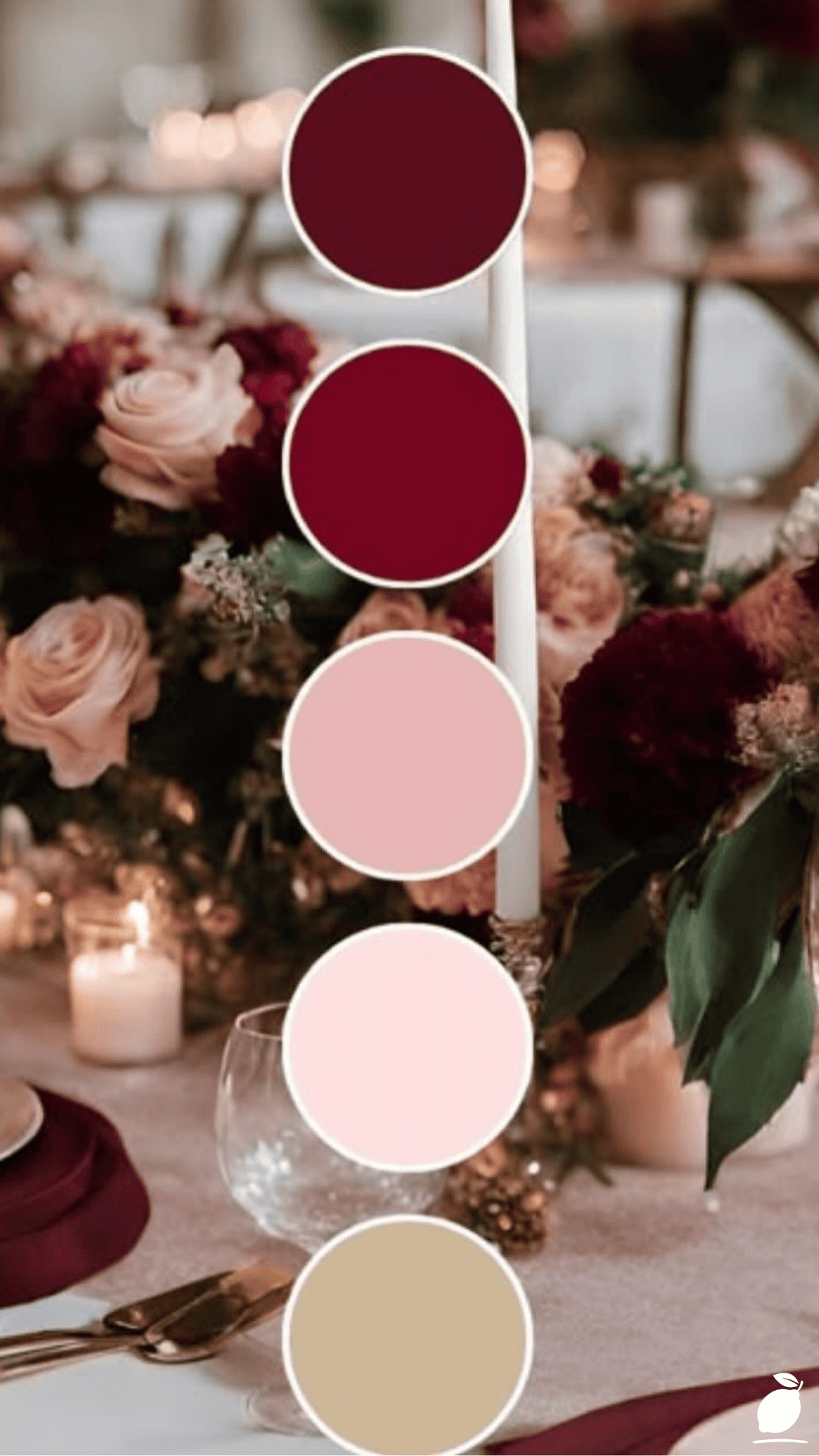
Warm and dramatic deep burgundy, chocolate brown, forest green with gold accents a palette that feels rich, enveloping, and slightly formal, appropriate for an evening celebration in a grand venue with candlelight.
Rustic and organic burnt orange, terracotta, warm cream, sage green, and natural wood tones a palette that feels approachable and handcrafted, appropriate for a barn, farm, or outdoor ceremony in natural surroundings.
Romantic and refined dusty rose, warm taupe, champagne, and muted rust a palette that reads as seasonal but soft, appropriate for a daytime fall wedding in an elegant interior.
Bold and contemporary: deep orange, high-contrast black, and bright cream a palette that uses fall’s warmth in a graphic, modern way rather than an organic one, appropriate for city venues and contemporary architecture.
The palette in the image chocolate browns, warm orange, cream, and tan belongs to the rustic-and-organic register, which is the most widely used fall wedding palette category and the one most directly responsive to the seasonal landscape. Defining the register before selecting specific colors prevents the inspiration board problem: if the reference images are from multiple registers, the resulting palette has no coherent emotional direction.
Step 2: Select Your Primary Fall Wedding Color
The primary color is the dominant tone the one that will appear most often in the fall wedding’s visual landscape, from the bridesmaid dresses to the table linen to the primary floral component. In the image’s palette, the warm orange occupies this role: it appears in the largest volume of flowers in the bouquet and in the brightest, most eye-catching of the five color swatches.
For a fall wedding, the primary color choices are:
Burnt orange/terracotta: the most quintessentially autumnal fall wedding primary color, relating directly to the changing leaves of the season and providing the warmth that reads as both dramatic in photographs and welcoming in person.
Burgundy / deep red: the richest and most formal fall wedding primary, relating to wine, dark foliage, and the depth of late autumn rather than the brightness of early autumn.
Mustard / golden yellow: a warm, sunlit fall wedding primary that evokes harvested fields and late golden-hour light, most effective when paired with deep neutrals to prevent it from reading as too cheerful or summery.
Forest green a fall wedding primary color that reads as the evergreen quality of late autumn and early winter, providing depth and richness without the warm-tone saturation of the other primary options.
Choose one primary color and commit to it before moving to the supporting palette. The primary color should be the one you would most want to see first: the first color a guest notices arriving at the ceremony, the dominant tone in the bouquet, the color of the bridesmaid dresses.
Step 3: Build the Supporting Palette: Two or Three Secondary Colors
The supporting palette for a fall wedding consists of two to three colors that complement the primary without competing with it. In the image, the chocolate brown and medium brown tones serve as the supporting palette to the warm orange primary; they provide depth and grounding that prevents the orange from reading as too bright, too summery, or too Halloween-adjacent.
Build the supporting palette using three color relationships:
Tonal depth: a significantly darker version of the primary color’s tonal family provides depth and richness. For a burnt orange primary, a deep chocolate brown provides tonal depth. For a burgundy primary, a deep plum or almost-black provides the same function.
Neutral anchor: a warm neutral (cream, champagne, warm white, oatmeal, or light tan) provides the visual breathing space that keeps a fall wedding palette from feeling heavy. The cream and tan swatches in the image serve this anchoring function.
Optional accent a third secondary color, used in smaller proportions as an accent, adds dimension to the palette. Sage green beside terracotta and cream reads as landscape-organic; gold beside burgundy and plum reads as richly formal; dusty pink beside chocolate brown and orange reads as romantic and unexpected.
Step 4: Establish the Color Proportions
The color proportions determine how the fall wedding palette reads at scale across a whole venue, a whole day of photographs, and the full sweep of florals and fabric and stationery combined. Using equal proportions of every color produces a palette that reads as busy and unresolved, regardless of how beautiful each color is. The palette in the image demonstrates correct proportions: orange appears most (the primary), brown appears second most (the dominant secondary), cream and tan appear as accents, and the deep chocolate appears least, providing depth without dominating.
Apply the same proportional logic to the fall wedding design:
60% primary: the dominant color in bridesmaid dresses, primary floral volume, primary table linen, and the majority of repeat-pattern elements.
30% dominant secondary the supporting depth color in groomswear accents, secondary floral elements, ribbon and textile accents, and stationery borders.
10% accent: the neutral and any third accent color in candle holders, place cards, small floral details, and miscellaneous décor elements.
This proportional framework can be adjusted 50/35/15 or 55/30/15, but maintaining a clear primary-dominant-accent hierarchy prevents the palette drift that produces visually inconsistent fall weddings where every room and every element looks beautiful independently, and nothing looks cohesive together.
Step 5: Apply the Palette to Every Design Category Systematically
A fall wedding palette is applied across four primary design categories, and consistency across all four is what produces the cohesive visual experience that makes a fall wedding look professionally designed:
Florals, the category most directly visible in the image, should reflect the palette proportions precisely. The primary color appears in the largest-volume flower (garden roses, dahlias, or chrysanthemums for a burnt orange primary). The secondary colors appear in supporting flower varieties or in stems and foliage. The neutral anchor appears in white or cream filler flowers. A florist briefed with the five-swatch palette rather than a verbal description (“warm and autumnal”) produces a result that relates correctly to every other element of the fall wedding.
Fabrics: bridesmaids’ dresses in the primary color; groomsmen pocket squares or ties in the secondary; table linen in the neutral anchor; napkins in the accent. If the primary color is too saturated for bridesmaid dresses over a full day, shift the dresses to the dominant secondary and use the primary in florals and stationery instead.
Stationery invitations, menus, place cards, and programs are the first and most widely seen brand expression of the fall wedding palette. Use the full five-swatch palette across the stationery suite; not every piece needs every color, but the suite collectively should express all five tones.
Venue décor candles, centerpiece vessels, favors, signage, and ceremony arch elements should each belong to one of the five palette tones. Any element that does not belong to the palette introduces visual noise that the photograph will catch even if the eye does not.
Step 6: Proof the Palette in Physical Samples Before Committing
Before finalizing any fall wedding supplier decision florals, fabric, stationery, assemble physical samples of all five palette colors and assess them together in the actual light conditions of the venue. Colors that read as perfectly matched on a screen often reveal subtle undertone conflicts in natural or artificial light: a burnt orange fabric that reads as compatible with a chocolate brown ribbon on screen may read as slightly more red or more yellow than the ribbon in the venue’s specific light.
Request physical samples from all suppliers: a swatch of the bridesmaid fabric, a sample bloom from the florist, a printed stationery sample, and assess them together in the venue before finalizing any order. The five-swatch palette photograph approach used in the image is the professional florist’s standard methodology for exactly this reason: the color swatches make undertone relationships visible in a way that verbal descriptions and screen colors do not.
Expert Secrets for Success
Pro-Tips for a Better Result
- Build the palette from the florals outward, not inward. Fall wedding flowers set the color tone more powerfully than any other element because they appear in photographs at every scale from close-up detail to wide venue shot. Choose the specific flower varieties and their colors first, then match the fabric, stationery, and décor to the floral palette rather than vice versa. A florist who has designed the fall wedding bouquet palette becomes the most reliable reference point for every subsequent supplier decision.
- Test all palette elements in the venue’s specific lighting conditions. Fall wedding venues vary dramatically in their light barn receptions with string lights, grand halls with chandeliers, outdoor ceremonies in dappled autumn afternoon light. Each light condition shifts warm colors significantly. Burnt orange reads differently under warm tungsten candlelight (more golden, more amber) than under cool LED overhead lighting (more red, more vivid). Assemble all fabric and floral samples in the venue’s actual light before committing to any quantity orders.
- Include at least one green element in any fall wedding palette. Fall wedding palettes heavy in warm oranges and browns can read as one-dimensional without a green element that relates them to the living seasonal landscape. A stem of olive, eucalyptus, sage, or fern in the bouquet, a greenery runner on the reception table, or a single deep green candle among the warm-tone centerpiece elements provides the color relief that prevents the palette from reading as monotone.
- Use the same palette in ceremony and reception spaces, not separate schemes. A common fall wedding planning mistake is treating the ceremony décor and the reception décor as separate design decisions. Guests experience both spaces, and a palette shift between them from burgundy-and-gold ceremony to terracotta-and-cream reception produces a visual discontinuity that reads as unplanned. Maintain the same five-swatch palette across all spaces, adjusting proportions between spaces if desired (more neutral in the ceremony, more primary color drama in the reception) but keeping all five tones present throughout.
- Photograph the palette swatches with your bouquet early in the planning process. The image approach above five circular swatches photographed beside the floral arrangement is a professional technique that produces the most useful visual brief for every fall wedding supplier. Create your own version of this image at the earliest possible planning stage, photograph it in natural light, and share it with every supplier rather than attempting to describe the palette verbally or through a Pinterest board. The physical swatch photograph eliminates undertone ambiguity and dramatically reduces the risk of color discrepancies between suppliers.
Common Mistakes to Avoid
- Choosing a fall wedding palette that reads as Halloween rather than autumn. The combination of bright orange and black or bright orange and purple triggers Halloween association at the saturation levels of seasonal retail. Fall wedding palettes avoid this by using muted, complex versions of orange (terracotta, rust, burnt sienna, amber) rather than bright holiday orange, and by pairing it with chocolate brown, deep green, or burgundy rather than black or purple.
- Using too many fall wedding colors at equal visual weight. A fall wedding palette with five equal colors produces visual competition rather than visual harmony. The proportional hierarchy of primary-secondary-accent is not a suggestion; it is the structural principle that distinguishes a fall wedding that looks designed from one that looks decorated. Identify the primary, commit to the proportion, and apply it consistently.
- Selecting bridesmaid dresses before choosing the full palette. Bridesmaid dresses are the most visible single fabric element in the fall wedding and the most common starting point for color decisions. When dresses are chosen before the full palette is established, every subsequent decision must match an already-committed color rather than being part of a designed palette. Choose the palette first, then select dresses in the primary color rather than building the palette around a dress chosen in isolation.
- Ignoring the neutral anchor. Fall wedding palettes heavy in warm saturated colors oranges, burgundies, rusts without sufficient neutral presence read as too dense and heavy in photographs, particularly in indoor reception settings. The cream, champagne, or warm white element of the palette provides the visual breathing space that makes the richer tones read with maximum impact. Do not reduce the neutral to a single candle on the table.
- Changing the palette between planning and execution. Fall wedding color planning typically spans 12 to 18 months, and the palette that felt perfect in the early planning stage may feel tired or changed-against by the time of execution. Avoid significant palette changes within six months of the fall wedding; by this point, stationery is printed, fabric may be ordered, and florists have made plant orders. Minor refinements to proportion are manageable; wholesale palette changes are logistically disruptive and expensive.
Why Fall Wedding Matters
A fall wedding held in the full expression of the season with a color palette that genuinely responds to the amber, rust, and chocolate of the autumn landscape creates an experience for guests that no other season quite replicates. The visual context of autumn is one of the most emotionally resonant in the natural world. The colors associated with fall carry associations of warmth, completion, and the particular melancholy-and-gratitude quality of a season that is beautiful precisely because it is ending. A fall wedding that uses this seasonal resonance deliberately through a cohesive palette that makes the venue feel like a distillation of the outdoors rather than an interior decorated to evoke it achieves a depth of atmosphere that spring and summer weddings, for all their charm, do not have access to.
For couples, the fall wedding color scheme is not just a visual decision; it is the decision that determines how the wedding will be remembered. Not the specific orange of the ranunculus in the bouquet, but the overall feeling: warm, enveloping, rich with the season, complete in a way that a single day of extraordinary effort is supposed to be. The palette is the emotional container for everything that happens within it: the ceremony, the meal, the dancing, the photographs, and a palette that is coherent and beautiful makes every element within it look better than it would in a less considered context. This is the argument for spending the time on the color scheme: not perfectionism, but the understanding that the palette is the foundation everything else is photographed against.
And for the couple who works through the palette design process who defines the register, chooses the primary, builds the supporting tones, establishes the proportions, assembles the physical samples, and photographs them in the venue light the completed palette decision is one of the clearest moments of clarity in the planning process. The four hundred and twelve inspiration board images collapse into five swatches. The florist conversation becomes specific. The bridesmaid dresses have a color. The fall wedding begins to look, even in the planning stage, like a single cohesive thing rather than a collection of beautiful independent decisions waiting to be assembled. That clarity is what the palette design process delivers, and it is more valuable than any individual design choice it produces.
Frequently Asked Questions
What are the most popular fall wedding color combinations in 2026?
The most popular fall wedding color combinations in 2026 build on the continuing preference for earthy, organic palettes: terracotta and sage green with cream accents; chocolate brown and burnt orange with warm white; burgundy and dusty rose with champagne neutrals; and deep forest green with gold and ivory. The overall direction in fall wedding palette design continues to move toward muted, complex tones rather than bright saturated versions of warm colors the terracottas and burnt siennas that read as sophisticated rather than the vivid oranges that can feel seasonal in the holiday rather than the nature sense.
How do I choose fall wedding colors that photograph well?
Fall wedding colors that photograph best are tones with warm undertones in the medium-depth range, not so pale they wash out in bright outdoor light, not so deep they lose detail in lower-light indoor reception conditions. Burnt orange, terracotta, chocolate brown, and dusty rose all photograph with exceptional quality in autumn’s natural golden-hour light. Deep burgundy and forest green photograph beautifully indoors with warm candlelight. Pure white and very pale neutrals photograph better outdoors than in warm interior light, where they can read as yellow. Test colors against the specific lighting conditions of each venue space before finalizing.
Can I incorporate non-traditional colors into a fall wedding palette?
Yes, some of the most distinctive fall wedding palettes of recent years have incorporated unexpected pairings: deep cobalt blue as a jewel-tone accent in an otherwise warm palette; unexpected blush and terracotta together; or near-black alongside burnt orange and cream for a graphic, contemporary result. The governing principle is undertone consistency: unexpected colors that share the warm undertone of the rest of the palette integrate successfully; cool-undertone additions that contrast the palette’s warmth create visual tension. Test any non-traditional fall wedding color in physical samples alongside the established palette before committing.
When should I finalize the fall wedding color scheme?
The fall wedding color scheme should be finalized at least 12 months before the wedding date for large weddings, and at least 9 months before for smaller ones. This timeline allows stationery to be designed, printed, and mailed with adequate lead time; bridesmaid dress orders to be placed with sufficient lead time for production and alterations; florists to plan and order specialty blooms available in the specific fall wedding colors; and all venue décor orders to be placed without rush premiums. Attempting to finalize the fall wedding color scheme within six months of the wedding creates supply constraints that limit color options and increase costs.