The living room paint decision had been sitting unresolved for so long that I had started making peace with the builder beige, which is how you know a paint decision has been sitting too long. I knew I wanted blue. I had known I wanted blue for eight months, but every time I looked at paint chips in the blue family, the options multiplied faster than I could make a decision. Light blue, medium blue, navy blue, teal blue, dusty blue, slate blue, baby blue, powder blue: the blue spectrum at the paint store is, I discovered, not a color so much as a philosophy that requires extensive study before any practical application. Benjamin Moore blue paint colors specifically had been recommended to me by three separate people as the blue paint colors that “actually look the way they look on the chip,” an endorsement that captures something real about the frustration of choosing paint colors and discovering the gap between the chip and the wall. I had printed pages from the Benjamin Moore blue paint colors catalog and arranged them on my wall, and still could not choose.
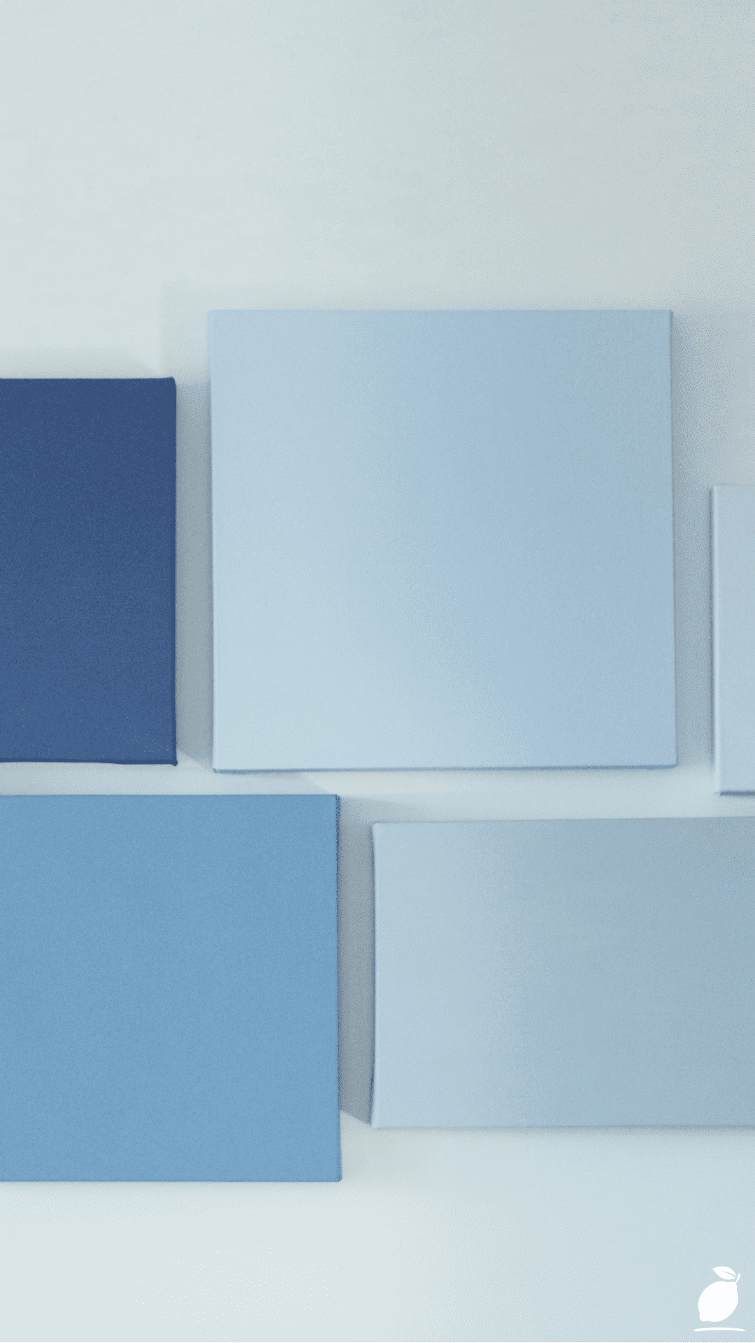
The wall arrangement in the image above resolved the decision not by showing me one correct answer but by showing me the full spectrum of what blue paint colors can do when they are arranged from deep to light from the navy at the left, through medium blue, through a gradient panel that shows a single blue transitioning from light to dark, through pale blue, to the lightest panel at the right. Six blue paint colors on white, arranged in a clean, modern scatter of unframed canvas panels, demonstrating that the blue family is not one decision but a spectrum of decisions, each producing a completely different atmospheric result. The navy panel on the left is a different room from the pale blue panel on the right. The blue paint colors you choose depend entirely on the quality of atmosphere you are building, how much light you want the room to absorb versus reflect, how enclosed or how airy you want the room to feel, and how strongly you want the blue to declare itself as the room’s defining palette decision.
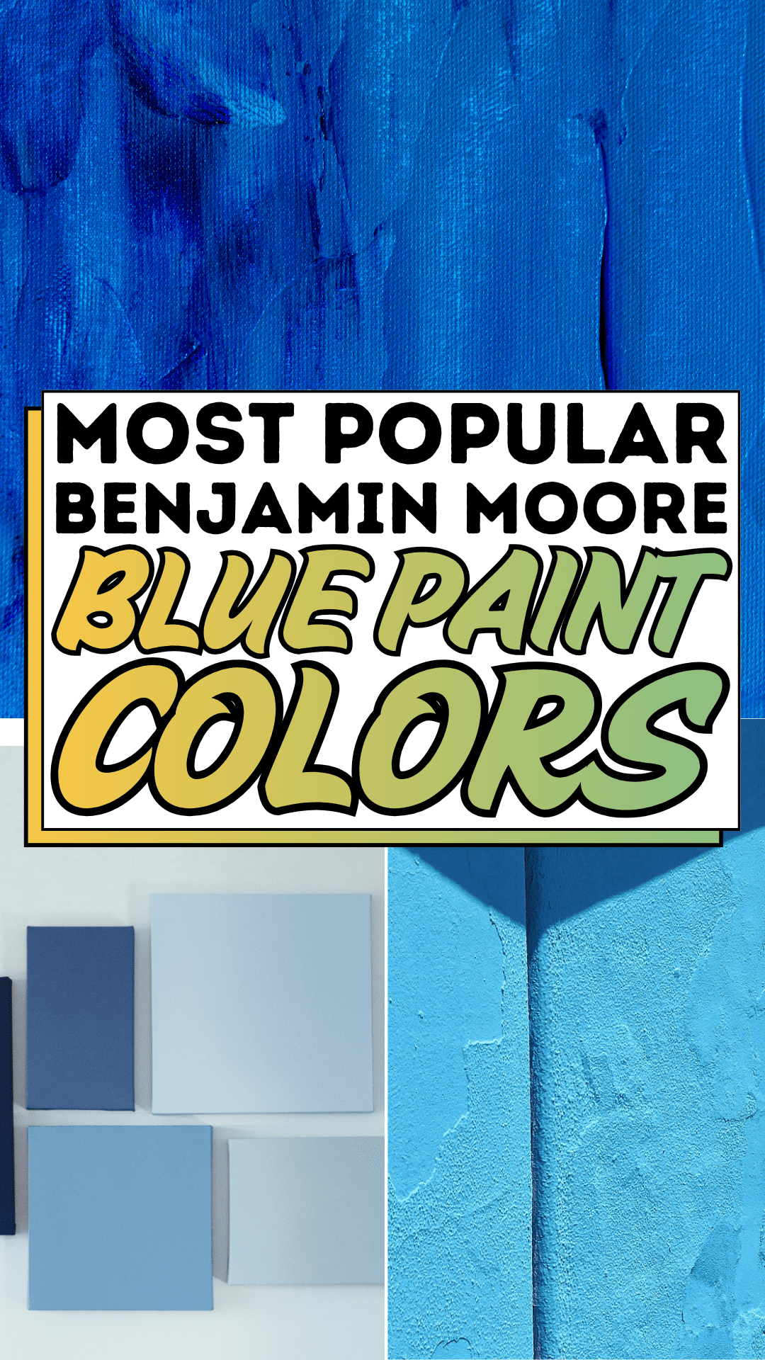
The Benjamin Moore blue paint colors in this guide are organized around that spectrum from the deepest, most dramatic navy through the most atmospheric mid-range blues to the most serene and most light-reflective pale blues with specific color names, codes, and room application guidance for each position in the spectrum. These blue paint color steps cover the full decision sequence: understanding what makes a Benjamin Moore blue paint color read correctly in a specific room’s light, matching the specific blue paint color to the specific room function and atmosphere goal, preparing and applying the blue paint color correctly, and styling the room to maximize the specific quality of the blue paint color chosen. The blue paint color decision that has been unresolved for eight months is resolved in this guide.
The Blue Paint Colors Blueprint

Step 1: Understand the Benjamin Moore Blue Paint Colors Spectrum Before Choosing
Benjamin Moore blue paint colors span a wider and more atmospherically varied range than any other color family in the brand’s portfolio, from the deepest, most pigment-rich navies through complex mid-range blues with gray, green, and purple undertones to the lightest, most barely-there pale blues that register more as atmosphere than as color. Understanding where in this spectrum the blue paint color you choose sits, and what the specific characteristics of that position mean for the room it will occupy, is the prerequisite for every subsequent blue paint color decision the guide addresses.
The spectrum demonstrated by the image’s six panels from left to right corresponds to the Benjamin Moore blue paint colors spectrum at six key positions. The deep navy position corresponds to blues like Hale Navy (HC-154), Benjamin Moore’s single most iconic and most consistently specified blue, a deep, warm navy with subtle red undertones that reads as rich and grounded in almost every light condition. The medium blue position corresponds to blues like Van Deusen Blue (HC-156), the same warm family as Hale Navy at a lighter value, providing depth without darkness.
The gradient blue demonstrates the specific quality that all Benjamin Moore blue paint colors exhibit at the medium-to-pale transition: the color becomes more atmospheric and more spatially expansive as it lightens. The pale blue position corresponds to blues like Gossamer Blue (2123-40), the classic pale blue that reads as barely-there in full natural light and as the most atmospheric, sky-like blue under warm artificial light. The medium blue center panel corresponds to blues like Newburyport Blue (HC-155) or Smoke (2122-40). The lightest panel corresponds to blues like Hazy Skies (2152-60) or Icy Blue (2057-70), the Benjamin Moore blue paint colors at their most diffuse and most luminous.
Understanding this spectrum positions every subsequent blue paint color decision within a clearly mapped range of available qualities from the navy’s enclosing, anchoring depth to the pale blue’s opening, lightening expansion. The correct blue paint color position in the spectrum is determined by the room’s intended atmosphere, not by a preference for “light” or “dark” in the abstract.
Step 2: Match the Blue Paint Colors Position to the Room’s Function and Light
Benjamin Moore blue paint colors at different spectrum positions are not interchangeable across different room types. The deep navy that produces the most beautiful and most sophisticated living room can produce an oppressively dark home office, and the pale sky blue that opens and lightens a bedroom can produce an underwhelming dining room that feels decorated but not designed. Matching the blue paint color’s position to the room’s specific function and natural light quality is the decision that most determines whether the blue paint color achieves the intended atmosphere.
For bedrooms, the room type where blue paint colors most consistently perform at their best, pale to medium Benjamin Moore blue paint colors produce the most restorative atmosphere: Gossamer Blue (2123-40), Smoke (2122-40), and Quiet Moments (AF-650) are the specific Benjamin Moore blue paint colors that produce the sky-like, spacious quality that makes a bedroom feel genuinely restful.
For dining rooms and living rooms where atmosphere and social engagement are the primary function, medium to deeper Benjamin Moore blue paint colors produce the most design-confident results: Van Deusen Blue (HC-156), Newburyport Blue (HC-155), and the mid-range blues create the depth and richness that make a social room feel genuinely special. For kitchens and bathrooms, pale to medium Benjamin Moore blue paint colors with gray or green undertones, Palladian Blue (HC-144) and Wedgewood Gray (HC-146) are the classic Benjamin Moore blue paint colors in this range, providing the freshness and cleanliness that suits the functional demands of these rooms.
For north-facing rooms with cool indirect light, choose Benjamin Moore blue paint colors with warm undertones, the Hale Navy family, Newburyport Blue, and the other blue paint colors that carry a subtle red or purple warmth to compensate for the cool light that would otherwise push a pure cool blue into an undesirably cold register. For south and west-facing rooms with warm direct light, Benjamin Moore blue paint colors with cooler, grayer undertones, Smoke, Quiet Moments, and the gray-blue range maintain their blue identity under warm light rather than shifting toward the warm-light-amplified purple that warmer blue paint colors can develop.
Step 3: Purchase and Test the Benjamin Moore Blue Paint Colors in the Specific Room
Benjamin Moore blue paint colors are famously accurate between the chip and the wall. The brand’s complex multi-pigment formulations produce colors that behave on walls more consistently than many other paint brands’ blues, which can shift significantly between chip and full-wall application. However, even the most accurate Benjamin Moore blue paint colors will read differently in the specific room’s specific light than they appear on the chip, because the room’s light quality is the single variable that no chip can replicate.
Purchase a Benjamin Moore Peel & Stick sample of each of the two or three blue paint colors finalists (available at Benjamin Moore retailers and The Home Depot at $6 to $8 per sample) and apply them to the wall in the planned application zone not on foam board, not on a small patch in a corner, but directly on the wall in a 30cm × 60cm area that receives the room’s primary light. Observe each Benjamin Moore blue paint color sample through the morning, midday, afternoon, and evening lamp light conditions that the room experiences daily. The Benjamin Moore blue paint color that reads most correctly and most beautifully through all four light conditions is the correct choice.
For the Benjamin Moore blue paint colors gradient effect demonstrated in the image’s center panel — a single blue transitioning from lighter to darker within a single wall application — this effect can be achieved through a dry-brush tinting technique: apply the full-depth blue at the wall’s base and lower third, then work upward with a progressively more diluted version of the same blue (mixed with white) in smooth, overlapping brush strokes that blend into the full-depth blue below and fade toward white at the wall’s top.
Step 4: Prepare the Walls and Apply the Benjamin Moore Blue Paint Colors Correctly
Benjamin Moore blue paint colors, particularly at the deeper, more saturated navy end of the spectrum, require thorough wall preparation to achieve the even, rich result that makes them perform at their photographed best. Deep blue paint colors amplify surface texture, repair patches, and lap marks from previous roller passes in a way that lighter colors do not, because the deep blue pigment reflects raking light at a sheen level that makes any surface irregularity cast a visible micro-shadow.
Fill all surface imperfections with lightweight spackling compound, sand flush with 220-grit when dry, and apply a tinted primer in a blue tone approximately 50 percent lighter than the planned Benjamin Moore blue paint colors topcoat. Benjamin Moore’s Fresh Start primer range includes formulations specifically designed for deep and saturated colors, which reduce the topcoat coat count from four to five (which deep blues may require over white primer) to two to three over a tinted primer, saving significant time and material cost on a full-room application.
Apply Benjamin Moore blue paint colors with a high-density 12mm nap roller for wall surfaces and a 50mm angled synthetic brush for cutting in at ceilings, baseboards, and corners. Benjamin Moore Aura and Regal Select are the two paint lines that produce the most consistent deep-blue results with the fewest topcoat applications. Aura’s self-priming formulation and exceptional hide make it the preferred Benjamin Moore blue paint colors line for navy applications, where four-plus coats of a lesser formulation would otherwise be required.
Step 5: Style the Room to Maximize the Specific Blue Paint Colors’ Atmosphere
The six Benjamin Moore blue paint colors position in the spectrum each invite a different furnishing and styling approach that maximizes the specific atmospheric quality of the chosen blue. A deep navy Benjamin Moore blue paint color (Hale Navy, Van Deusen Blue) is most powerfully styled with warm wood furniture, warm brass hardware, and white or cream textiles that provide the warm-cool contrast the navy requires for its full depth to read as richly sophisticated rather than oppressively dark. A pale Benjamin Moore blue paint colors room (Gossamer Blue, Quiet Moments) is most powerfully styled with natural fiber textures, soft white and cream textiles, and clear glass or light wood accessories that support the pale blue’s airy, light-expanding quality rather than introducing visual weight that grounds it unnecessarily.
For the medium-blue Benjamin Moore blue paint colors positions (Newburyport Blue, Smoke, Wedgewood Gray), the most effective styling relationship is with the same material approach that the image demonstrates with the panels’ white wall: white or very light gray as the dominant large-surface neutral, with warm wood or natural fiber providing the material warmth that prevents the blue-and-white relationship from reading as purely graphic and insufficiently inviting. The image’s six panels on white demonstrate this principle at the palette-reference level. The white wall makes each blue read as a complete, distinct color rather than a variation on a shared surface.
Step 6: Maintain and Update Benjamin Moore Blue Paint Colors Over Time
Benjamin Moore blue paint colors in the Aura and Regal Select lines are formulated for exceptional durability. The deep blue pigments that produce the navy end of the spectrum specifically include UV-stabilizing additives that prevent the color shifting and fading that cheaper blue paint colors consistently experience over three to five years of exposure to natural light. Maintaining Benjamin Moore blue paint colors in their original richness requires the same basic annual maintenance as any quality interior paint: cleaning with a soft, damp cloth and a mild pH-neutral cleaner, and touch-up application with the original formulation (kept in a sealed sample jar from the original project) for any chips or scuffs that occur from furniture contact or daily use.
For Benjamin Moore blue paint colors, rooms where the specific blue has been discontinued or its formulation updated, the Benjamin Moore Color Match system allows any existing blue paint colors to be re-created from a physical chip or a paint sample, ensuring that touch-up applications maintain color consistency regardless of how much time has passed since the original application.
Expert Secrets for Success
Pro-Tips for a Better Result
Apply the Benjamin Moore blue paint colors in Benjamin Moore Aura Paint for the richest, most consistent blue result in the fewest coats. Aura is Benjamin Moore’s premium interior paint line, formulated with proprietary Color Lock technology that produces the deepest, most saturated blue paint colors in the fewest applications, typically two coats over tinted primer, compared to the three to four coats that other formulations may require for the same depth at the navy end of the spectrum. The material cost difference between Aura and Regal Select is approximately $20 per gallon, a cost that is recovered in saved labor and material at the first full-room application.
Use Benjamin Moore blue paint colors in Matte finish for accent walls and Eggshell for full-room applications. Matte finish produces the most atmospheric and sophisticated blue paint colors at the wall scale. It absorbs light in the way that authentic mineral pigment surfaces do, creating depth and dimension that eggshell and satin cannot replicate. In rooms where the blue paint colors wall receives regular physical contact (hallways, children’s rooms, kitchen feature walls), eggshell provides the necessary cleaning durability without compromising the blue’s atmospheric quality as severely as satin or semi-gloss would.
Pair the Benjamin Moore blue paint colors selection with the specific trim white that shares its undertone temperature. The white trim against a blue wall is as important to the room’s quality as the blue itself. A blue with warm undertones (Hale Navy, Van Deusen Blue) paired with a cool, bright-white trim produces a temperature conflict that prevents the two surfaces from reading as designed together. Use Benjamin Moore Simply White (OC-17) or Chantilly Lace (OC-65) with warm-undertone blue paint colors, and White Dove (OC-17) or Decorator’s White (PM-1) with cool-undertone blue paint colors for the most harmonious blue-and-white room composition.
Order Benjamin Moore blue paint colors by the gallon rather than the quart for any room larger than 12 square meters. A standard quart of Benjamin Moore paint covers approximately 9 to 11 square meters at one coat, barely adequate for a small bedroom accent wall and insufficient for most full-room applications. Benjamin Moore blue paint colors applied in mid-project quantity breaks (when the first quart runs out and the second quart is a different batch) can show subtle tinting differences that are invisible on the chip but perceptible on an adjacent wall section. Order the full required volume from a single production batch for all blue paint colors applications above one coat.
Common Mistakes to Avoid
Don’t choose deep navy Benjamin Moore blue paint colors for north-facing rooms without first testing for the blue’s undertone under cool indirect light. Cool-undertone navies (those with green or pure blue rather than red-purple undertones) can read as almost black in north-facing rooms where the cool indirect light amplifies the blue’s cool component without the warm undertone that warm-light conditions provide. Benjamin Moore Hale Navy (HC-154) succeeds in north-facing rooms because of its warm red undertone; a cool-undertone navy like Naval Blue would read significantly darker and cooler in the same room. Always test blue paint colors in the specific room’s light before committing.
Don’t apply two different Benjamin Moore blue paint colors from different paint lines in adjacent rooms and expect them to read as complementary. The Benjamin Moore blue paint colors chip display at any retailer shows shades from multiple paint lines (Historical Colors, Color Preview, Affinity, Off-White) with their own undertone formulation logic. Two blues chosen by eye from adjacent chip positions on the display may read as unpleasantly clashing when applied in adjacent rooms, because their undertones (warm versus cool, green-leaning versus purple-leaning) conflict in the actual room conditions. For multi-room blue paint color schemes, choose all blues from within a single paint line or explicitly confirmed undertone family.
Don’t begin a Benjamin Moore blue paint colors application without reading the specific paint line’s surface temperature requirements. Benjamin Moore paint products specify minimum application temperatures typically 10°C to 12°C for water-based formulations, below which the paint film does not bond correctly, and the blue paint colors’ finish shows inconsistent sheen, poor adhesion, and color variation across the wall. Blue paint colors applied in rooms below the minimum temperature during winter months in northern climates consistently produce finish quality problems that are not correctable without a full reapplication after the room returns to minimum application temperature.
Don’t use the same Benjamin Moore blue paint colors in both a sunny south-facing room and a shaded north-facing room and expect the color to read the same. The spectrum shift between a cool-light north-facing room and a warm-light south-facing room can make the same Benjamin Moore blue paint color read as two entirely different blues, a phenomenon especially pronounced with the medium and pale blue paint colors in the range where small undertone shifts become dramatically more visible without the depth anchor of a deep navy. Choose the specific blue paint color for the specific room’s light condition rather than applying a single blue throughout the home regardless of each room’s light quality.
Why Blue Paint Colors Matter
Blue paint colors matter as a domestic design category because blue is the color family most directly associated by environmental psychology research with the specific psychological states that homes most need to support: calm, focus, rest, and the reduction of physiological stress response. The research is extensive and consistent; blue environments produce measurably lower heart rates, lower blood pressure readings, and higher reported feelings of tranquility than equivalent spaces in neutral or warm-toned environments. Benjamin Moore blue paint colors are not merely a design trend or an aesthetic preference: they are a color category whose application to the walls of a home produces measurable environmental quality improvements in the daily experience of the people who occupy that home.
The specific quality of Benjamin Moore blue paint colors their complex multi-pigment formulations that produce blue tones which shift and deepen across the day’s changing light rather than reading as a flat, static color field amplifies these psychological benefits by adding the element of temporal change to the color’s atmospheric contribution. A Benjamin Moore blue paint colors wall that reads as pale sky blue in the morning and as deep, rich blue in the warm glow of an evening lamp provides a daily micro-environment that changes with the rhythm of the day, providing the specific quality of living with a color rather than simply within it. This temporal quality, the way quality blue paint colors respond to light, is what distinguishes Benjamin Moore’s formulations and what makes their blue paint colors the ones that people fall in love with the moment the second coat dries.
Easy Peasy Life Matters is built on the conviction that paint color, the most immediately transformative and most personally visible home design decision, deserves the careful, informed selection process this guide provides. Benjamin Moore blue paint colors are the paint choices that reward the care most specifically and most consistently: they look the way they are supposed to look, they perform the way a quality paint is supposed to perform, and they produce the atmospheric quality that a thoughtfully chosen blue is supposed to produce in every room that receives them. The six panels in the image above show the range. These steps show you how to choose your position in it.
Frequently Asked Questions
What is the most popular Benjamin Moore blue paint color?
Benjamin Moore Hale Navy (HC-154) is consistently the most specified and most universally cited popular Benjamin Moore blue paint color, named to multiple “most popular” lists annually and recognized as the blue against which all other navy blue paint colors are frequently compared. Its specific popularity stems from the warm red undertone that makes it readable as rich and sophisticated in almost every light condition, warm and cool, direct and indirect, rather than shifting unexpectedly toward green (as cool navies can) or toward black (as the deepest navies often do in low-light conditions). Other frequently cited popular Benjamin Moore blue paint colors include Newburyport Blue (HC-155), Van Deusen Blue (HC-156), Smoke (2122-40), and Quiet Moments (AF-650).
How do I choose between the many Benjamin Moore blue paint colors for a bedroom?
For bedroom blue paint colors selection, focus on the pale to medium range of the Benjamin Moore blue paint colors spectrum (the fourth through sixth panels in the image) where the colors retain their blue identity without producing the visual weight that deeper blues introduce in a sleeping environment. Gossamer Blue (2123-40), Quiet Moments (AF-650), Smoke (2122-40), and Hazy Skies (2152-60) are the specific Benjamin Moore blue paint colors that most consistently produce the serene, restful bedroom atmosphere these colors are chosen for. Confirm the specific undertone (whether the blue leans toward green-gray or purple-gray) against the bedroom’s existing furniture and textiles before committing.
Can I use Benjamin Moore blue paint colors in a small room without making it feel smaller?
Yes — pale Benjamin Moore blue paint colors in the light end of the spectrum (Gossamer Blue, Icy Blue, Hazy Skies) actually increase a small room’s perceived size by expanding the room’s visual field through their high light reflectance value (LRV) and their association with open, expansive natural environments (sky, water). Deep navy Benjamin Moore blue paint colors in a small room will make it feel smaller and more enclosed, which can be desirable in a small home office or reading nook where an enclosed, focused atmosphere is the design goal, but undesirable in a small bedroom or living room where perceived spaciousness matters.
What sheen level is best for Benjamin Moore blue paint colors?
Matte finish (Benjamin Moore’s Matte or Flat finishes) produces the most atmospheric and most visually sophisticated blue paint colors for accent walls and decorative applications. The non-reflective surface allows the blue pigment to read at its purest, most depth-rich quality without the light-reflective sheen that eggshell and satin introduce. Eggshell (Benjamin Moore’s Eggshell formulation) provides the best balance between the atmospheric quality of matte and the cleanability required for daily-contact surfaces in full-room blue paint color applications. Satin and semi-gloss blue paint colors are appropriate for trim, doors, and architectural details where durability and cleanability are more important than atmospheric quality.
How do I fix an uneven or streaky application of Benjamin Moore blue paint colors?
Uneven or streaky blue paint colors application almost always results from one of three conditions: inadequate primer (blue applied over white primer without tinting requires too many topcoat applications, leading to impatience and under-application), roller texture variation (mixing different nap rollers or letting the roller dry between sections), or application in improper temperature or humidity conditions. For minor streakiness, a third coat applied with a fresh high-density roller, maintaining a consistent wet edge, typically resolves the issue. For major unevenness, sand the dried surface with 180-grit, wipe clean with a tack cloth, and reapply from a tinted primer step using Benjamin Moore Aura for maximum coverage in the fewest topcoat applications.