There is a specific kind of bathroom fatigue that has nothing to do with the fixtures being broken or the grout being genuinely beyond saving. It is the fatigue of a bathroom that simply does not feel like anything, a collection of builder-grade decisions that were never really made so much as accepted. The walls are white, but a cold, uncalibrated white that picks up the greenish cast of the vanity light and never quite settles. The floor tiles are gray, but a gray chosen because it was neutral rather than because it was right. There might be a piece of art somewhere, half-heartedly placed. The whole room functions. None of it feels intentional. Every morning, you stand in it for ten minutes and leave carrying the low-level weight of a space that does its job without doing anything else, without offering the small daily luxury of being somewhere that was genuinely thought about.
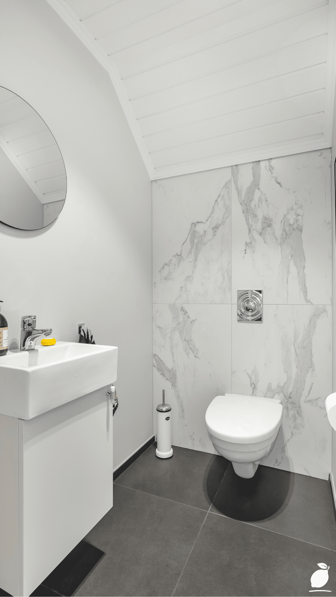
The bathroom in the image above is a response to exactly that feeling. It is not a large bathroom; the slanted attic ceiling announces its limitations immediately. But it is a bathroom that feels resolved from the moment you step in, and the reason is a color palette applied with precision: the monochromatic white and gray that dominate the space read not as absence of color but as a deliberate coastal discipline, the same palette the sea applies to itself on overcast mornings when the water and the sky become one continuous gray-white field. The large-format marble-pattern accent wall behind the toilet brings organic movement into the controlled palette without breaking it. The dark gray floor tiles ground the room against its own lightness. The green soap dispenser and the pink artwork are the coastal equivalent of sea glass found on a white sand beach, small, specific, entirely at home. The palette does not shout. It settles.
A coastal bathroom color palette is among the most misunderstood decorating concepts in residential interior design, precisely because the word “coastal” gets applied to everything from genuinely salt-weathered New England interiors to rooms full of anchor-printed throw pillows and turquoise paint. The coastal bathroom in the image has no anchors and no turquoise. What it has is the underlying color logic that makes every actual coastal environment feel the way it feels: the layering of white, gray, and stone with precise natural accents, the material honesty of surfaces that suggest water and rock without illustrating them. This guide gives you the specific steps to build that palette in your own bathroom, regardless of its size or current condition.
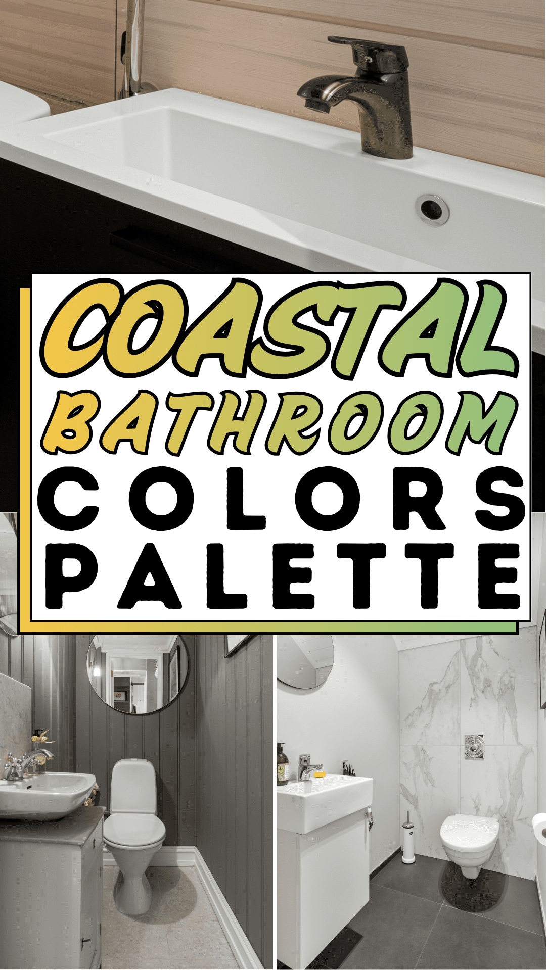
The Coastal Bathroom Blueprint
Step 1: Understand the True Coastal Bathroom Color Logic
Before a single paint chip is pulled or a tile sample ordered, the coastal bathroom color palette needs to be understood at its structural level because misunderstanding it is the reason most coastal bathroom attempts produce a themed room rather than a genuinely coastal one. The coastal palette is not a collection of beach-inspired objects. It is a specific relationship between a small number of tones derived from the actual color composition of coastal environments: the white of sea foam and bleached driftwood, the gray of wet stone and overcast Atlantic sky, the warm beige of sand above the tide line, the deep charcoal of wet slate, and the controlled introduction of organic accent colors the green of sea grass, the muted pink of a shell interior, the rust of oxidized iron in quantities that suggest the natural world rather than illustrating it.
The bathroom in the image executes this logic at its most refined: white walls and ceiling as the primary field, marble-pattern gray and white as the accent surface, dark gray tile as the grounding layer, and green and pink as the accent notes held to a single object each. Every element belongs to the same color family. Nothing introduces a competing palette. The coherence of the result is a direct function of that discipline.
For your own coastal bathroom, write the palette before you buy anything: a primary white or near-white for walls and ceiling, a secondary gray-toned surface material for one accent application, a dark grounding tone for the floor, and one to two accent colors from the organic coastal register held to minimal application. That written palette is the filter through which every subsequent purchase decision passes.
Step 2: Select the Coastal Bathroom Wall Color
The wall color is the largest single color field in any bathroom, and the decision that most determines whether the coastal bathroom palette reads as sophisticated or generic. White is the correct primary choice for a coastal bathroom, but not all whites perform equally in this context, and the undertone of the white chosen makes the difference between a coastal bathroom that feels like a beach house and one that feels like a hospital corridor.
Coastal whites carry warm or neutral undertones, a slight cream, a barely perceptible gray, or a soft greige that prevents the wall color from reading as clinical under artificial light. Pure optical white with blue undertones, the most common builder-grade wall choice, produces a cool, institutional quality that works against the organic warmth of the coastal palette. Benjamin Moore White Dove (OC-17), Sherwin-Williams Alabaster (SW 7008), and Farrow & Ball Wimborne White (No. 239) are among the most consistently successful coastal bathroom wall whites, each warm enough to prevent clinical coldness while light enough to maintain the airiness that the coastal palette requires.
For coastal bathrooms where pure white feels too committed to minimalism, a very pale gray with warm undertones, Benjamin Moore Pale Oak (OC-20), Sherwin-Williams Agreeable Gray (SW 7029) provides a softer primary field that still reads within the coastal palette’s gray-white range while adding a degree of warmth that pure white cannot deliver.
Apply the coastal bathroom wall color to all four walls and the ceiling in the same tone or the ceiling one shade lighter within the same family. The tonal ceiling is one of the most effective techniques for making a small coastal bathroom feel taller and more expansive. It dissolves the visual lid that a contrasting white ceiling creates and allows the eye to travel upward without interruption.
Step 3: Choose and Install the Coastal Bathroom Accent Wall
The accent wall is the highest-drama element in the coastal bathroom color palette strategy, the surface where the palette’s organic complexity is concentrated and where the most visible design statement is made. In the image, the marble-pattern wall behind the toilet achieves its effect through a combination of scale, placement, and pattern logic: the large-format veining is coastal in its reference (the movement of water over stone, the organic unpredictability of natural material), the gray-white palette is already established by the room’s primary colors, and the placement against the toilet wall makes it visible from the bathroom’s entry point without competing with the functional surfaces around the sink and vanity.
For a coastal bathroom accent wall, marble, real or high-quality porcelain marble-look tile, is the most versatile and most authentically coastal material choice. Its veining references stone shaped by water; its gray-white palette belongs to the coastal register without requiring any translation; and its reflective surface quality amplifies light in a small bathroom in the same way water amplifies light at the shoreline. Large-format marble or marble-pattern tiles 60cm × 120cm or larger read more dramatically and more contemporary than smaller formats, and their reduced grout-line count makes the accent wall easier to clean and maintain.
If tile installation is beyond the current project scope or budget, peel-and-stick marble-pattern wallpaper formulated for bathroom humidity provides the same visual effect at a fraction of the material and installation cost. Applied to a single wall, the toilet wall, the wall opposite the entry, or the wall behind the bathtub in a bathroom with a tub, it anchors the coastal bathroom color palette with the organic gray-white patterning that the palette’s structure requires.
Step 4: Select Coastal Bathroom Floor Tile
The floor is the coastal bathroom palette’s grounding layer, the tone that anchors the lightness of white walls and marble accent surfaces, and prevents the room from reading as a white-on-white study in monochrome without spatial definition. In the image, large-format dark gray tiles perform this function with the same authority that wet rock performs it at the shoreline: a deep, quiet darkness that makes everything above it appear lighter, cleaner, and more deliberate.
For the coastal bathroom floor, dark or mid-tone gray large-format tiles 60cm × 60cm minimum, 90cm × 90cm for larger bathrooms are the most effective grounding choice. The large format reduces visible grout lines, which makes the floor read as a single continuous surface rather than a grid, and produces a more expansive perceived floor area in small coastal bathrooms. Matte or low-sheen finish is preferable to high-gloss for floor tile, it references the matte quality of natural stone and coastal rock, prevents the slipping hazard of wet high-gloss surfaces, and ages more gracefully under the daily use that bathroom floors endure.
For coastal bathrooms where dark gray floor tile feels too committed to contrast, a medium warm gray, a greige tile with slight brown warmth, provides grounding without the drama of deep charcoal and integrates more softly with the white walls and marble accent surfaces above it.
Step 5: Select Coastal Bathroom Fixtures and Hardware Finishes
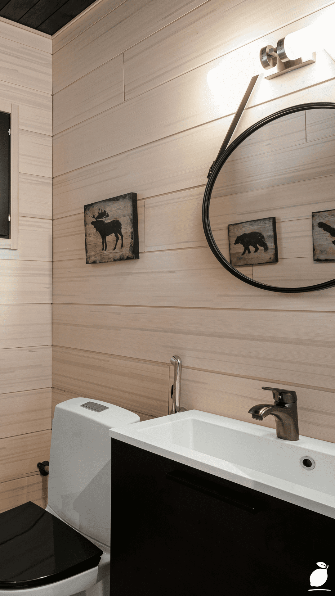
Fixtures and hardware are the jewelry of the coastal bathroom palette, the metallic layer that either coheres the palette or introduces a competing material conversation. The image uses chrome throughout: chrome flush button, chrome elements in the faucet, and fixtures. Chrome is the most naturally coastal metallic finish because it shares the cool, reflective quality of water and the silver-gray of weathered metal in marine environments. It belongs to the coastal palette’s gray-white-cool register without requiring any undertone adjustment.
For coastal bathrooms where chrome feels too industrial, brushed nickel provides the same tonal register with a softer, more matte quality. Aged brass, the warm alternative in most bathroom hardware conversations, works in coastal bathrooms only when the palette has been deliberately warmed: sandy beige walls, warm wood vanity, amber-toned stone tile. Applied to a cool gray-white coastal bathroom like the one in the image, aged brass introduces a warmth that the palette is not built for and reads as an undertone conflict rather than an accent addition.
Apply a single hardware finish consistently across all fixtures: faucet, towel bar, toilet paper holder, robe hook, and any exposed plumbing. Hardware finish consistency is the single most cost-effective upgrade in a coastal bathroom palette refresh. A full set of matching chrome or brushed nickel hardware typically costs $150 to $300 and transforms the room’s perceived cohesion more dramatically than any paint change or accessory update at equivalent cost.
Step 6: Introduce Coastal Accent Colors With Precision and Restraint
The coastal bathroom accent colors the green, pink, rust, or sand tones that signal the organic world within the controlled gray-white field are the palette’s most delicate element and the one most frequently over-applied in coastal bathroom attempts. The image holds its accent colors to two objects and two objects only: a single green soap dispenser and a single pink-toned artwork partially visible on the right wall. Together they account for perhaps five percent of the room’s total visual surface. That five percent is what prevents the coastal bathroom from reading as a clinical white room, and it is sufficient for that purpose. Nothing more is needed.
Apply coastal accent colors in your own bathroom with the same discipline. Choose one to two accent tones from the organic coastal palette: sage green, dusty pink, warm sand, faded rust, muted navy, and hold each to a single object. A green soap dispenser. A pink hand towel was folded on the vanity. A sand-colored woven basket under the sink. A rust-toned ceramic toothbrush holder. These accents animate the palette without altering its dominant character. Scale matters: each accent object should be small enough that the coastal bathroom’s primary gray-white field remains undisturbed. If an accent object occupies more than roughly five percent of the room’s visual field, it has crossed from accent to competing color and needs to be reconsidered.
Expert Secrets for Success
Pro-Tips for a Better Result
Test the coastal bathroom wall whites in all four lighting conditions before committing. A coastal white that reads warm and resolved in afternoon natural light can read green-gray under fluorescent or cool-LED vanity lighting, the most common lighting condition in which the bathroom is actually used. Test paint samples on foam board and observe them under morning natural light, afternoon direct light, overcast diffused light, and the bathroom’s actual artificial lighting before selecting. The coastal bathroom palette depends on the wall white holding its warmth across all conditions; a white that shifts to cool under artificial light undermines the whole palette structure.
Use grout color as a palette decision, not a neutral default. Grout color is one of the most overlooked coastal bathroom palette decisions. Dark gray grout on dark gray floor tile makes the floor read as a continuous surface, clean and contemporary. White or light gray grout on dark tile creates a visible grid that reads as a pattern and reduces the floor’s grounding effect. For the coastal bathroom floor, match grout color to tile color as closely as possible to maximize the single-surface visual quality of the large-format tile choice.
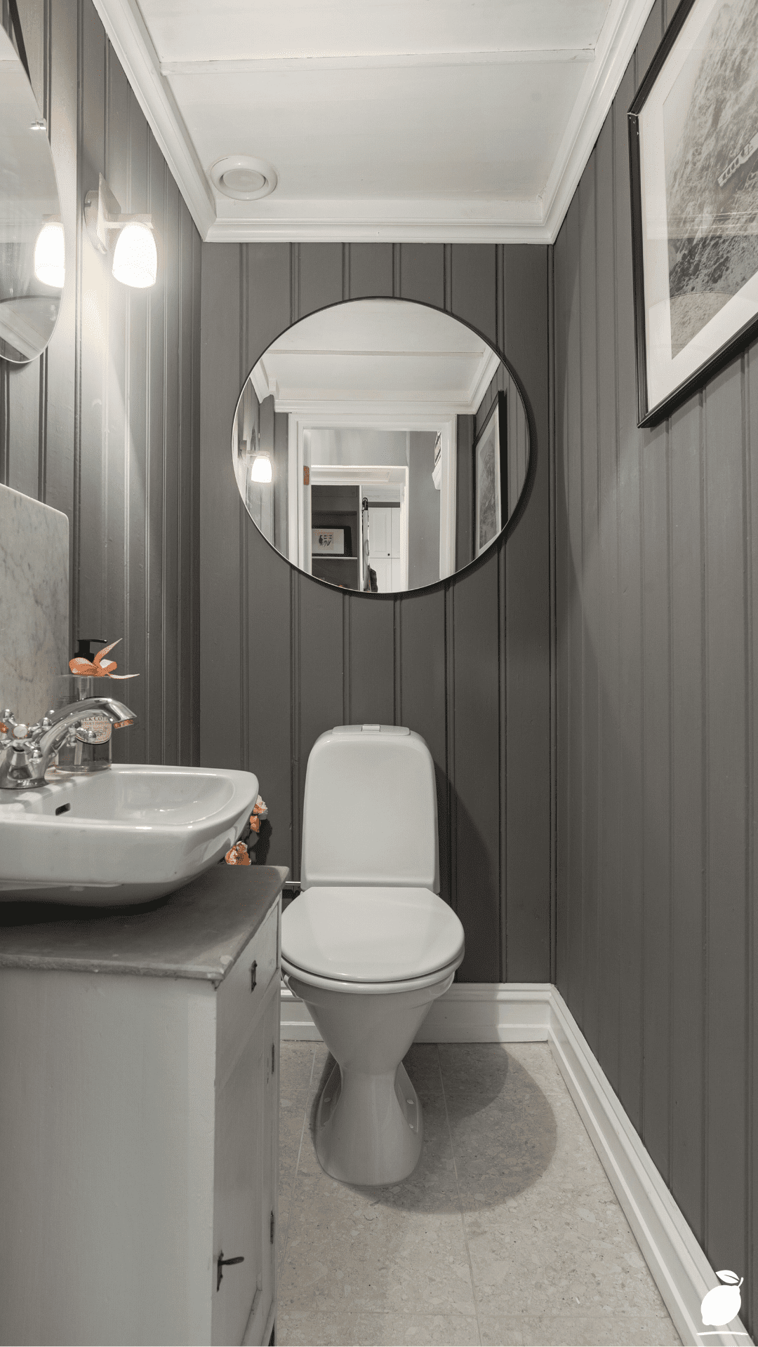
Install the vanity mirror at ceiling height or as close to it as practical. A circular or rectangular mirror that extends toward the ceiling, as in the image’s circular mirror mounted high on the wall above the floating vanity, draws the eye upward and makes the coastal bathroom feel taller than its measurements. A mirror hung at conventional vanity height terminates the vertical visual line exactly where you don’t want it, at face level, and reinforces the ceiling’s presence as a low boundary. Ceiling-adjacent mirror placement is among the most effective spatial expansion techniques in small coastal bathrooms.
Layer lighting at two heights. The coastal bathroom palette depends on its whites and grays reading as warm and dimensional rather than flat and institutional, and flat overhead lighting is the single condition most likely to undermine that quality. A wall-mounted fixture at mirror height, either a single statement fixture above the mirror as in the image, or sconces on either side, provides the directional lighting at eye level that the coastal bathroom palette needs to reveal its warmth. Pair it with recessed overhead lighting on a separate dimmer circuit for ambient light that can be adjusted independently.
Common Mistakes to Avoid
Don’t introduce a strong coastal theme through objects rather than palette. Anchor prints, rope-wrapped mirrors, shell collections, and “Beach House” typography art are not coastal bathroom palette decisions; they are coastal bathroom theme decisions, and they produce a fundamentally different result. The coastal bathroom in the image contains no coastal objects and no coastal iconography. It achieves its coastal quality entirely through color, material, and proportion. Themed objects applied over a non-coastal palette produce a decorated room; a coastal palette produces a coastal room. Commit to the palette and resist the theme.
Don’t use high-gloss paint on coastal bathroom walls. High-gloss wall paint in a small bathroom amplifies every surface imperfection; every patch seam, roller mark, and nail hole becomes visible under the oblique light that high-gloss reflects. It also introduces a reflectivity quality that conflicts with the matte, organic character of the coastal palette’s stone and water references. Use eggshell finish as the standard for coastal bathroom walls, it provides enough sheen for moisture resistance and wipe-clean practicality without the reflectivity that undermines the palette’s quality.
Don’t let the accent colors drift into multiple tones. A coastal bathroom that begins with a green soap dispenser and a pink artwork is a controlled palette. The same bathroom with a green soap dispenser, a pink artwork, a blue bath mat, a yellow candle, and a lavender diffuser is a collection of objects that happen to share a room. Every accent color addition beyond the first two requires the removal of an existing accent to maintain the palette’s discipline. If you find yourself wanting more color in the coastal bathroom, add it through one larger-format application of a single accent, a towel set in a consistent sage green, a bath mat in consistent warm sand, rather than through multiple small objects in different tones.
Don’t skip the floating vanity if budget and wall structure allow. The floating vanity in the image, wall-mounted with clear floor space beneath, is one of the most effective spatial expansion techniques in small coastal bathrooms. Exposed floor beneath the vanity makes the floor read as larger than it is, creates a visual lightness that a floor-mounted cabinet cannot achieve, and makes the floor easier to clean completely. In a small coastal bathroom where the dark gray tile floor is doing significant work as a palette grounding element, allowing that floor to be fully visible rather than partially obscured by a cabinet base amplifies its contribution to the room’s spatial quality.
Why Coastal Bathroom Matters
Water has always been the primary metaphor for psychological restoration in human experience. The reason people travel to coastlines when they need to reset, why the sound of moving water is among the most universally studied environmental relaxants, and why the visual palette of the shoreline, white, gray, the controlled movement of organic pattern against a neutral field, appears across every culture’s idea of a restorative environment. The coastal bathroom is not a room trying to look like the beach. It is a room trying to deliver, in the fifteen minutes of daily use that most bathrooms receive, something approaching the quality of attention that the coastline reliably provides: the sense of being in an environment that is organized without being rigid, natural without being uncontrolled, clean without being cold.
Research in environmental psychology has documented the physiological effects of blue-gray-white environments, such as slower heart rate, lower cortisol levels, and increased willingness to remain in the space. These are not large effects in any single exposure. They are the kind of effects that compound across hundreds of bathroom visits over months and years, producing a household member who begins the morning slightly more settled than they would have in a room that felt unresolved, and ends the evening with a slightly better quality of transition to rest. These are the stakes of a bathroom renovation that appear nowhere in the renovation planning conversation and are felt every day in its aftermath.
Easy Peasy Life Matters is built on the conviction that intentional design in the rooms we use most produces lives that feel genuinely better. The bathroom is used more times per day than any other room in the house, and for most of those visits it operates below conscious attention, a background environmental condition that either costs the nervous system something or gives it something back. A coastal bathroom color palette, executed with the precision and restraint this guide describes, is among the most consistently generous of those background environmental investments. It does not announce itself. It simply makes every ordinary morning slightly more like a brief visit to the shore.
Frequently Asked Questions
What are the best colors for a coastal bathroom palette?
The most authentic and versatile coastal bathroom color palettes are built from three to four tones: a warm white or very pale gray for walls and ceiling, a mid-to-dark gray for floor tile or accent surfaces, a marble or stone-patterned material for one accent wall surface, and one to two organic accent colors sage green, dusty pink, warm sand, or muted navy held to minimal application in accessories. This palette references the actual color composition of coastal environments, sea foam, wet rock, driftwood, and sea glass without requiring any coastal-themed objects or iconography to communicate its character.
Can a coastal bathroom palette work in a bathroom with no natural light?
Yes, with deliberate adjustments to the palette’s white selection and lighting design. In a windowless coastal bathroom, choose a wall white with a slightly warmer undertone than you would for a naturally lit space, and pair it with warm-temperature artificial light sources (2700K to 3000K bulbs) that support the white’s warmth rather than shifting it toward cool or green. The coastal palette’s gray-white structure is particularly well-suited to artificial light environments because its contrast between the white walls and the dark gray floor creates visual definition that does not depend on natural light for its clarity.
How do I add color to a coastal bathroom without disrupting the palette?
The safest method is the single-object rule: introduce one new accent color through one specific object, a soap dispenser, a hand towel set, or a small ceramic vase, and assess its effect on the palette before adding anything else. Coastal bathroom accents should always come from the organic coastal register: sage, eucalyptus, dusty rose, warm sand, faded rust, muted denim. Avoid saturated or bright versions of these colors; the coastal palette’s organic quality depends on all accents being slightly desaturated as if they have been softened by salt air and diffuse light.
What type of tile is best for a coastal bathroom floor?
Large-format dark gray porcelain tile 60cm × 60cm minimum, in a matte or low-sheen finish, is the most versatile and most effective coastal bathroom floor choice for the reasons the image demonstrates: it grounds the palette’s lighter wall and accent surfaces, reduces visual grout-line complexity, and references the material quality of natural coastal stone. For coastal bathrooms where dark gray feels too high-contrast, a warm medium gray tile, greige-toned rather than cool, provides grounding while integrating more softly with warm white walls. Avoid white or very light floor tile in a coastal bathroom; it eliminates the grounding contrast that the palette’s structure requires and makes the room feel visually floating rather than anchored.
How is a coastal bathroom palette different from a nautical bathroom?
The distinction is between referencing an environment through palette and material and referencing it through objects and iconography. A coastal bathroom palette uses the actual colors and materials of coastal environments, white, gray, stone, and organic accents, to create a room that feels coastal in its atmosphere. A nautical bathroom uses coastal-themed objects, anchors, rope, ship wheels, navy and white stripes, to communicate a coastal theme. The coastal bathroom is a design approach; the nautical bathroom is a decorating theme. The coastal bathroom ages well because its palette is permanent; the nautical bathroom dates because its theme is specific to a particular moment in interior design popularity.