Choosing a paint color for the outside of a cottage-style house sounds like it should be the easy part. Easier than replacing the roof, easier than regrading the drainage, easier than the dozen structural decisions that consumed the first year after moving in. And yet the cottage paint color decision kept getting postponed, season after season, because every time it moved up the priority list, the number of options became paralyzing rather than exciting. Warm grey or cool grey? Cream or white? The color chip that looked perfect in the hardware store read as something entirely different on the actual wall in afternoon light. The sample patch that looked ideal in October looked wrong in March. And the fear of committing to a wrong choice one that would be visible from the street and live on the house for a decade kept the decision in the deferred category while the original paint continued to peel at the window frames.
The real source of the difficulty with cottage paint color selection is not the number of options; it is the absence of a principle to choose by. Without a governing idea about what the cottage’s exterior should feel like, every color sample is evaluated in isolation rather than as part of a composition. The question becomes “do I like this color?” rather than “does this cottage paint color serve the architecture, relate to the garden, and work alongside the trim and accent decisions already made?” The first question has infinite valid answers. The second question has a much smaller set. And working through the second question, in order, is how the decision gets made.
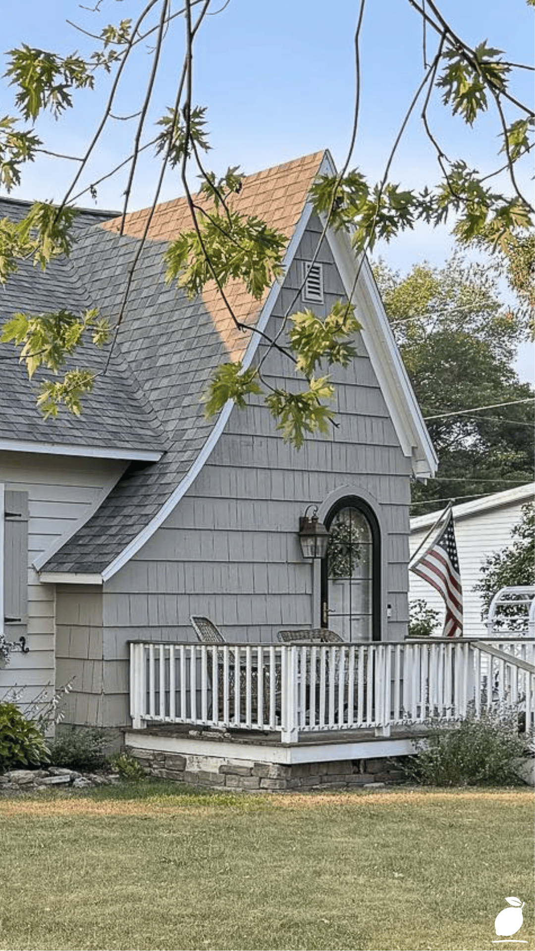
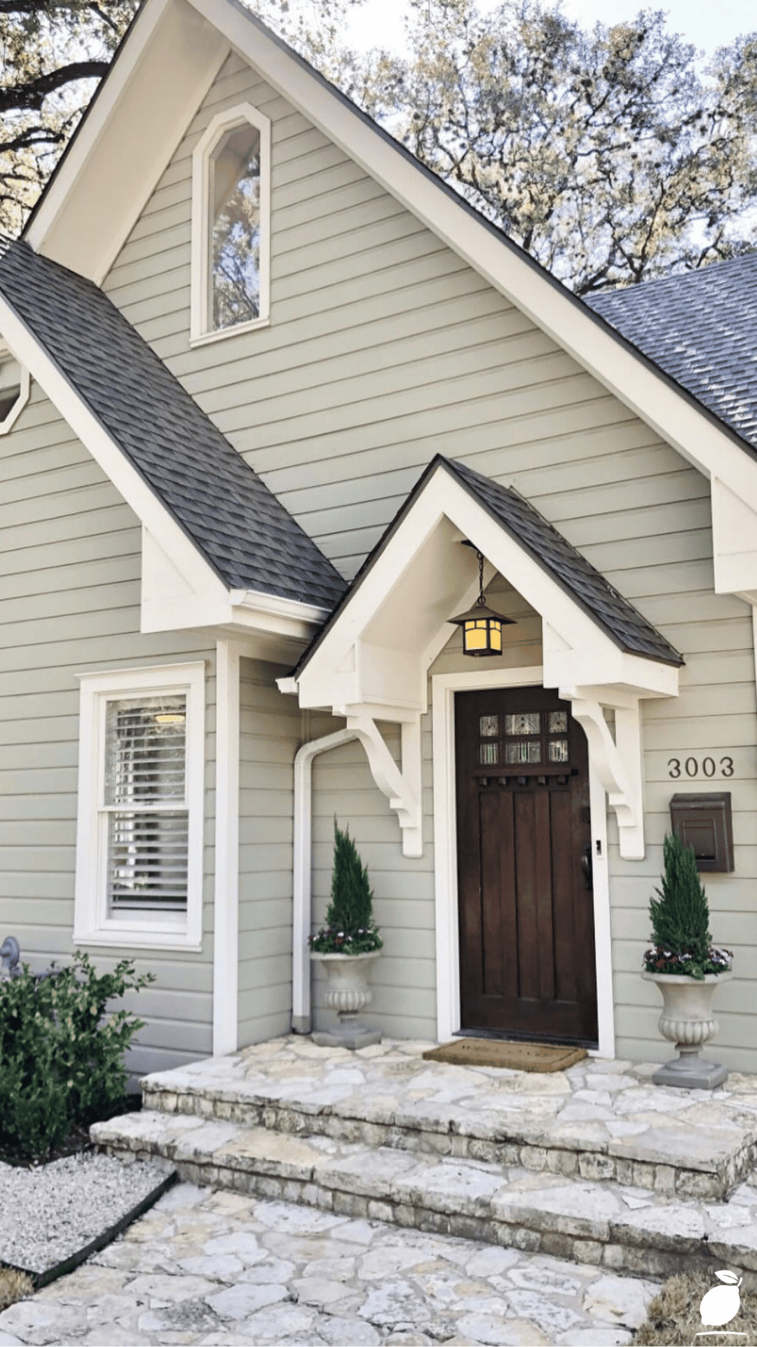
The cottage in the image provides the answer in visible form. Its soft grey body is cool-toned enough to read as crisp against the white porch railing and window trim, warm enough to relate to the green-leafed tree in the foreground without fighting it is a specific cottage paint color decision that responds to every element of the composition simultaneously. The grey says: I have thought about this. The white trim says: and I know what I am contrasting it with. The flower boxes say: and I know what will bloom in front of it. That layered response to the architecture and the setting is what a good cottage paint color achieves. Here is the blueprint for achieving it.
The Cottage Paint Color Blueprint
The cottage paint color decision is not a single choice; it is a sequence of related choices made in a specific order, where each decision narrows and informs the next. Work through these steps from beginning to end before committing to any purchase.
Step 1: Define the Aesthetic Register of Your Cottage
The first step in choosing a cottage paint color is establishing the aesthetic register the specific character the exterior should communicate. English cottage aesthetics span a significant range from the romantic and rural (climbing roses, irregular stone, soft organic tones) to the clean and architectural (pointed gable, crisp trim, more formal geometry). The cottage in the image tends toward the latter; the pointed roof, the symmetrical window arrangement, and the structured porch railing suggest a cottage paint color decision that is organized and composed rather than relaxed and faded.
Identify which register your cottage occupies before beginning the color selection. A cottage with irregular stonework, an asymmetric roofline, and a garden visible from the street tends toward the organic end of the spectrum and suits cottage paint color choices in more naturalistic tones: sage greens, muted terracottas, warm ochre whites. A cottage with a regular timber frame, a clearly pitched roofline, and formal porch elements suits a more architectural cottage paint color choice: cooler greys, crisp whites, dusty blues that respond to the geometry rather than softening it.
Step 2: Identify the Fixed Elements the Cottage Paint Color Must Work With
Every cottage exterior has fixed elements that cannot be changed without significant expenditure, and that must be accommodated by the cottage paint color rather than ignored: the roof material and color, the hardscape materials (path, driveway, foundation, steps), the window frame profile and glass tone, and any masonry elements that will remain unpainted. In the image, the roof is a dark grey that is cool-toned; the cottage paint color on the body must relate to this roof tone rather than fighting it.
List every fixed element and its approximate tone before beginning the color selection. The cottage paint color that works will be in the same tonal family as the roof (neither so similar that they disappear into each other nor so different that they compete), will relate to the path and hardscape materials (a warm-toned path suits a warm-toned cottage paint color; a cool grey path suits a cool-toned one), and will provide sufficient contrast from the window frame color to make the windows readable as individual architectural elements. This list of constraints narrows the field of viable cottage paint color options significantly and makes the final selection considerably easier.
Step 3: Choose the Body Cottage Paint Color Within the Narrowed Field
With the aesthetic register defined and the fixed element tonal relationships established, the cottage paint color for the body of the house is selected from the narrowed field that satisfies both constraints simultaneously.
For a cottage with the characteristics of the image cool-toned grey roof, white trim, pointed architectural roofline, porch with formal railing the viable cottage paint color range falls within the cool-to-neutral grey spectrum. Within that spectrum, the specific tonal decision is determined by the desired relationship between the house and its landscape:
A grey with a blue undertone (Sherwin-Williams Uncertain Grey, Farrow & Ball Plummett, Benjamin Moore Grey Owl) reads as airy and sky-related, relating the house to the clear sky backdrop visible in the image and to the lighter tones of a formal, well-maintained landscape.
A grey with a green undertone (Sherwin-Williams Sea Salt, Farrow & Ball Mizzle, Benjamin Moore Sage Mountain) reads as garden-related and organic, creating the softer connection between the house and the surrounding foliage that makes a cottage feel embedded in its landscape rather than placed upon it.
A grey with a warm beige undertone (Benjamin Moore Revere Pewter, Sherwin-Williams Agreeable Grey, Valspar Flagstone) reads as the most accommodating of the grey cottage paint color choices, working with both warm and cool adjacent materials and relating to both formal and informal landscape settings.
Step 4: Establish the Trim Cottage Paint Color as the Architectural Definer
The trim cottage paint color in an English cottage exterior performs the architectural definition function; it outlines the windows, frames the porch, defines the corner boards and eave fascias, and makes every feature of the cottage’s structure legible at the viewing distances from which it is typically seen. The image demonstrates this function precisely: the white trim makes the window frames readable as rectangular elements against the grey body, makes the porch railing read as a distinct structural component, and keeps the overall composition crisp without being harsh.
The trim cottage paint color is almost always a white or near-white in English cottage architecture. The specific white matters a blue-white trim (Benjamin Moore Chantilly Lace) reads as the crispest and most contemporary against a cool grey body; a warm white trim (Benjamin Moore White Dove, Sherwin-Williams Alabaster) reads as softer and more historically resonant; an aged off-white trim (Farrow & Ball Wimborne White, Sherwin-Williams Creamy) reads as the most historically authentic English cottage trim choice and suits cottage paint color schemes where the body color is in the warm grey-green or sage family.
Step 5: Select the Accent Cottage Paint Color for Door and Detail Elements
The accent cottage paint color applied to the front door, shutters if present, and any decorative detail elements like flower box brackets or porch post bases is the element that gives the exterior its individuality and its warmth. In a scheme where the body is grey, and the trim is white, the accent cottage paint color is where personality is introduced without disrupting the architectural coherence of the composition.
English cottage paint color traditions for the accent draw from the garden: the color of what blooms in the flower boxes and the border planting is the starting point for the door and shutter choice. Pink and red flowering plants in the boxes suggest a door in a related tonal family: dusty rose, muted red, or a deep pink, or in a complementary cool tone (sage, dusty blue) that sets off the warm flower colors. Purple and lavender plantings suggest a door in an analogous cool tone (lavender, slate blue, or dusty mauve). Yellow and cream flowers suggest a door in a complementary contrast (deep navy, forest green, or slate grey).
Test the accent cottage paint color alongside a physical sample of both the body and trim colors, and also alongside an actual cutting or photograph of the intended window box planting. The three-way relationship between body, trim, and accent in dialogue with the landscape is the final quality check before any cottage paint color is committed to purchase.
Step 6: Apply in the Correct Order With Appropriate Surface Preparation
The application sequence for a cottage paint color scheme follows a fixed order that minimizes masking time and produces the cleanest edges: surface cleaning, repair, and priming first; body color second; trim color third; accent color last. Applying the trim before the body means masking finished trim against body paint application, an avoidable additional labor step. Applying body paint over trim color inevitably produces bleed-through at edges that requires an additional trim touch-up pass.
Prepare all surfaces by cleaning thoroughly with a pressure washer, repairing any failed caulking at trim-to-body junctions, and spot-priming any bare wood, patched areas, or areas where the previous cottage paint color has failed adhesion. Apply the primer and top coats on the body first, then the trim, then the accent, cutting clean edges with a quality angled brush and maintaining a wet edge to prevent visible lap marks in the finished cottage paint color.
Expert Secrets for Success
Pro-Tips for a Better Result
- Always choose a cottage paint color sample one shade darker than your instinct suggests. Paint samples and color chips consistently read lighter than the same cottage paint color applied at full exterior scale in the specific light conditions of your site. The color that looks ideal on a chip reads washed-out on the wall; the color that looks slightly deeper than necessary reads exactly right at scale. Apply this calibration to every cottage paint color candidate and the final result will be significantly more accurate than samples alone suggest.
- Paint sample areas on every elevation, not just the most accessible one. The same cottage paint color reads differently on a south-facing wall in full afternoon sun and on a north-facing wall in cool indirect light. A grey cottage paint color that reads as perfectly balanced on the south elevation may read as cold and flat on the north elevation. Sample every elevation before committing, and choose the cottage paint color that performs most consistently across all of them rather than the one that looks best on the most favorable wall.
- Incorporate the trim cottage paint color into the test area. A body color sample patch painted without the adjacent trim color gives an incomplete picture of how the cottage paint color will read in the finished composition. Apply a strip of the trim color at the edge of the body color sample, even on a window frame section or a piece of scrap board held against the wall, to assess the body-to-trim relationship at scale before the final decision is made.
- Consider the seasonal cycle when timing the final color decision. The cottage paint color that looks ideal against a background of summer green foliage may read very differently in November against bare branches and grey sky. If possible, assess the cottage paint color samples across at least two seasons before committing, or visualize the winter landscape specifically and ask whether the chosen cottage paint color will still read as the house’s best version of itself without the seasonal softening of surrounding greenery.
- Use a dedicated exterior painting primer matched to the top coat cottage paint color. A primer tinted to approximately 50% of the final cottage paint color’s pigment load reduces the number of top coats required for full, accurate color and provides better hide over the previous color. Request a custom-tinted primer when purchasing the cottage paint color from any major paint supplier; the service is typically free and the time saving in top coat application is significant.
Common Mistakes to Avoid
- Selecting a cottage paint color that is too warm for a cool-toned roof. The most common cottage exterior color conflict arises from a warm-toned body cottage paint color (cream, warm white, warm beige) paired with a cool-toned dark grey or blue-grey roof. The warm-cool clash creates a visual tension that makes both elements read as slightly wrong. If the roof is cool-toned, the cottage paint color for the body must be neutral to cool, not warm in its undertone, to prevent this clash.
- Using a gloss finish on the body cottage paint color. Gloss finishes on cottage exterior walls reflect light in a way that reveals every surface imperfection nail pops, settlement cracks, filler patches, and texture variations with unflattering clarity. They also make the cottage paint color read as more saturated and contemporary than its swatch suggests, which can undermine the muted, absorbed quality of an English cottage paint color. Specify flat or low-sheen finishes for all body applications.
- Matching the body and trim cottage paint color too closely. When the body and trim are within two or three values of each other on the tonal scale, the architectural features defined by the trim lose their definition. The window frames, corner boards, and porch elements that give the cottage its character depend on the contrast between body and trim for their visibility. A cottage paint color scheme that lacks sufficient contrast between these elements produces a house that reads as a unified volume rather than a composed architectural facade.
- Applying the final cottage paint color without a full-coverage primer. On a previously painted exterior, a primer application before the new cottage paint color is often skipped to save a step. On surfaces where the previous color is similar in tone, this may produce adequate results. On surfaces where the previous color is significantly different (particularly where the previous color was warmer or more saturated than the new cottage paint color), painting without a primer produces a result where the old color reads through the new one, particularly in raking light and the final cottage paint color never achieves its accurate, clean appearance.
- Choosing the cottage paint color from digital renderings alone. Digital visualizer tools that allow you to apply a cottage paint color to a photograph of your house are useful for eliminating obvious wrong choices, but they are not reliable substitutes for physical samples applied to the actual house. Screen color calibration, JPEG compression, and digital rendering algorithms all affect the apparent color significantly enough that a cottage paint color that appears ideal in a digital visualization must still be physically sampled before purchase.
Why Cottage Paint Color Matters
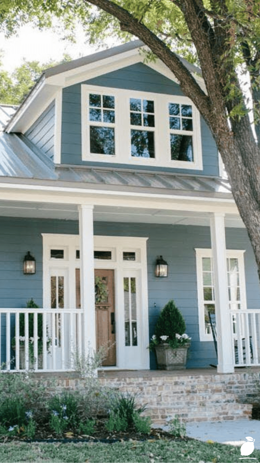
A carefully chosen cottage paint color does something that no other exterior element can do: it transforms the entire character of the house in a single decision. Not gradually, not partially, not in a way that requires noticing the specific change to appreciate it, but immediately and completely. The house that communicated “adequate” on Friday communicates “considered” on Monday, because a single cottage paint color applied over a weekend changed the register of every feature the architecture contains. The flower boxes read as gardener’s choice rather than builder’s accessory. The porch railing reads as architectural detail rather than code requirement. The roofline reads as the pointed cottage peak it is rather than as a geometric feature awaiting context. The right cottage paint color provides all of that context at once.
For families, this transformation carries a specific daily value. The house that a child describes to their friends, that a teenager brings people home to, that a parent returns to at the end of every working day the one that is identified by its color and its character from the street is the house that a thoughtful cottage paint color creates. Home is not just the rooms inside. Home is the first impression from the pavement, the recognition from the end of the street, the particular quality of the exterior in evening light that signals arrival. A cottage paint color chosen with care gives that signal its fullest expression, and every person who lives in or visits the house receives it every time they approach.
And for the homeowner who takes the time to work through the decision properly, who samples the grey on every elevation, who tests the trim color alongside it, who chooses the door accent in dialogue with the window box planting, the completed cottage paint color project delivers a quality of satisfaction that is specific to this category of home improvement. It is not the satisfaction of a problem solved. It is the satisfaction of a potential revealed. The house was always this good. The right cottage paint color is what makes it finally show.
Frequently Asked Questions
How do I choose a cottage paint color that works in all seasons?
Cottage paint colors that perform consistently across seasonal lighting changes share two characteristics: a moderate depth of tone (not very pale, where winter light makes them disappear, nor very deep, where summer sun makes them heavy) and a neutralized undertone (grey-green, grey-beige, or grey-blue rather than a pure green, pure beige, or pure blue). These tonal characteristics allow the cottage paint color to shift slightly in apparent warmth as the seasonal light changes without ever reading as wrong. The grey cottage paint color range in its various green, beige, and blue variants is the most seasonally consistent category in the English cottage palette.
Should the flower box color match or contrast the cottage paint color?
The most cohesive English cottage aesthetic uses flower box plantings that contrast with the body cottage paint color rather than matching it. Warm flower colors (pink, red, orange, yellow) against cool body cottage paint colors (grey, blue-grey, sage) create the color tension that makes both the wall color and the planting read more vividly. Planting colors that are close in tone to the body cottage paint color blend into the wall and lose their visual contribution to the composition. Consider the planting color palette as part of the cottage paint color selection process rather than as a separate seasonal decision.
Can I apply a new cottage paint color directly over existing exterior paint?
In most cases, yes, if the existing paint is well-bonded, not peeling, and in good general condition. Clean the surface thoroughly, sand any rough or raised edges, spot-prime any areas where the existing paint has failed or where bare wood is exposed, and apply the new cottage paint color in two full coats over the cleaned, primed surface. If the existing paint is in poor condition, with significant peeling, blistering, or adhesion failure, the failing paint must be removed to a stable base before the new cottage paint color is applied, or the new paint will delaminate over the same areas as the old.
What is the best brand for authentic English cottage paint color exterior products?
Farrow & Ball produces the most authentically English cottage paint color palette; their colors are developed from historical British architectural documentation, and their exterior Eggshell formulation is specifically designed for timber and render surfaces in the UK climate. For US-available alternatives with a similar heritage-palette character, Benjamin Moore’s Historical Colors range and Sherwin-Williams Emerald Exterior in custom-matched heritage tones offer comparable quality with wider accessibility. Valspar’s Signature Exterior also offers a Heritage collection specifically developed for cottage and vernacular architectural applications.