The wall above my bed had been blank for eight months after I moved the last print to a different room. Not intentionally blank, not a considered design decision about negative space and breathing room, but blank in the specific way that walls become blank when the thing that was on them has been removed, and nothing has yet replaced it. I had bought two prints I liked, put them in a corner, and spent four months in the specific paralysis of not knowing how to hang them in a way that would not look accidental.
Gallery wall projects I had seen online all seemed to involve either a set of seven to twelve matched frames in a single aesthetic or a complex, room-sized arrangement that required measuring and planning tools and a confidence in hole placement that I did not possess. I wanted something between those two options: a small, curated gallery wall above the bed, two or three pieces that had a visual conversation with each other and with the room, hung purposely without requiring the mathematical precision of a gallery installation.
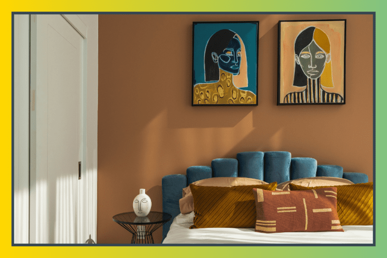
The bedroom in the image above is that middle option, fully realized. Two framed artworks above a white bed on a terracotta accent wall, one depicting a female portrait in blue tones with a gold patterned neck piece, the other a stylized face in bold black and white stripes. The two pieces are different in subject and palette but belong to the same visual family: contemporary, graphic, figurative, confident. Together, they form the gallery wall that transforms the terracotta wall from a beautiful painted surface into a room with a specific creative identity.
The wall says something about the person who chose these prints and placed them with this intention. Paper Collective is the Scandinavian art print platform whose entire design approach is oriented toward exactly this kind of gallery wall: curated, contemporary, figurative, and abstract prints in limited-edition formats from international artists, designed specifically to be displayed as a gallery wall arrangement rather than as a single statement piece on an otherwise empty surface.
The gallery wall steps in this guide follow the specific approach that the image demonstrates and that Paper Collective’s curation is built around: choose prints that have a visual dialogue with each other rather than matching prints that simply repeat a single aesthetic, frame consistently but simply, hang above a key piece of bedroom furniture at the correct height and spacing for the scale of both the prints and the wall, and let the prints’ visual conversation carry the gallery wall’s interest without requiring additional accessories or styling to complete the composition. These gallery wall steps produce the image’s specific quality, two or three strong prints that make a wall feel designed rather than decorated in any bedroom, at any budget that Paper Collective’s accessible print pricing supports.
The gallery wall Blueprint
Step 1: Choose Paper Collective Prints That Create a Visual Dialogue
The gallery wall principle the image demonstrates is the most important and the least frequently articulated aspect of a successful two-to-three print arrangement: the prints should have a visual dialogue with each other, not simply coexist in adjacent frames. Visual dialogue in a gallery wall means that the prints share at least one specific visual quality, a color, a subject, a graphic approach, or a mood that makes them read as a chosen pair or trio rather than a random selection. The two portraits in the image share the figurative subject (female faces), the graphic quality (bold, stylized, contemporary), and the limited palette (blue and gold in one, black and white in the other), three shared qualities that create a strong visual dialogue even though the two prints look quite different from each other.
For gallery wall print selection using Paper Collective’s catalog, browse by collection or by artist rather than by individual print. Paper Collective organizes its prints into collections specifically to support gallery wall arrangements, with prints within each collection designed to work together as a visual unit. A gallery wall built from two or three prints within the same Paper Collective collection will always have at least the coherence of a shared artistic vision; a gallery wall built from prints across different collections requires more deliberate curation to produce the same visual dialogue quality.
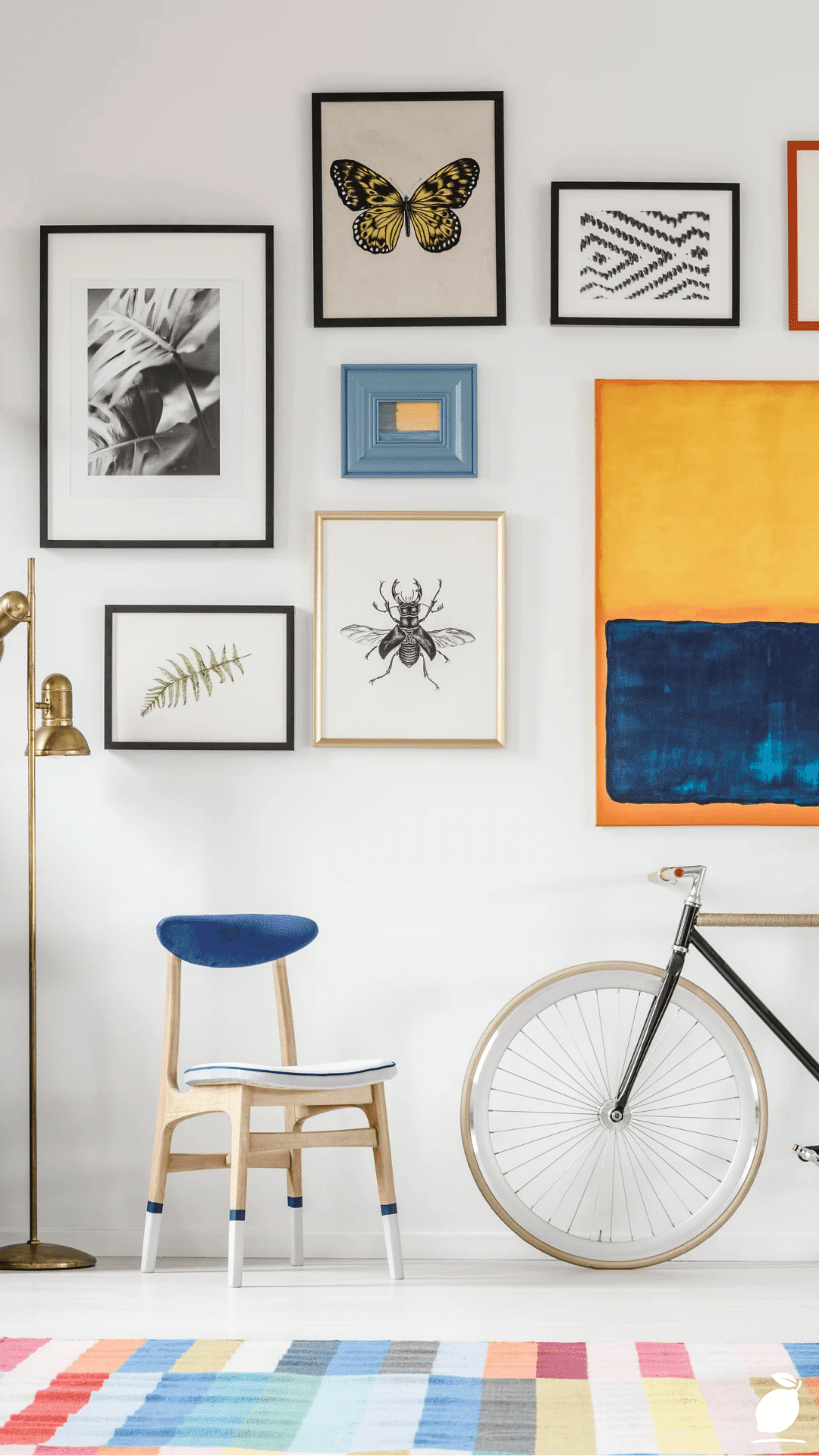
Identify the gallery wall dialogue quality you are building toward before browsing: figurative (two or three prints depicting faces, figures, or botanical forms), abstract (two or three prints exploring color field, geometric pattern, or mark-making), or typographic (two or three prints using text or lettering as the primary visual element). Each gallery wall dialogue category produces a different atmosphere against the terracotta wall of the image. Figurative prints (as shown) produce intimacy and personality; abstract prints produce visual energy and contemporary sophistication; typographic prints produce wit and intellectual presence.
Step 2: Determine the Correct Gallery Wall Scale for the Bedroom Wall and Bed
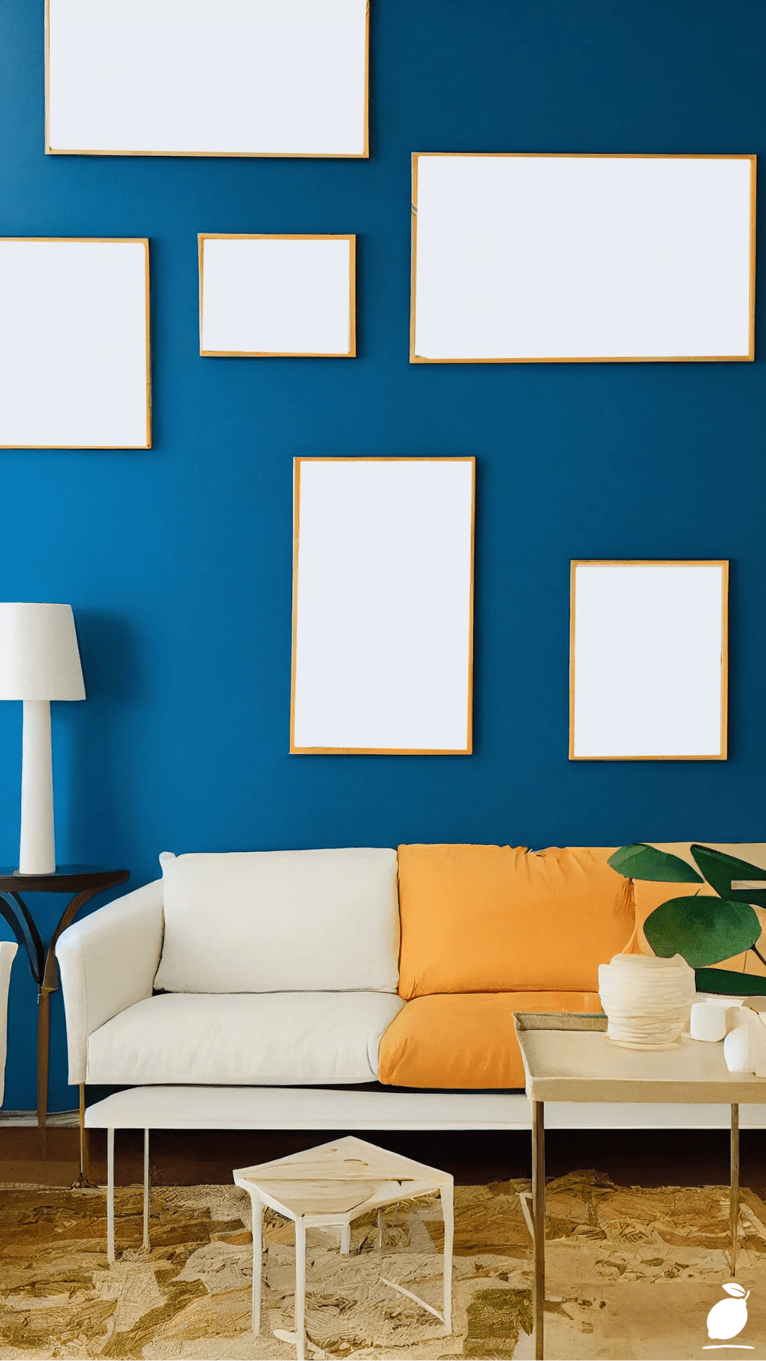
Gallery wall arrangements above a bed are governed by a specific scale relationship: the combined width of the gallery wall arrangement should be between 50 and 70 percent of the bed’s width, and the bottom of the lowest frame in the arrangement should be positioned 20 to 25cm above the top of the headboard. These two measurements, combined width and headboard clearance, determine whether a gallery wall reads as correctly scaled to the bed it occupies or as either too small (lost above the headboard) or too wide (overwhelming the bed by extending past its visual frame).
For the bed in the image, a standard queen or king with a blue velvet headboard, a two-print gallery wall in landscape orientation, or a two-print arrangement in portrait orientation each occupies approximately 80 to 120cm of combined frame width, sitting comfortably within the 50 to 70 percent bed-width rule. Paper Collective prints are available in multiple standard sizes (A3, A2, A1, 50×70cm, and 70×100cm). The A2 and 50×70cm formats are the sizes that most reliably produce a two-print gallery wall at the correct scale for a standard queen or king bed, providing enough visual presence to read from the room’s entry point while remaining proportional to the headboard height.
Measure the bed’s width and calculate the 50 to 70 percent gallery wall width range before choosing print sizes. For a 160cm queen bed, the combined width of the gallery wall should fall between 80 and 112cm, compatible with two A2 prints (42cm × 59.4cm each) in matching frames, side by side, with a total frame-edge-to-frame-edge width of approximately 90cm, including the gap between frames.
Step 3: Select Matching Frames That Complement the Gallery Wall Prints and Room Palette
The gallery wall framing in the image, both prints in what appear to be simple, thin black frames, is the most significant styling decision in a two-to-three print gallery wall after the print selection itself. Frame consistency across all prints in a gallery wall is the single rule that most reliably produces a cohesive result: matching frames of the same profile, finish, and width communicates that the prints were chosen for display together as a gallery wall rather than accumulated individually over time.
For gallery wall framing with Paper Collective prints, choose frames in a finish that relates to at least one element of the room’s existing palette. In the image’s room, black frames relate to the black wire side table, repeating the black material at both the furniture and the wall-hanging scale, creating a material continuity between the gallery wall and the room’s furniture that makes both elements read as part of the same considered design rather than as independently purchased decorating decisions. Paper Collective offers framed print options in their own frame range; alternatively, IKEA’s LOMVIKEN and RIBBA frame ranges in black provide quality gallery wall frames at accessible prices that match Paper Collective’s print dimensions precisely.
For gallery wall frames, avoid mixing frame widths (thin frames from one source, chunky frames from another) or frame finishes (matte black and gloss black in adjacent frames) even within the same nominal “black” category. The gallery wall’s visual coherence is produced by the frames reading as identical rather than similar, and the difference between a 1cm frame and a 2.5cm frame in adjacent positions in the same gallery wall is consistently visible at viewing distance and consistently undermines the arrangement’s polish.
Step 4: Plan the Gallery Wall Layout Before Hanging Anything
The gallery wall mistake that produces the most holes, the most adjustment effort, and the most disappointing results is attempting to plan the layout by hanging directly on the wall, placing the first frame, assessing it, adjusting, hanging the second, realizing the spacing is wrong, filling the first holes, and re-hanging. Gallery wall projects planned on the floor before touching the wall consistently produce better results with fewer holes and less elapsed time than gallery wall projects planned incrementally on the wall as each frame is hung.
Lay the framed prints on the floor in a clear space, arranging them in the planned gallery wall configuration. For a two-print gallery wall in a side-by-side arrangement, position the frames with a gap of 8 to 12cm between them, the spacing that reads as a deliberate, designed gap rather than prints accidentally placed near each other (too close) or prints that appear to be ignoring each other (too far apart). Photograph the floor arrangement from directly above, then view the photograph on a phone screen to assess the gallery wall composition at the distance and scale approximation of the room’s primary viewing position.
Transfer the floor arrangement to the wall using the paper template method: trace each frame’s outline on paper, mark each hanging mechanism’s position within the outline, cut out the templates, and tape them to the wall in the planned arrangement. Hang the templates at the correct height from the headboard (20 to 25cm clearance) and correct position relative to the bed’s center axis (gallery wall center should align with the bed’s center), and stand back to assess the layout before drilling a single hole. Adjust the template positions as needed, then use the templates’ marked hanging points to place hooks precisely before removing the templates and hanging the actual frames.
Step 5: Hang the Gallery Wall Prints With Precision and Wall-Safe Hardware
Gallery wall hanging hardware selection is determined by three factors: the wall material (standard drywall, plaster, brick, or concrete), the print and frame’s combined weight, and the requirement to minimize wall damage for eventual removal or adjustment. Paper Collective prints in standard frame sizes are lightweight, typically under 2kg for A2 and 50×70cm framed prints, and compatible with damage-minimizing gallery wall hanging systems that do not require large holes or heavy anchors.
For a gallery wall hanging on drywall or plaster in a rental or owned home where minimal damage is a priority, adhesive picture-hanging strips rated for at least 4kg per pair (Command Large Picture Hanging Strips) provide a reliable gallery wall mounting system for lightweight framed prints. Apply two pairs per print, one pair at each upper corner of the frame, following the manufacturer’s instructions for surface cleaning, strip application, and the mandatory one-hour pressing period before hanging any weight. Adhesive gallery wall strips allow removal and repositioning without wall damage, making them the most forgiving gallery wall hanging system for the iterative adjustments that achieving precise two-print alignment typically requires.
For gallery wall hanging on solid plaster or masonry walls where adhesive strips do not bond reliably, use picture rail hooks (for rooms with existing picture rail molding) or small-gauge picture hooks with the minimum-diameter nail appropriate for the frame’s weight. A single small-gauge picture hook in a plaster wall leaves a hole under 2mm in diameter, the minimum wall impact available for a gallery wall hung on traditional plaster walls.
Step 6: Style the Gallery Wall’s Supporting Zone for Composition Completion
The gallery wall above the bed in the image achieves its specific quality not only through the two prints themselves but through the complete zone composition that the gallery wall occupies: the terracotta wall as the warm backdrop, the white bedding as the neutral foreground, the blue velvet headboard as the color-connecting element between the gallery wall’s blue portrait and the bed below it. The gallery wall is not a standalone wall event in the image it is the upper element of a complete wall-to-floor composition that includes the bed, the side table, the rug, and the wall color as supporting elements of the gallery wall’s visual story.
For gallery wall styling in a bedroom, assess the complete wall zone from floor to ceiling after hanging the prints and identify any element between the bottom of the gallery wall frames and the floor that disrupts or enhances the gallery wall’s composition. In the image, the blue velvet headboard connects the gallery wall’s blue portrait to the bed below through color repetition, a styling coincidence that reads as intentional because the blue appears in both the gallery wall and the headboard. If the existing bedroom furniture does not create this kind of color-connection between the gallery wall and the room below it, introduce a small object in the gallery wall’s palette (a blue vase, a terracotta planter, a throw pillow in the gallery wall’s accent color) at the bedside table or headboard level to create the vertical color thread that the image demonstrates.
Expert Secrets for Success
Pro-Tips for a Better Result
Order Paper Collective prints in consecutive edition numbers for the most coherent gallery wall pairing. Paper Collective limited edition prints carry edition numbers that reflect the print’s position within a collection, or a specific artist’s series prints from the same collection series often share subtle palette relationships, proportion similarities, or compositional echoes that make them read as a designed pair when displayed as a gallery wall. When browsing Paper Collective’s catalog, note the collection a print belongs to and check whether adjacent prints in the same collection are available in compatible sizes for your planned gallery wall scale.
Level the gallery wall frames using a spirit level app rather than a physical level for two-print horizontal arrangements. A two-print gallery wall where the frames are not perfectly level with each other is immediately visible and impossible to unsee once noticed. Use a phone spirit-level application held flat against the front face of each frame after hanging to verify horizontal alignment before stepping away from the gallery wall. Minor adjustments of 1 to 2mm at the hanging point are easier to make while at the wall than after the gallery wall has been assessed from a distance.
Use white card mats within the frames for Paper Collective prints to add visual breathing room in small gallery wall arrangements. Paper Collective prints displayed at their full paper size within a closely fitting frame can appear slightly compressed in a small gallery wall arrangement. A white card mat adding 3cm to 5cm of white border around the print, purchased as a custom mat cut from any framing supplier to the print’s dimensions, adds visual breathing room that makes each gallery wall print appear more significant and more museum-quality, while the white mat surface coordinates naturally with the white bedding and walls visible in the image.
Photograph the completed gallery wall in natural light and artificial light separately to confirm the arrangement looks correct in both conditions. The gallery wall above a bed is experienced in both morning natural light and evening lamp light, and the prints’ color relationships and the frame-to-wall contrast may appear differently in each condition. Photograph the gallery wall immediately after hanging (natural light) and again in the evening with the room’s primary lamp on (artificial light) to confirm the arrangement achieves the intended visual quality in both the gallery wall’s most common lighting conditions.
Common Mistakes to Avoid
Don’t hang the gallery wall too high above the headboard. The most common gallery wall above-bed positioning error is placing the arrangement too high on the wall, hung at a height that feels correct when standing beside the wall, but that reads as floating or unconnected when viewed from the bed or from across the room. The 20 to 25cm clearance between the top of the headboard and the bottom of the lowest gallery wall frame is the measurement that produces the visual connection between the gallery wall and the bed. Exceeding this clearance by more than 5cm consistently produces the floating gallery wall quality that makes an arrangement look incorrectly placed rather than intentionally positioned.
Don’t choose Paper Collective prints in sizes that are mismatched relative to each other in the gallery wall. A gallery wall pairing of one A1 print (59.4cm × 84.1cm) and one A3 print (29.7cm × 42cm) creates a size differential so extreme that the two prints cannot occupy the same visual conversation. The smaller print reads as an annotation to the larger one rather than as a co-equal gallery wall member. For gallery wall arrangements of two prints, choose prints within one standard size step of each other (both A2, or one A2 and one 50×70cm) to maintain the scale parity that makes both gallery wall prints read as equally important members of the arrangement.
Don’t use matted and unmatted prints in the same gallery wall arrangement. A gallery wall where one print is displayed with a white mat, and another is displayed without, creates a visual inconsistency between the two frames’ apparent sizes (the matted print’s image area appears smaller within its frame) and between the two prints’ borders (the white mat border versus the frame’s inner edge directly against the print). Keep the gallery wall treatment consistent: all prints matted or all prints unmatted. If adding mats to some Paper Collective prints, add mats of identical dimensions to all prints in the gallery wall.
Don’t hang the gallery wall before the room’s primary furniture is in its final position. A gallery wall hung in relationship to the bed’s current position must be rehung if the bed is later moved, an outcome that produces unnecessary wall holes and the visual evidence of a relocated gallery wall. Confirm the bed’s permanent position in the room (relative to windows, doors, and electrical outlets) before placing any gallery wall hanging hardware, and confirm that the bed will not need to be moved for seasonal reasons, roommate changes, or furniture rearrangements that are already anticipated.
Why gallery wall Matters
A gallery wall is not merely a decorating project; it is the visible expression of a specific human need: the need to inhabit a space that reflects something true about the person who lives in it. The walls of a home are its largest surfaces, and its most persistent visual presence, and walls that hold nothing personal that are white or painted but unadorned communicate, daily, the absence of a decision about what the space should be. A gallery wall changes this. It asserts a specific aesthetic preference, a specific relationship to visual art, and a specific willingness to make the home’s walls part of the household’s creative life rather than simply its background.
Research in environmental psychology has documented the relationship between personal expression in the home environment and the occupant’s daily sense of identity coherence, the feeling of being in a space that is specifically yours, that reflects your particular aesthetic, rather than in a generic residential space that could belong to anyone. Gallery walls that include art that has been genuinely chosen, the Paper Collective print selected because it resonates rather than because it fills space, contribute to this identity coherence in a way that mass-market decorative objects do not. The gallery wall’s specific contribution to daily domestic experience is the experience of living in a room where the walls are part of who you are.
Easy Peasy Life Matters is built on the conviction that every bedroom deserves at least one wall that has been thought about, at least one surface that holds something chosen, something specific, something that communicates the person who sleeps in the room rather than simply the room’s dimensions. A gallery wall built from two or three Paper Collective prints in matching frames, hung at the correct height above the bed with the precision and intention this guide provides, produces that wall in a single afternoon. The image at the top of this guide shows what it looks like. These steps are how to build it in any bedroom, with any prints, on any wall that has been waiting for the decision it deserves.
Frequently Asked Questions
What is Paper Collective, and why is it good for gallery wall projects?
Paper Collective is a Copenhagen-based art print platform founded in 2012 that represents over one hundred international artists and sells limited-edition prints in standard sizes designed for easy gallery wall framing. Paper Collective is particularly well suited to gallery wall projects for three reasons: its prints are curated into collections that are specifically designed to be displayed together as gallery wall arrangements, its standard sizing (A3, A2, A1, 50×70cm, 70×100cm) ensures compatibility with widely available gallery wall frames, and its print pricing ($30 to $150 per print depending on size and edition) makes building a two-to-three print gallery wall accessible at a realistic budget without the custom printing and framing costs that artist originals or custom prints require.
How many prints should a gallery wall above a bed include?
For a gallery wall above a bed, two to three prints is the range that produces the most consistently successful results: two prints for beds up to 160cm wide, where the gallery wall needs to remain compact and tightly scaled, three prints for beds 180cm and above, where a two-print arrangement would leave the wall on either side of the arrangement reading as conspicuously empty. A single print above a bed is not technically a gallery wall; it is a single statement piece, which is a legitimate design choice, but produces a different atmospheric quality from the conversational, multi-voice quality that makes a gallery wall more personally expressive than a solo print.
What size frames should I use for a Paper Collective gallery wall?
For a gallery wall above a standard queen bed (160cm wide), A2 frames (42cm × 59.4cm) or 50×70cm frames are the sizes that produce the correct visual scale large enough to read from the room’s entry point, correctly proportioned to the headboard height, and together spanning approximately 90 to 100cm of wall width when hung with an 8 to 12cm gap between frames. For a king bed (180cm to 200cm wide), two 70×100cm frames or three A2 frames create a gallery wall at the wider scale that the larger bed requires. Paper Collective prints come in all standard sizes; confirm the available size for any print before purchasing frames to ensure the frame dimensions match the print dimensions.
How do I decide on the gallery wall layout, side by side or offset?
Side-by-side alignment (both frames sharing the same top edge, hung at the same height) is the most visually clean gallery wall layout for two prints and suits the bedroom context because its horizontal regularity relates naturally to the horizontal line of the bed and headboard below. Offset alignment (one frame positioned higher than the other, creating a stepped arrangement) provides more visual dynamism and suits gallery wall contexts where the arrangement needs to fill a taller wall zone. For the above-bed gallery wall, the image demonstrates that side-by-side alignment with a shared top edge produces the most cohesive and most proportionally resolved result.
Can I create a Paper Collective gallery wall in a rental apartment without damaging the walls?
Yes, Paper Collective prints in A2 and 50×70cm framed sizes are lightweight enough (typically 1 to 2kg per framed print) for Command Large Picture Hanging Strip sets, which support up to 7.2kg per pair and remove without leaving visible damage on most painted drywall and plaster surfaces. Apply two pairs of strips per frame (one pair at each upper corner), follow the manufacturer’s 60-minute wall-pressing protocol, and allow the full 72-hour cure period before hanging any gallery wall frame weight. Remove strips following the Command tab-pull removal method (pull the tab straight down along the wall surface, not outward) for the cleanest removal without paint lifting.