The bedroom had been white since the move-in. Not a considered white, the default white of a rental that had been painted over three times with whatever was cheapest, the kind of white that registers as absence rather than choice. It was fine in the way that inoffensive things are fine: it didn’t bother anyone, it didn’t inspire anyone, and it offered none of the warmth that a bedroom is actually supposed to provide. Every autumn, the gap between what the room felt like and what the season outside was doing became harder to ignore. The trees went copper and rust and gold. The light shifted to amber. And the bedroom remained stubbornly, flatly, disinterestedly white, a room that had opted out of the season entirely.
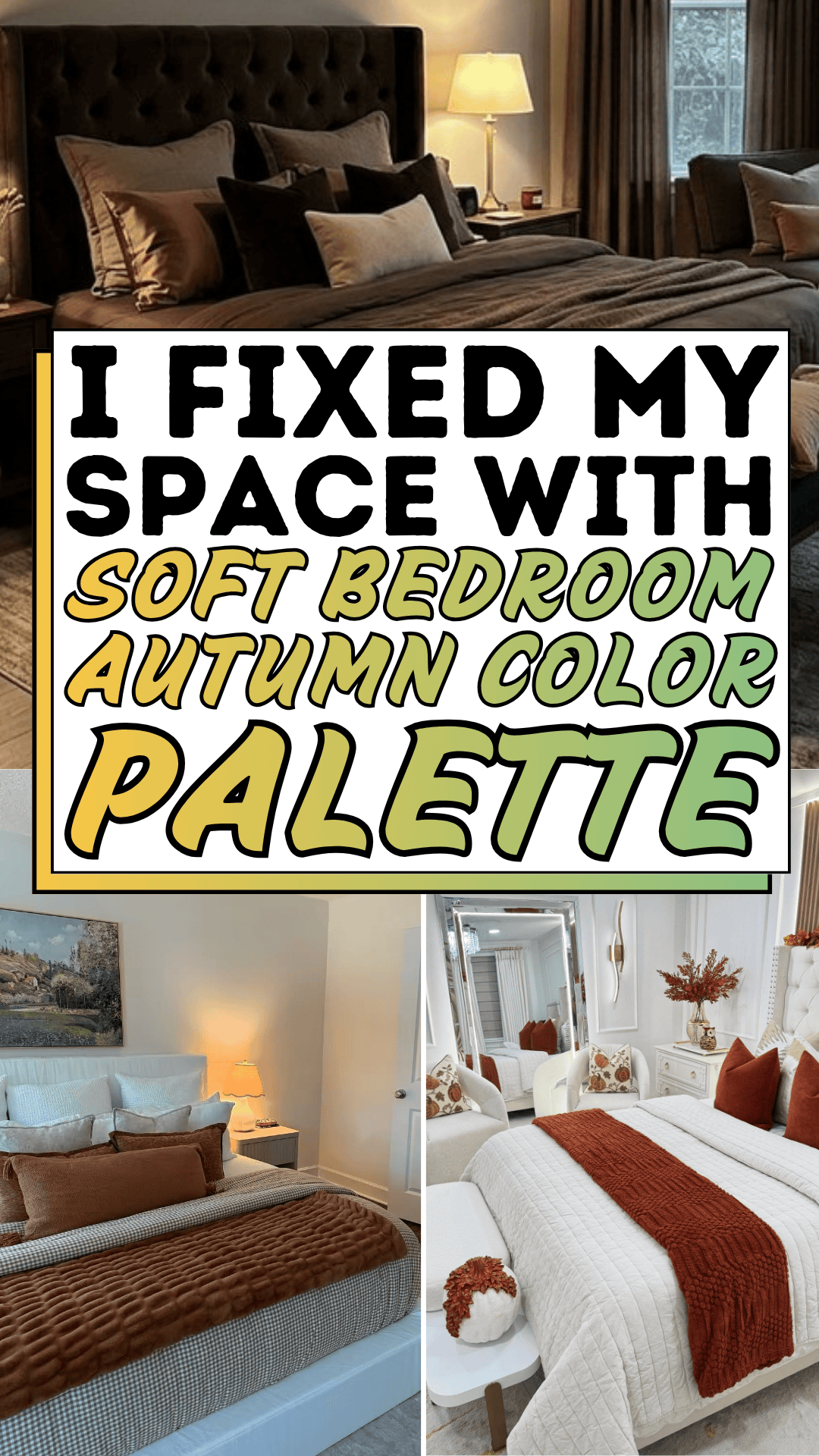
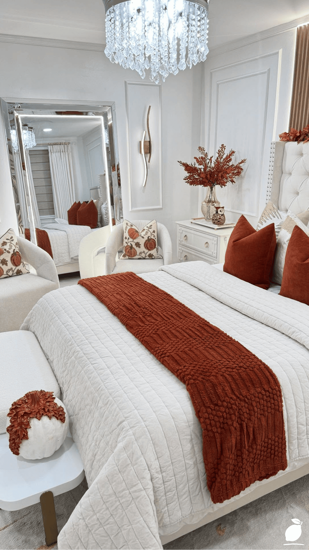
The autumn color palette enters bedrooms the way the season itself enters a landscape, not through a single dramatic statement but through a layering of warm, rich, organic tones that gradually shift the room’s emotional temperature. An autumn color palette bedroom is not a Halloween bedroom. It is not a maximalist project of dark walls and heavy drapes. The best autumn color palette bedroom ideas and the image above demonstrate this precisely; they are exercises in warmth management: how to bring the season’s specific quality of richness and depth into a sleeping space without sacrificing the calm that a bedroom requires. White-and-gold as the dominant palette. Deep red throw and pillows as the autumn color layer. A crystal chandelier and gold-framed mirror catching the season’s amber light. The room is warm without being heavy, rich without being busy, seasonal without being themed.
What changed my understanding of the autumn color palette in a bedroom context was the realization that it operates through texture as much as through color. The deep red of the throw blanket in the featured image reads as autumnal not just because of its hue but because of its soft, plush quality, the tactile suggestion of warmth against the coming cold. The gold of the hardware and mirror frames reads as autumnal not just because gold is in the season’s palette but because of its specific warmth, its reference to afternoon light at a low angle. An autumn color palette bedroom is a sensory environment, not just a visual one. This guide gives you the step-by-step framework to build that environment in your own bedroom, from the foundation palette to the final textural detail.
The Autumn Color Palette Blueprint
Step 1: Establish the Dominant Neutral as the Palette Foundation
Every autumn color palette bedroom begins with a dominant neutral that functions as the season’s equivalent of fallen leaves’ background: the earth, the ground, the canvas against which the warmer accent colors register. In the featured image, this dominant neutral is white specifically, a warm white with cream content rather than a cool blue-white, which allows the deep red and gold accent elements to read as rich and deliberate against it rather than competing with a saturated wall color for visual attention.
For an autumn color palette bedroom, the dominant neutral must have warm undertones, not the cool blue-grey neutrals that read as winter, and not the stark white that reads as spring’s freshness. The autumn color palette’s neutrals are warm whites (Benjamin Moore White Dove, Sherwin-Williams Alabaster), warm greiges (Benjamin Moore Pale Oak, Farrow & Ball Elephant’s Breath), soft caramels and taupes, and the warm mid-browns that reference bark, soil, and dried grass. Any of these reads as an authentic autumn color palette foundation in a bedroom context.
If the bedroom has existing wall color that can’t or won’t be changed, assess its undertone family: is it warm or cool? A warm-toned existing wall color (cream, beige, greige, warm grey) can accept autumn color palette accent layers without conflict. A cool-toned existing wall color (blue-grey, lavender-grey, cool white) will require more deliberate warm accent choices to shift the room’s temperature toward the autumn color palette’s characteristic warmth.
Step 2: Introduce the Autumn Color Palette’s Deep Accent Color
The autumn color palette’s defining visual element in a bedroom is the deep accent color, the rich, saturated tone that carries the season’s specific emotional weight. In the featured image, this is the deep red of the throw blanket and decorative pillows: a burgundy-adjacent red with enough blue content to read as sophisticated rather than aggressive, and enough warmth to sit comfortably within the white-and-gold dominant palette without clashing.
Deep red is the most traditionally autumnal accent choice for a bedroom autumn color palette, and it is also the most challenging to calibrate; it can easily shift from rich and warm to harsh and heavy depending on how much of it is used, where it is positioned in the room, and what texture it is carried in. The featured image uses deep red exclusively in the softest, most tactile elements of the room a plush throw, velvet, or richly woven decorative pillows rather than in harder, more architecturally fixed elements. This is the correct autumn color palette approach for deep red in a bedroom: soft furnishings as the carrier, never walls or large upholstered pieces.
Alternative autumn color palette accent colors for bedrooms that find deep red too intense: burnt orange the most immediately autumnal of all the season’s colors, warming a bedroom dramatically when introduced in throw pillows and a single textile layer; deep forest green the accent that connects the autumn color palette to the season’s evergreen notes, creating a more complex, nature-adjacent palette alongside warm whites and wood tones; mustard yellow the softest and most versatile autumn color palette accent for bedrooms, sitting between warmth and neutrality in a way that requires less calibration than deep red or orange.
Step 3: Add the Metallic Layer — Gold as Autumn Color Palette Architecture
Gold is the autumn color palette’s architectural color, the tone that appears in hardware, mirrors, light fixtures, and decorative objects, carrying the season’s warm, amber light quality into the fixed and semi-fixed elements of the bedroom. In the featured image, gold appears in the dresser knobs, the mirror frame, and the chandelier three fixed-position elements that anchor the autumn color palette throughout the room without requiring any seasonal adjustment.
For an autumn color palette bedroom, the metallic choice is always warm rather than cool. Gold, brass, aged bronze, and copper all carry the autumn color palette’s characteristic warmth. Silver, chrome, and brushed nickel carry the cool, reflective quality of winter and work against the autumn color palette’s warmth regardless of how richly the surrounding textiles are colored. If your bedroom’s existing hardware is in a cool metal finish, adding an autumn color palette layer in textiles and decorative objects will work against the cool metallic fixtures in a way that makes the overall palette feel unresolved.
The gold layer in an autumn color palette bedroom functions best when it appears in at least three distinct locations, the quantity required for the eye to read it as a designed element rather than an isolated accessory. A gold-framed mirror, a gold-toned lamp base, and a piece of artwork with gold content collectively establish gold as the autumn color palette’s architectural thread in a way that a single gold object cannot.
Step 4: Layer the Autumn Color Palette Through Textiles
The textile layer is where the autumn color palette delivers its most immediate sensory impact: the physical experience of warmth and richness that the season’s visual qualities suggest. The featured image’s textile layering is a precise demonstration of the autumn color palette in soft furnishings: a white quilt as the base, a deep red throw at the foot of the bed, decorative pillows in varying red tones and textures, and a floral cushion on the white armchair that bridges the red and the white of the dominant palette.
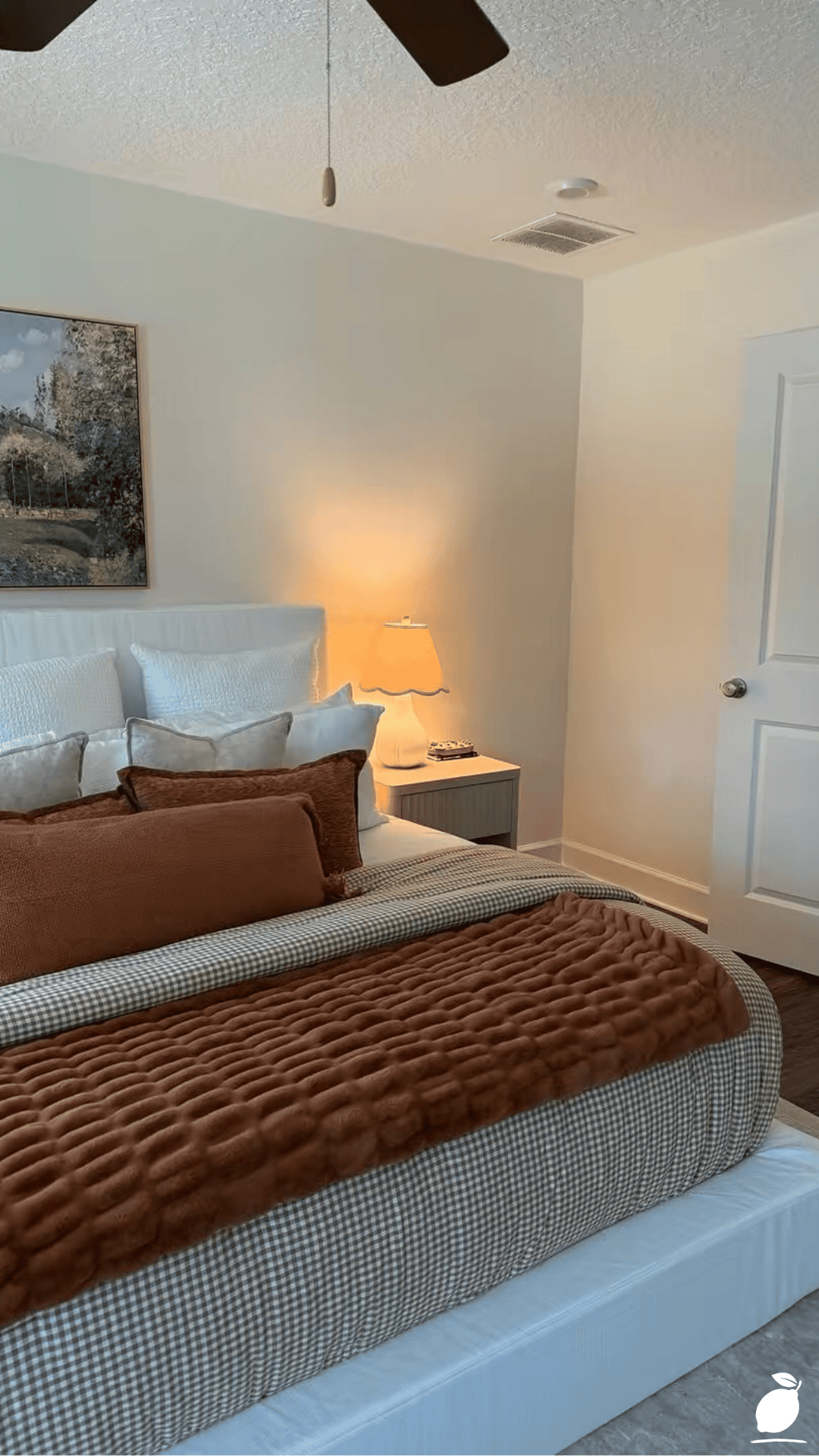
Autumn color palette bedroom textiles should vary in texture as much as in color. The season’s richness comes from the variety of tactile quality a smooth velvet pillow against a knitted throw against a woven cotton quilt creates: visual complexity and textural depth that a single-texture layering cannot achieve, even when the colors are perfect. Build the autumn color palette textile layer with: one smooth (velvet, silk, sateen), one matte-woven (cotton, linen), and one textural (knit, chunky wool, faux fur) in the same color family, and the result reads as professionally styled rather than seasonally dressed.
For autumn color palette bedroom layering on a budget, focus the investment on one high-quality statement piece a genuinely rich cashmere or wool throw in the season’s accent color and supplement it with more affordable textural elements. A single beautiful piece reads as more luxurious than several mediocre ones combined.
Step 5: Introduce Organic and Botanical Autumn Color Palette Elements
The autumn color palette’s connection to the natural world is what gives it its emotional depth, and introducing organic materials and botanical elements into the bedroom brings that connection into the space in a way that manufactured decoration cannot replicate. The featured bedroom’s decorative vases with autumnal leaves reference this principle directly: the actual material of the season, positioned as decoration, carries an authenticity that printed or artificial seasonal decoration never achieves.
For an autumn color palette bedroom, the organic element layer includes: dried botanicals (pampas grass, dried hydrangea, eucalyptus branches, cotton stems) in neutral, bleached, or warm-toned vases; seasonal cut stems (branches with turning leaves, orange berries, dried alliums) in a single statement vessel; and natural material objects (woven rattan, wooden bowls, stone bookends) that carry the season’s earth quality in texture and material rather than color.
The autumn color palette botanical layer should be concentrated in one or two positions in the bedroom: a bedside table arrangement, a dresser vignette, rather than distributed across every available surface. Concentration creates the impact of an intentional still life; distribution creates the diffuse quality of general decoration that reads as seasonal purchase rather than considered composition.
Step 6: Edit the Autumn Color Palette to Maintain Serenity
The final and most important step in any autumn color palette bedroom project is the editing pass: the assessment of what is now in the room against the standard of whether it contributes to the bedroom’s warmth and calm or merely adds seasonal color without adding quality. An autumn color palette bedroom that overcrowds its surfaces with seasonal objects, layers too many accent colors within the autumn family, or introduces elements that don’t connect to the palette’s established dominant and accent structure loses the quality of serenity that the bedroom requires.
Edit by the following principle: every object in the finished autumn color palette bedroom should be connected to at least one other object in the room by color, material, or form. An object that stands in complete visual isolation, disconnected from every other element in the autumn color palette by all three qualities, is not contributing to the composition. Remove it, replace it with something that connects, or relocate it to a position where it shares a visual relationship with a neighboring element.
Expert Secrets for Success
Pro-Tips for a Better Result
Swap only three elements to shift the bedroom into the autumn color palette. The most efficient autumn color palette bedroom transformation, delivering the season’s warmth with the minimum disruption and investment, replaces three specific elements: the throw (to the season’s accent color), the decorative pillows (to the same accent color family in two textures), and the bedside vignette (to an arrangement of dried botanicals and a warm-toned candle). These three changes affect the bedroom’s most immediately visible and most experientially prominent zone, the bed and its immediate surroundings, and shift the room’s palette more dramatically than any equivalent investment in walls, window treatments, or floor coverings.
Use candlelight to activate the autumn color palette in the evening. The specific quality of autumn light warm, low-angled, amber is most accurately replicated indoors by candlelight rather than by electric illumination. Placing two or three candles in warm amber or cream tones on the bedside table, the dresser, and the windowsill shifts the bedroom’s evening atmosphere into the autumn color palette’s most emotionally resonant register. Use candles in holders that carry the palette’s metallic or warm neutral tones gold, brass, terracotta, raw wood so the candle arrangement reads as part of the palette rather than as supplementary decoration.
Layer the autumn color palette’s depth through window treatment weight. Autumn’s shift to shorter days and longer evenings makes the bedroom’s window treatments significantly more relevant to the room’s warmth than in summer. Adding a heavier drape panel in a warm linen or velvet alongside existing sheers, the layered window treatment approach immediately shifts the room’s thermal and visual qualities toward the autumn color palette’s characteristic depth and enclosure. Choose the drape panel in the palette’s neutral family (warm white, cream, caramel, warm taupe) rather than the accent color, to maintain the room’s balance of depth and lightness.
Common Mistakes to Avoid
Don’t introduce the autumn color palette in every room simultaneously. The autumn color palette bedroom transformation is most effective when the bedroom is distinguished as the seasonal sanctuary, the room that most fully commits to the season’s warmth and enclosure. Applying the same autumn color palette transformation throughout the whole house dilutes the impact of each room and creates a home that reads as uniformly seasonal rather than carefully considered. Let the bedroom lead the autumn color palette, and allow other rooms to reference it with one or two seasonal elements rather than the full palette treatment.
Don’t use bright, pure orange in an autumn color palette bedroom. True orange the color of Halloween decorations and emergency signage, is the autumn color palette color that most consistently undermines bedroom serenity. It is too bright, too energizing, and too strongly associated with external cultural references to function as a relaxing bedroom accent. The autumn color palette for a bedroom uses burnt orange, terracotta, rust, and amber orange tones that have been muted, browned, or warmed into the earthy family, not the pure, saturated orange of the primary color family. This distinction is the most important calibration in the autumn color palette bedroom’s accent color selection.
Don’t neglect the autumn color palette’s connection to lighting temperature. An autumn color palette bedroom in the right colors but with cool, blue-white LED lighting loses most of its warmth; the cool light strips the warm undertones from every element it illuminates, making deep red look purple-toned and gold look silver. Replace cool LED bulbs (above 4000K color temperature) in the bedroom with warm white LEDs (2700K to 3000K) when the autumn color palette transformation is implemented. The change in light quality delivers as much perceptible warmth to the autumn color palette as any single textile or decorative change.
Don’t over-accessorize the autumn color palette with purchased seasonal decoration. The autumn color palette’s specific quality of warmth and depth comes from the accumulation of natural materials, rich textiles, and warm metallics, not from the purchase of explicitly seasonal decorative objects (autumn leaf garlands, pumpkin ornaments, harvest-theme prints). These objects communicate season loudly and authentically temporarily. An autumn color palette bedroom built on materials and colors rather than on themed objects reads as warm and considered throughout the season and is transitioned easily at season’s end by swapping the textile layer rather than removing an array of decorative items.
Why Autumn Color Palette Matters
The season we live in shapes our psychology in ways that indoor environments either support or contradict. Autumn’s specific emotional character the combination of richness and melancholy, warmth and the awareness of approaching cold, the beauty of things at their most vivid before their quieting is one of the most complex and most resonant of the year’s four emotional registers. A bedroom that responds to the autumn color palette doesn’t just look seasonally appropriate. It provides the environmental context in which the season’s specific quality of experience can be felt and inhabited rather than looked at through a window while living in a space that has opted out of it.
Research in environmental aesthetics identifies the alignment between indoor color environments and seasonal natural palettes as a significant contributor to mood regulation, specifically the use of warm, earth-toned indoor palettes in autumn and winter to compensate for the reduced sunlight and cooler ambient temperatures of these seasons. An autumn color palette bedroom is not a decorating project in the conventional sense. It is a seasonal adjustment of the bedroom’s emotional environment that supports the body’s and mind’s natural response to the time of year. The warmth is not just visual. It is physiological: the deep reds and golds and warm neutrals of an autumn color palette bedroom activate the same comfort response as the season’s natural warmth, and they do so precisely when that natural warmth is beginning to withdraw.
Easy Peasy Life Matters is built on the conviction that living intentionally in a home means living seasonally within it, allowing the changes outside to be met and reflected by the environment inside, rather than maintaining a static interior that the seasons pass without touching. An autumn color palette bedroom is one of the most accessible and most immediately rewarding expressions of this seasonal intentionality: a few textile swaps, a botanical arrangement, the change of a throw and a candle, and the bedroom that was white all year becomes amber and deep red and gold for the months that deserve it most. The featured image is the destination. This guide is the path.
Frequently Asked Questions
How do I transition an autumn color palette bedroom back to a year-round palette?
The autumn color palette bedroom is designed for easy seasonal transition by building the transformation around the room’s textile layer rather than its structural elements. The walls, flooring, and furniture remain constant; only the throw, the decorative pillows, the botanical arrangement, and the candle vignette change between seasons. To transition out of the autumn color palette, remove the deep red or burnt orange throw and pillows and replace with the lighter, cooler-toned textiles used in spring and summer; replace the dried botanical arrangement with fresh green stems or flowers; replace the amber candles with lighter-scented alternatives. The room returns to its year-round palette in under an hour, with the autumn color palette elements stored flat in a textile bag until the following September.
What is the best autumn color palette for a bedroom that already has a dark wall color?
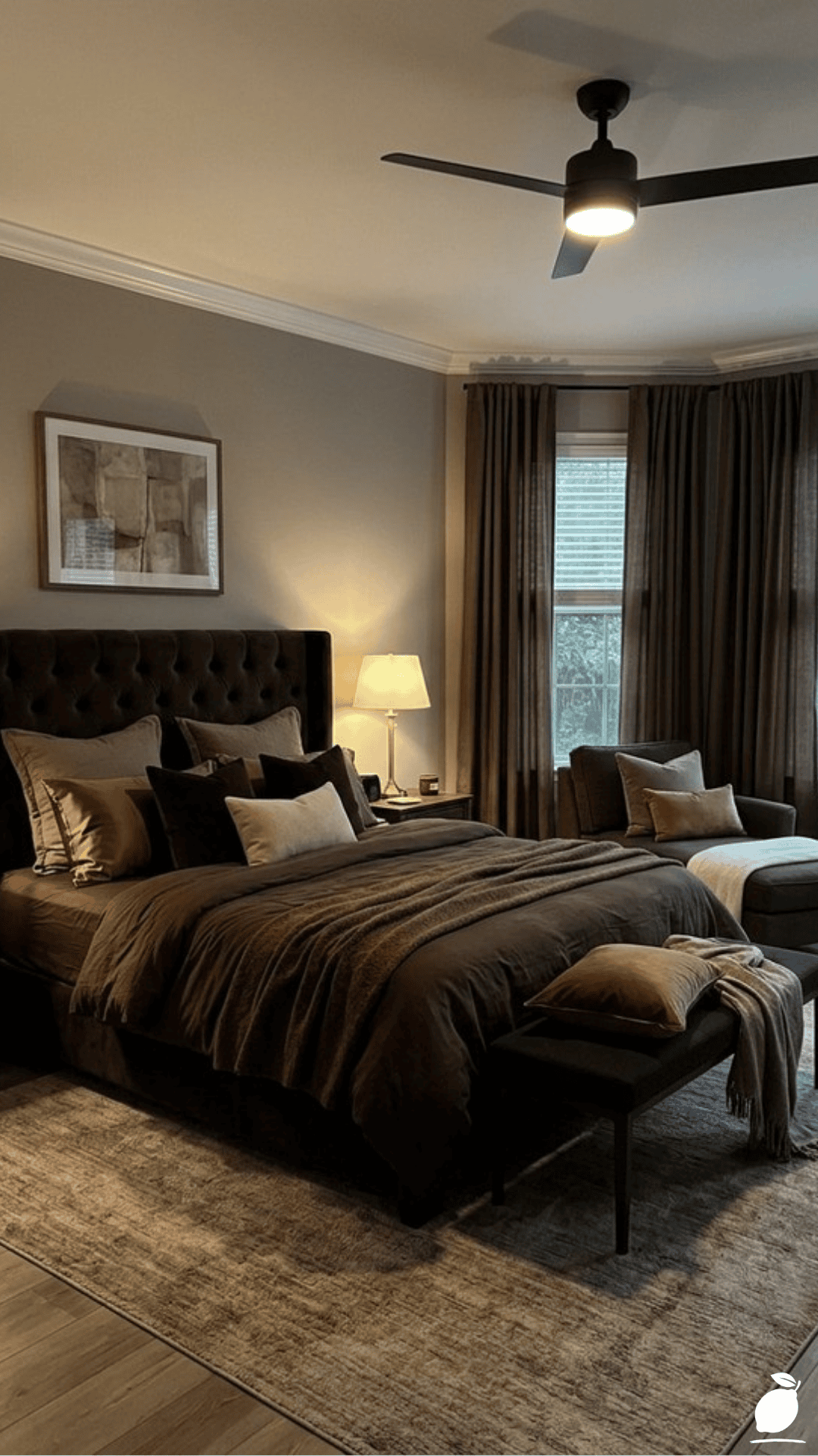
A bedroom with an existing dark wall color navy, charcoal, forest green can carry an autumn color palette through a warmer textile and accent layer without the risk of the room reading as heavy. Against dark walls, the autumn color palette’s accent colors shift toward the lighter, warmer end of the family: cream and gold rather than deep red, amber rather than rust, warm white rather than caramel. The dark wall provides the season’s depth automatically; the autumn color palette textiles provide its warmth. Add a warm white quilt or duvet in place of cool-toned bedding, introduce gold hardware and mirror frames, and position one warm botanical arrangement on the bedside table. The existing dark wall becomes the autumn color palette’s deepest tone, and the warmer accent layer sits against it with autumn warmth.
How many colors should an autumn color palette bedroom use?
The most effective autumn color palette bedroom uses three to four colors: one dominant neutral (warm white, cream, or warm greige), one deep accent (deep red, burnt orange, forest green, or mustard), one metallic (gold or warm brass), and optionally one secondary neutral that bridges the dominant and the accent (warm brown, tan, caramel). Adding a fifth color introduces visual complexity that works against the bedroom’s need for calm. Within the three-to-four color palette, variety is achieved through texture variation and tonal depth within each color using three different textures of the same deep red, for example, rather than introducing a fourth accent color to add interest. Restraint in the autumn color palette’s color count produces greater elegance and more effective seasonal warmth than abundance.