The paint color that was supposed to solve everything turned out to be the problem. I had chosen pure, bright, confident white for the living room refresh, and the result was a room that looked clean for approximately seventy-two hours before it started reading as something else entirely. Cold in the morning when the light came from the north. Greenish at noon under the overhead light I had not yet replaced. Lavender at dusk in a way I could not explain and could not unsee once I had noticed it.

Guests told me the room looked nice, and I believed them right up until the moment I realized that “nice” was what people said about rooms that were inoffensive rather than rooms that were genuinely good. I had painted white and produced clinical. I had wanted airy and produced an institutional one. The problem, which I would not fully understand for another six months and two rounds of repainting, was that I had chosen the wrong white. Not the wrong color. The wrong white. There is a difference that most people learn by painting the wrong one first.
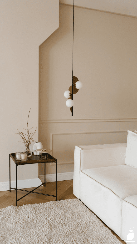
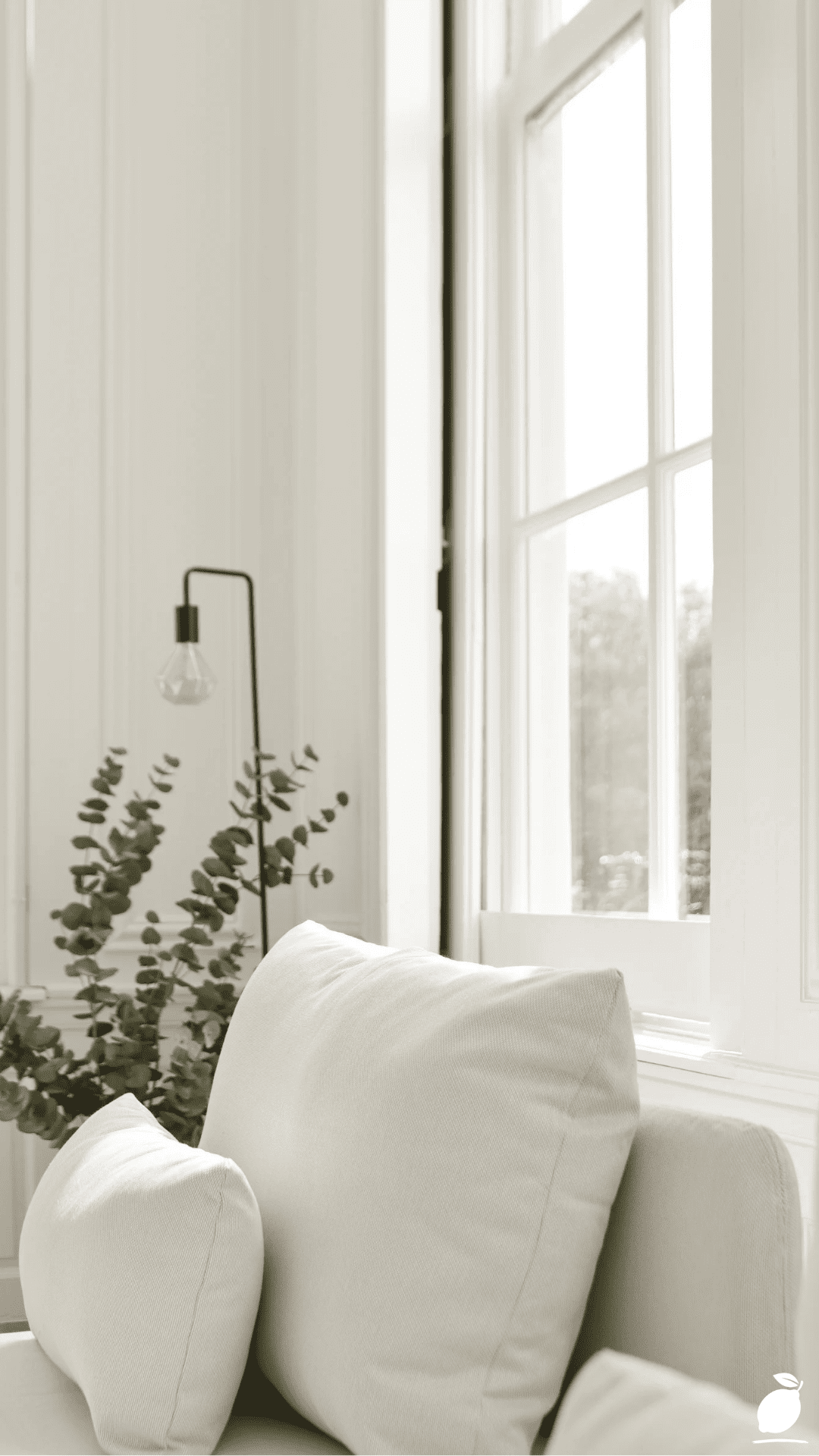
The room in the image above is the difference made visible. White walls with vertical panel detailing that glow rather than glare, the specific quality of warm white paint colors that have enough pigment warmth in their undertone to absorb and redistribute natural daylight rather than simply reflecting it at maximum brightness. The white upholstered armchair with its clean lines and curved armrests reads as a composed, intentional piece precisely because the wall behind it is warm white paint colors that support the chair’s cool white without competing with it.
The black minimalist floor lamp and the large white-framed window with divided panes provide the tonal anchoring that warm white paint colors require to define themselves. Warm white reads as warmer and as more specifically itself in the presence of black and glass and the specific silvery-green of the eucalyptus branches in the clear vase. The atmosphere is bright and airy and monochromatic, and every quality that makes it feel genuinely livable rather than photographically staged traces back to the warm white paint colors on the walls. These walls are doing the room’s most important work, and they are doing it by being exactly the right kind of white.
Warm white paint colors are the most misunderstood category in residential interior paint for the same reason my own white painting mistake was made: the word “white” obscures the entire spectrum of undertone variation that determines whether a white reads as warm and welcoming or cold and institutional. This guide gives you the complete framework for choosing warm white paint colors that deliver the atmospheric quality the image demonstrates, the specific knowledge of what makes a white warm, which warm white paint colors perform best in which light conditions, and how to apply warm white paint colors in a way that makes every room feel like the one in the image. These are the warm white paint colors decisions that make the difference between a room that looks painted and a room that looks considered.
The Warm White Paint Colors Blueprint
Step 1: Understand What Makes a White Paint Color Warm Before Choosing Any Shade
Warm white paint colors are not simply white paint with a slight off-white quality; they are white paint formulations in which the pigment base carries a specific warm undertone: yellow, red, orange, or brown pigment in small quantities that shift the white’s light reflectance toward the warm end of the color spectrum. The degree of warmth in warm white paint colors is determined by the quantity and type of these undertone pigments, and the spectrum runs from barely-warm (a white that reads as white in most conditions but prevents the blue-gray shift that pure optical white produces under warm artificial light) to visibly warm (a white that reads as cream or off-white in direct natural light and as rich warm ivory under lamp light).
Understanding where on this spectrum the warm white paint colors most useful to your specific home decor situation sit is the prerequisite for making any warm white paint colors purchase. A room that already has warm wood floors, warm leather furniture, and amber lamp shades needs warm white paint colors at the barely-warm end of the spectrum, enough warmth to prevent the walls from reading as cool against the room’s warm materials, but not so much warmth that the walls and the furnishings produce an accumulated warmth that tips the room from cozy into yellow. A room with cool gray furnishings, chrome hardware, and north-facing light needs warm white paint colors at the more visibly warm end of the spectrum, enough warmth to compensate for the room’s inherent cool quality and produce the atmospheric balance that the image demonstrates.
Write down the undertone direction of your room’s fixed materials, flooring, major furniture, and existing hardware before selecting any warm white paint colors. All warm materials together: choose barely-warm. All cool materials together: choose more visibly warm. Mixed materials: choose the balanced middle of the warm white paint colors spectrum, where the warmth is present but not dominant.
Step 2: Learn the Warm White Paint Colors Spectrum From Barely-Warm to Richly Creamy
The warm white paint colors spectrum that most residential home decor applications require runs through four distinct zones, each appropriate for different room conditions and home decor aesthetic directions. Understanding these zones in the context of specific, named warm white paint colors is the practical knowledge that prevents the paint chip overwhelm that strikes most homeowners in the white section of any paint store.
Barely-warm whites, the warmest whites that still read as white in most conditions, are the warm white paint colors that most closely replicate the image’s wall quality: clean, crisp, and bright in natural light, but with enough warmth to prevent the blue-gray or lavender shift that pure optical whites produce. Benjamin Moore Chantilly Lace (OC-65) is the purest white in this zone with barely perceptible warmth; Benjamin Moore White Dove (OC-17) is the quintessential barely-warm white that has defined the category for twenty years; Sherwin-Williams Alabaster (SW 7008) sits in the same zone with a slightly warmer, slightly creamier quality that makes it more forgiving in lower-light conditions.
Balanced warm whites with clearly warm undertones that still read as white rather than cream are the warm white paint colors’ sweet spot for most home decor applications. Farrow & Ball All White (No. 2005) provides a complex, slightly chalky warm white quality that reads as sophisticated in both natural and artificial light; Benjamin Moore Cloud White (OC-130) provides a warm, gentle quality appropriate for traditional and transitional home decor; Sherwin-Williams Creamy (SW 7012) sits at the boundary between balanced warm and richly creamy.
Richly creamy whites, warm white paint colors that read as distinctly cream rather than pure white in most light conditions, suit home decor situations where the aesthetic direction is specifically traditional, farmhouse, or French country. Benjamin Moore Navajo White (OC-95), Farrow & Ball Pointing (No. 2003), and Sherwin-Williams Antique White (SW 6119) are the most-specified warm white paint colors in this zone.
Step 3: Test Warm White Paint Colors in Your Room’s Specific Light Before Purchasing
No warm white paint color decision should be committed to without physical sample testing in the specific room where the warm white paint color will be applied, because warm white paint colors respond to each room’s specific light conditions in ways that paint chips, digital color renderings, and other people’s photographs cannot accurately predict for your specific space. The warm white paint color that produces the image’s airy, glowing wall quality in a south-facing room with generous window area may produce a yellow-cream result in a west-facing room under afternoon sun or a flat gray-white result in a north-facing room with limited natural light.
Order sample pots of the three to four warm white paint colors that appeal to you from the spectrum zones identified in Step 2. Apply each warm white paint color on a 30cm × 30cm section of foam board rather than directly on the wall. The foam board allows you to move each warm white paint color sample around the room and observe it at different positions, at different heights, and against different furnishings and materials without committing any paint to the actual wall surface.
Observe each warm white paint color sample at four distinct light conditions that the room experiences: morning natural light, midday natural light, late afternoon natural light, and evening artificial light from the lamps that will actually be used in the room. A warm white paint color that reads perfectly in three of these conditions and shifts unexpectedly in one, a warm white that looks cream-yellow under the room’s incandescent lamps, for example, is not the correct warm white paint color for that room, regardless of its reputation or reviews. The warm white paint color that reads consistently across all four conditions is the correct choice.
Step 4: Prepare Walls Properly for Warm White Paint Colors Application
Warm white paint colors reveal surface imperfections more specifically than mid-toned or deeply colored paints because their high light reflectance value (LRV), the percentage of light reflected from a painted surface, creates strong oblique light conditions that cast shadows at any raised texture, unfilled hole, or transition between different surface materials. A warm white paint color application on walls with unfilled nail holes, unfeathered spackle patches, or irregular texture from previous paint layers will show those imperfections in raking light more clearly than the same walls painted in any deeper color.
Fill all holes and indentations with lightweight spackling compound and allow to dry completely a minimum of two hours for small holes, four to eight hours for larger repairs. Sand all repairs flush with the surrounding wall surface using 150-grit sandpaper on a sanding block, then feather the sanded area with 220-grit sandpaper to eliminate the visible boundary between the repaired area and the original wall surface. Wipe all wall surfaces with a damp cloth to remove dust, grease, and fingerprint residue. Warm white paint colors applied over contaminated surfaces produce adhesion variation that is visible as a subtle but permanent texture difference in the finished paint film.
Apply a quality primer in a warm white or tinted white before the warm white paint colors’ topcoat, particularly if the existing wall color is significantly different from the planned warm white paint colors, or if the walls have new drywall patches that absorb paint differently from the existing painted surfaces around them. A primer tinted to approximately 50 percent of the warm white paint colors’ topcoat shade provides the most even topcoat coverage and most accurate final color reading.
Step 5: Apply Warm White Paint Colors in the Correct Finish for Each Room Application
Warm white paint colors are available in every sheen level from flat through high-gloss, and the finish selection is as important to the finished result’s quality as the color selection. The sheen level determines how much light the warm white paint colors’ surface reflects, which affects both the room’s perceived brightness and the color’s undertone visibility. Higher sheen levels make warm white paint colors appear slightly cooler (more light reflected = less color absorbed) and slightly more precise in their undertone expression; lower sheen levels make warm white paint colors appear slightly warmer and more chalky.
For warm white paint colors on living room, bedroom, and dining room walls, the home decor applications where the atmospheric quality of the image is the design goal use a matte or flat finish for maximum warmth and depth. The vertical panel detailing in the image’s warm white paint colors walls reads with the specific quality it demonstrates because the paint’s matte surface absorbs light at slightly different angles across each panel’s face and edge, creating the subtle dimensional interest that only matte warm white paint colors provide. Eggshell finish is appropriate for warm white paint colors in higher-traffic areas, and for homeowners who need wipeable walls, it provides enough sheen for reasonable cleaning durability without the reflectivity that compromises the warm white paint colors’ atmospheric warmth.
Reserve satin and semi-gloss warm white paint colors for trim, doors, and architectural details. The panel molding in the image would have been finished in a slightly higher sheen than the wall field, creating the subtle distinction between field and trim that traditional interior architecture expresses. Apply warm white paint colors to ceiling surfaces in the same color as the walls or within one shade lighter in the same undertone family for the enveloping quality the image demonstrates.
Step 6: Coordinate Warm White Paint Colors With the Room’s Furnishings and Accents
The warm white paint colors on the walls are not the room’s final design decision; they are the room’s foundation, and the furnishings, textiles, and accents placed against them determine whether the warm white paint colors produce the image’s specific airy, composed quality or simply produce more white. The image’s warm white paint colors work at their highest level because of the specific combination of elements placed against them: the white armchair with its clean-lined contemporary silhouette, the black floor lamp and window frame providing tonal definition, and the eucalyptus branches in the clear vase providing the one organic color note that prevents the warm white paint colors composition from reading as a white-goods display.
For home decor against warm white paint colors walls, apply the same principle the image demonstrates: one dominant material (the white upholstery that relates to the warm white paint colors walls through the white-to-white relationship), one dark anchoring element (the black lamp that prevents the warm white paint colors from reading as undifferentiated lightness), and one organic or natural accent (the eucalyptus that brings the living quality of the natural world into the warm white paint colors home decor composition). This three-element principle, dominant warm white relation, dark anchor, organic accent, is the home decor formula that most consistently produces the quality of result that warm white paint colors are capable of delivering when they are paired thoughtfully.
Expert Secrets for Success
Pro-Tips for a Better Result
Order sample pots of warm white paint colors in the exact finish you plan to use for the final application. The sheen of the sample and the sheen of the topcoat affect the warm white paint colors’ undertone appearance significantly. A matte sample of the same warm white paint color reads differently from an eggshell sample of the same color, because the matte surface absorbs more light and reveals the undertone more clearly than the eggshell surface’s slight reflectivity does. Most warm white paint color sample pots are produced in a single finish regardless of the planned topcoat finish, which means the sample may not accurately represent the topcoat result. If the warm white paint colors sample and topcoat finishes differ, apply the sample color in the planned topcoat finish on a foam board to see the accurate representation.
Apply warm white paint colors to the ceiling in the same color as the walls for the image’s enveloping quality. The specific glow of the image’s warm white paint colors the quality of luminosity that makes white read as warm and alive rather than cold and flat, is partly produced by the ceiling being in the same warm white paint color as the walls, which creates a complete warm white paint color enclosure that bounces warm undertone light across all surfaces simultaneously. A white ceiling above warm white paint colors walls creates a visual lid that interrupts this mutual light exchange and makes the warm white paint colors read as a wall color rather than an atmospheric environment.
Use warm white paint colors, panel detailing — vertical or horizontal — on one accent wall to replicate the image’s dimensional quality. The vertical panel detailing on the image’s warm white paint colors walls provides the surface dimension that flat drywall cannot, creating the subtle texture that makes warm white paint colors read as architecturally sophisticated rather than simply painted. Standard MDF beadboard, painted V-groove paneling, or applied molding strips create this panel effect on existing drywall in a single afternoon and transform the warm white paint colors application from a color choice into a material experience.
Test warm white paint colors in the room at night under the actual bulbs that will be used. Evening artificial light from standard warm-white LED bulbs (2700K to 3000K) dramatically amplifies the warmth in warm white paint colors, often pushing barely-warm and balanced-warm white paint colors toward a visible cream that reads quite differently from the daylight result. Testing warm white paint color samples under the room’s actual evening light conditions before committing, rather than assessing only in natural daylight and discovering the evening quality after the walls are painted, prevents the specific surprise of a warm white paint color that looked right during the day and reads orange-cream in the evening.
Common Mistakes to Avoid
Don’t choose warm white paint colors based on the paint chip’s appearance under store lighting. Paint store lighting is typically a combination of warm and cool sources designed to render paint chips as neutrally as possible, conditions that bear no relationship to the lighting in a residential living room, bedroom, or kitchen. Warm white paint colors that appear neutral and slightly warm under paint store lighting may read as strongly yellow-cream in a warm-lamp living room or as flat and cold in a north-facing room. Always test warm white paint colors in the specific room where they will be used, under the room’s actual light conditions, before purchasing full gallons.
Don’t apply warm white paint colors over existing dark or saturated wall colors without a stain-blocking primer. Deeply saturated or dark existing wall colors bleed through warm white paint colors topcoats in ways that are not immediately visible, but that become apparent over the first weeks after painting as the existing color’s pigments migrate through the new paint film and shift the warm white paint colors’ undertone in unpredictable directions. A stain-blocking shellac-based primer applied before warm white paint colors topcoats prevents this bleed-through entirely and is the correct preparation step for any warm white paint colors application over a previously saturated wall color.
Don’t use the same warm white paint colors on walls, trim, and ceiling in the same sheen level. The image’s refined quality comes partly from the distinction between the flat or matte warm white paint colors on the wall field and the slightly higher sheen of the trim and panel edges, a distinction that creates the subtle dimensional quality of a room that has been painted with architectural intentionality rather than practical efficiency. Using the same sheen on all surfaces produces a flat, undifferentiated warm white paint color result, where the architectural elements lose their definition. Apply flat or matte warm white paint colors to the wall field, eggshell to the ceiling, and satin or semi-gloss to all trim and architectural details.
Don’t rush the warm white paint colors’ dry time between coats. Warm white paint colors applied in a second coat before the first coat has dried completely produce the specific quality failure of uneven sheen patches where the second coat lifted or softened the first coat’s surface before it cured, creating permanent variations in the paint film’s surface texture that are visible under raking light and that no additional coats can smooth over once they have cured. Allow a minimum of four hours between warm white paint colors coats under normal temperature and humidity conditions, and assess the first coat’s dryness in the areas of lowest air circulation, corners, areas behind furniture, and areas adjacent to exterior walls before beginning the second coat application.
Why warm white paint colors Matter
Warm white paint colors matter because the wall color of a room is not a backdrop; it is a participant. The specific quality of light in a room, the specific quality of warmth a room extends to the people in it, and the specific quality of ease with which a room accepts furniture, textiles, and personal objects without fighting them are all determined more by the wall color than by any other single design decision. Warm white paint colors that are chosen correctly, that carry the right undertone for the room’s light, the right sheen for the room’s function, and the right warmth for the room’s furnishings, produce the atmospheric quality the image demonstrates: a room that feels genuinely good to be in, that reads as composed and considered without requiring the visitor to articulate why.
Research in environmental color psychology has consistently identified warm, light-reflective wall colors as among the most reliably positive residential environment conditions, specifically, that rooms with warm white paint colors at high light reflectance values produce lower physiological stress responses, higher perceived spatial comfort, and greater willingness to linger in the space than equivalent rooms in cool-toned or deeply colored walls. This is not a subjective quality of preference. It is the measurable effect of warm white paint colors on the human nervous system’s response to enclosed space, an effect that compounds across the thousands of daily hours spent in the rooms where warm white paint colors have been applied correctly.
Easy Peasy Life Matters is built on the conviction that the most fundamental home decor decisions, the paint colors on the walls, the quality of light those colors reflect, the specific atmospheric qualities they produce, are the decisions most worth getting right and the ones most frequently made by default or by accident. Warm white paint colors chosen with the knowledge this guide provides produce home decor results that guests feel when they walk into the room, before they can identify a single specific design decision that produced the feeling. That is the specific quality of warm white paint colors done right: they make the room feel like itself. They make the home feel like home.
Frequently Asked Questions
What is the most popular warm white paint color for home decor in 2026?
Benjamin Moore White Dove (OC-17) remains the most consistently specified warm white paint color in residential home decor for 2026, a barely-warm, versatile white with enough warm undertone to prevent the blue-gray shift of pure optical white while remaining bright enough to read as clean, crisp white in most light conditions. Sherwin-Williams Alabaster (SW 7008) is the most-specified warm white paint color in new construction and renovation projects for its exceptional performance in a wide range of lighting conditions. Farrow & Ball All White (No. 2005) is the most specified warm white paint color in premium home decor renovations for its complex, slightly chalky quality that photographs particularly well and reads as sophisticated in both natural and artificial light.
How do I know if a white paint color is truly warm or just off-white?
The most reliable method for identifying warm white paint colors from cool or neutral whites is the gray card test: hold a pure neutral gray card (available from photography suppliers) next to the white paint chip and observe any color shift in the white. If the white appears to shift toward yellow, orange, cream, or pink in comparison to the neutral gray, it carries a warm undertone and belongs to the warm white paint colors category. If it appears to shift toward blue, lavender, or cool gray in comparison to the neutral card, it is a cool or neutral white regardless of how warm it appeared on its own. This test eliminates the subjective assessment that viewing whites in isolation always produces.
Can warm white paint colors make a small room feel larger?
Yes, and warm white paint colors are the most effective paint choice for small rooms where the goal is maximum perceived spaciousness, because their high light reflectance value (LRV above 80) reflects the maximum amount of available light back into the space, while the warm undertone prevents the room from reading as clinical or cold. The key is choosing warm white paint colors at the barely-warm or balanced-warm zones of the spectrum rather than richly creamy whites. Creamy whites have lower LRV values that absorb more light and make small rooms feel slightly smaller and cozier rather than larger. Apply the warm white paint colors to the ceiling in the same shade as the walls (the five-wall application) for maximum perceived volume.
What trim color works best with warm white paint colors on walls?
The most versatile trim color for warm white paint colors on walls is a slightly brighter or slightly purer white in the same undertone temperature register, not a contrasting white (which creates a stark, two-tone effect) but a related white that is distinguished by sheen rather than color difference. Applying the same warm white paint color at satin or semi-gloss on trim and doors against the same color at matte on the walls creates the subtle sheen-based distinction that the image demonstrates: the trim catches the light slightly differently from the wall field, creating a dimensional quality without color contrast. If a true contrasting trim is desired, choose a bright white that shares the warm white paint colors’ undertone temperature, a warm bright white rather than a cool optical white.
How many coats of warm white paint do I need?
Most warm white paint colors require two full topcoat applications for complete, even coverage over a primed surface, and both coats are necessary even when the first coat appears to provide full coverage, because a single coat of warm white paint colors typically has insufficient film thickness to resist the minor abrasion and cleaning contact that walls receive in daily use. Warm white paint colors applied over a significantly different existing color (dark gray, saturated blue, or deep green) typically require three topcoat applications even over primer, because the high LRV of warm white paint colors makes any coverage inconsistency visible as a subtle color variation under raking light. Apply thin coats with full dry time between them rather than heavy coats to prevent the application-texture issues that thick coats of warm white paint colors consistently produce.