There’s a particular kind of Sunday afternoon panic that every home decorator knows well. You finally committed to navy blue, the deep, moody, gloriously rich navy blue you’ve been pinning for months, and now you’re standing in the middle of your living room holding a throw pillow, a paint swatch, and a quiet sense of dread. Everything you grab either clashes violently or disappears entirely against that dark, commanding backdrop. The room that was supposed to feel like a coastal escape now feels like the inside of a submarine. You love the color. You just can’t figure out what to put with it.
That feeling of visual chaos is more common than you think, and it has nothing to do with your taste. Navy blue is one of the most versatile, sophisticated colors in the entire design spectrum, but it plays by its own rules. It’s the strong, silent type of the color wheel. It doesn’t volunteer information. It doesn’t shout its compatible partners the way a pastel or a neutral might. Navy asks you to understand it before it rewards you, and when you finally do, the payoff is extraordinary. Rooms anchored by navy have a depth and intentionality that simply can’t be faked.
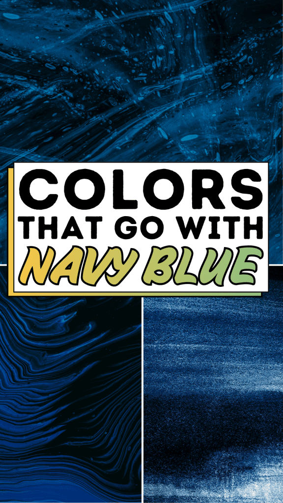
The image that inspired this post captures that quality perfectly: flowing, liquid waves of deep navy and midnight blue, layered with light and shadow, moving and calm at the same time. That’s exactly what a well-paired navy room feels like. So let’s break down the science, art, and easy-peasy logic behind what colors go with navy blue so your next design decision feels less like a gamble and more like a statement.
The What Colors Go With Navy Blue Blueprint

Step 1: Understand Navy Blue as Your Anchor Color
Before reaching for complementary shades, recognize what navy actually is: a deep, cool-toned blue with strong neutral tendencies. Unlike royal blue or cobalt, navy leans dark enough to function almost like a neutral; it grounds a room the way charcoal or espresso brown does. This means it can handle both warm and cool companions without losing its identity. Your job isn’t to “match” the Navy, it’s to respond to it.
Step 2: Start With Crisp White for Maximum Contrast
The single most reliable partner for navy blue is a clean, crisp white. White doesn’t compete, it clarifies. Think white trim against a navy wall, white linen bedding on a navy headboard, or white cabinet hardware in a navy kitchen. The contrast is classic, nautical, and endlessly elegant. Avoid cream or off-white if you want a modern feel; save those warmer whites for a cozier, more traditional pairing.
Step 3: Layer in Warm Metallics Gold, Brass, and Copper
Navy blue and gold is perhaps the most celebrated pairing in interior design for a reason: it’s royally luxurious without being overdone. Brass light fixtures, gold-framed mirrors, copper candleholders, and any warm metallic transforms navy from cool and contained to rich and inviting. Even small doses work powerfully. A single gold accent lamp in a navy room can elevate the entire space from “nice” to “intentional.”
Step 4: Add Warmth With Terracotta, Rust, and Burnt Orange
If you want your navy space to feel grounded and organic rather than cold and sleek, reach for earthy warm tones. Terracotta, rust, and burnt orange sit on the opposite side of the color wheel from blue, creating a vibrant but harmonious tension. A terracotta ceramic vase, rust-colored throw blanket, or burnt orange accent chair alongside navy furniture creates warmth without sacrificing sophistication.
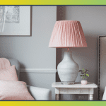
Step 5: Introduce Softness With Blush Pink and Dusty Rose
For bedrooms, nurseries, or living rooms that need to feel approachable and romantic, blush pink is a surprisingly perfect navy companion. The contrast between bold, dark navy and soft, whispery pink creates a balance that feels both modern and timeless. Dusty rose tones work even better than bright pinks; they carry enough gray to complement the navy’s depth without feeling juvenile.
Step 6: Embrace the Tonal Family Light Blues and Periwinkle
Navy doesn’t have to live in contrast. Pairing it with lighter shades from its own color family, sky blue, powder blue, or periwinkle creates a layered, monochromatic look that’s sophisticated and serene. Think of it like the waves in our featured image: different shades of blue coexisting beautifully, each defining the other through subtle variation. This approach works especially well in bathrooms and bedrooms.
Step 7: Ground It With Warm Neutrals: Camel, Tan, and Sand
If metallics feel too glam and bright colors feel too bold, warm neutrals are your answer. Camel leather, sandy linen, and tan wool all bring organic warmth to navy without demanding attention. A navy sofa with camel leather throw pillows and a jute rug is arguably one of the most effortlessly chic combinations in modern interior design and one of the easiest to pull off.
Step 8: Make a Bold Statement With Emerald Green
For the design-confident decorator, emerald green and navy is a jewel-toned combination that feels opulent and unexpected. These two deep, rich colors create drama when used together, perfect for an accent wall behind a navy sofa, or a navy and emerald patterned rug. Balance with plenty of white or natural wood tones to prevent the combination from overwhelming a space.
Step 9: Don’t Overlook the Power of Natural Wood Tones
Raw, natural wood, whether blonde oak, walnut, or weathered driftwood, is one of the navy’s most grounding companions. Wood tones bring warmth, texture, and an organic quality that softens navy’s intensity without diluting it. A navy room with exposed wooden beams, a reclaimed wood coffee table, or warm wood flooring feels collected and lived-in rather than showroom-stiff.
Step 10: Finish With Texture Over Color
Once you’ve established your palette, remember that texture is the final layer that makes a navy room feel complete. Velvet cushions, linen drapes, rattan baskets, and wool rugs all interact with navy differently under light, and that interaction is what creates visual richness. A navy room without texture variety can feel flat; the same navy room with layered textures feels like a place you want to stay.
Expert Secrets for Success

Pro-Tips for a Better Result
Test your pairings in natural and artificial light. Navy shifts dramatically between daylight and evening lamplight. A pairing that looks stunning at noon can feel muddy at 9 PM. Always hold swatches and fabric samples in the actual room at different times of day before committing.
Use the 60-30-10 rule. Let navy dominate at 60% (walls, large furniture), introduce your secondary color at 30% (textiles, rugs, curtains), and use your accent color, gold, terracotta, blush at just 10% (accessories, hardware, art). This ratio creates balance without monotony.
Embrace pattern mixing. Navy is one of the best colors for mixing patterns. Stripes, florals, geometrics, and botanical prints all look cohesive when anchored by a consistent navy base. The key is varying scale; pair a large-scale print with a small-scale one rather than two mid-scale patterns.
Let your grout and trim do the work. In kitchens and bathrooms with navy tile or cabinetry, white grout lines and trim create a visual rhythm that makes the navy look intentional rather than heavy.
Common Mistakes to Avoid
Avoid pairing navy with black. While this combination can work in very controlled, ultra-modern settings, navy and black together typically read as muddy and unresolved to the eye. If you love dark and dramatic, use charcoal gray instead of black to maintain contrast without visual confusion.
Don’t over-saturate with cool tones. Pairing navy with cool gray, cool white, and cool blue accessories can make a room feel clinical and unwelcoming. Always balance with at least one warm element: a wood tone, a warm metallic, or a warm-neutral textile.
Resist the urge to use too many accent colors. Navy is strong enough to work with multiple accent shades, but that doesn’t mean it should. Choosing one or two complementary colors and committing fully will always look more intentional than a scattered mix of four or five “navy-friendly” shades.
Don’t confuse navy with black on digital screens. When ordering online, navy can appear almost black on certain monitors. Always request physical samples before committing to large purchases like sofas, rugs, or paint.
Why What Colors Go With Navy Blue Matters

There’s something quietly profound about getting your home’s colors right. It might seem like a purely aesthetic concern, a matter of personal style or Pinterest inspiration, but the truth runs much deeper. The colors surrounding us every day have a measurable impact on our mood, our stress levels, and our sense of safety. A room that feels visually chaotic, where nothing seems to work together, generates a low-grade anxiety that most of us don’t even consciously register. We just know the space feels off, and that feeling follows us through our day.
When you find the right colors to live alongside your navy blue, when that camel leather chair finally lands next to the navy sofa, or when the brass lamp casts its warm glow against the deep blue wall, something settles. The room stops being a problem to solve and starts being a place to be. Children do homework more calmly in rooms with visual harmony. Partners have fewer friction-filled evenings when the shared space feels restful. You sleep more deeply when your bedroom isn’t quietly agitating you with mismatched tones.
Easy Peasy Life Matters is built on one core belief: that small, intentional choices compound into a life that feels more manageable, more beautiful, and more genuinely yours. Knowing what colors go with navy blue isn’t a decorating trivia point; it’s one small act of clarity that ripples through the entire atmosphere of your home. And a home that feels right is a home that holds your family better.
Frequently Asked Questions
Does navy blue go with gray?
Yes, but the type of gray matters significantly. Warm grays (those with beige or greige undertones) pair beautifully with navy, creating a sophisticated, contemporary look. Cool grays can work in very modern, minimalist spaces, but they risk making a room feel cold if not balanced with warm textures or metallic accents. When in doubt, test a warm gray first.
Can you use navy blue in a small room without it feeling cramped?
Absolutely. The key is balancing the navy’s visual weight with light. Use navy on a single feature wall rather than all four walls, incorporate plenty of mirrors and reflective surfaces, choose light-colored flooring, and make sure natural light can flow freely. A small room with one navy wall and white ceilings and trim can feel bold and cozy rather than claustrophobic.
What wood tones go best with navy blue?
Light to medium warm woods work best, think blonde oak, warm walnut, or honey-toned pine. Very dark wood tones like ebony can feel heavy alongside navy, while very pale white-washed woods can feel too cool. Mid-range warm woods strike the perfect balance, grounding the navy while keeping the space feeling light and livable.
Is navy blue a good color for a bedroom?
Navy is one of the best colors for a bedroom. Studies consistently show that blue tones promote restfulness and lower the heart rate, and navy’s depth adds a cocooning quality that makes sleeping spaces feel secure and private. Pair with soft white linens, warm brass accents, and light wood flooring for a bedroom that feels like a five-star retreat.
What colors should I absolutely avoid pairing with navy blue?
Beyond navy-on-black (generally avoid) and oversaturated cool palettes, be cautious with very bright, saturated colors like neon yellow, lime green, or hot pink. These combinations create visual tension that rarely resolves into elegance. If you love bold color alongside navy, reach for jewel tones, emerald, sapphire, and deep plum rather than neon or fluorescent shades.
How many colors can I pair with navy blue in one room?
Two to three is the sweet spot. Navy as your dominant color, one primary companion (white, camel, or blush), and one accent (gold, terracotta, or emerald) is typically all a room needs to feel complete. Adding a fourth or fifth color often dilutes the intentionality that makes navy rooms so compelling. Restraint is the secret ingredient.