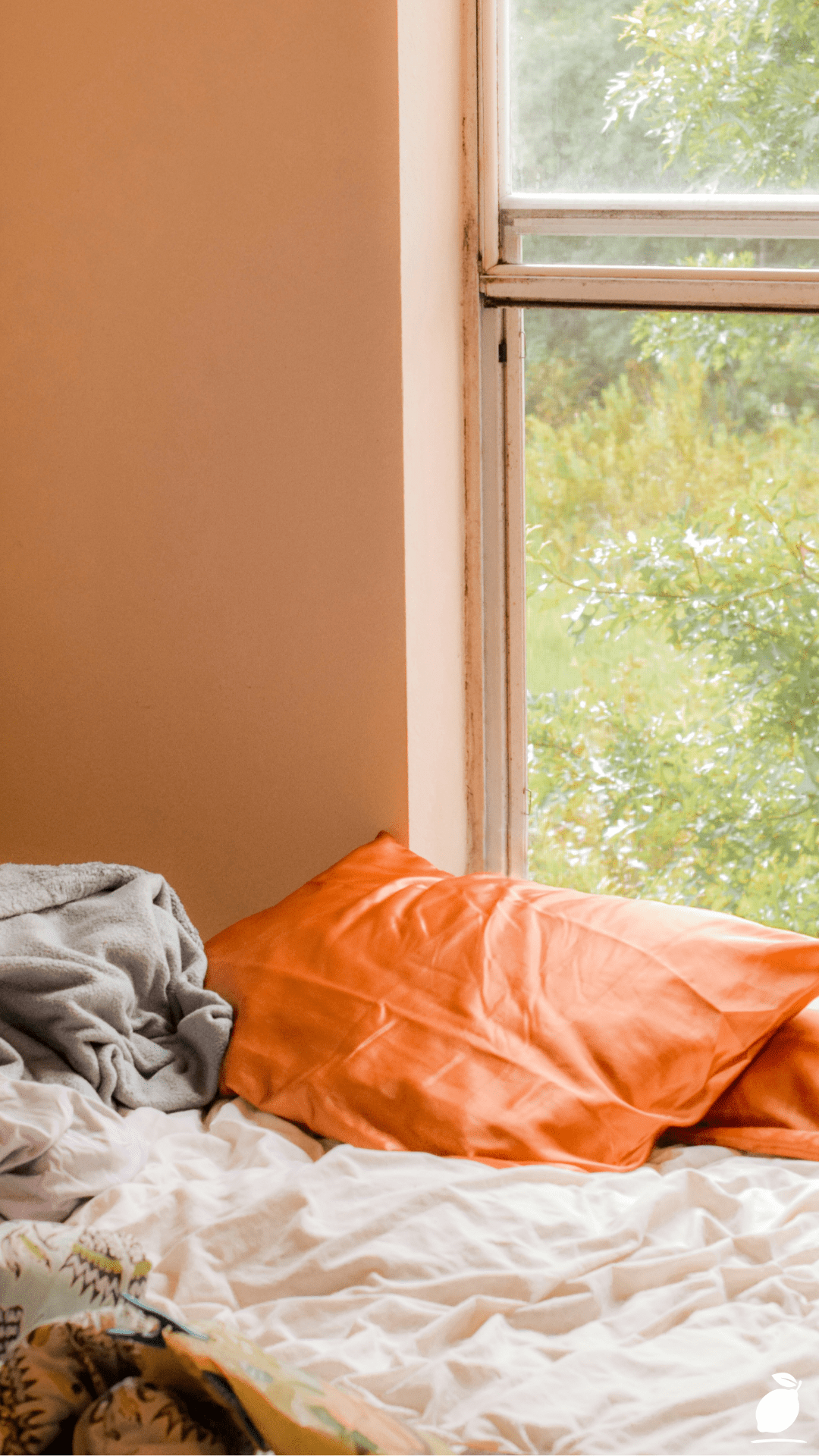
You know that feeling when you finally commit to a bold color and then spend the next three weeks second-guessing every single decision that follows? That was me, standing in my bedroom doorway at 7 a.m., coffee in hand, staring at a freshly painted peachy-burnt-orange wall that I absolutely loved but had absolutely no idea how to style. The bedding was wrong. The throw blanket felt off. The whole room looked like it was trying too hard and not hard enough at the same time. I’d made the brave choice, but somewhere between the paint swatch and the finished wall, I’d forgotten to plan everything else around it.
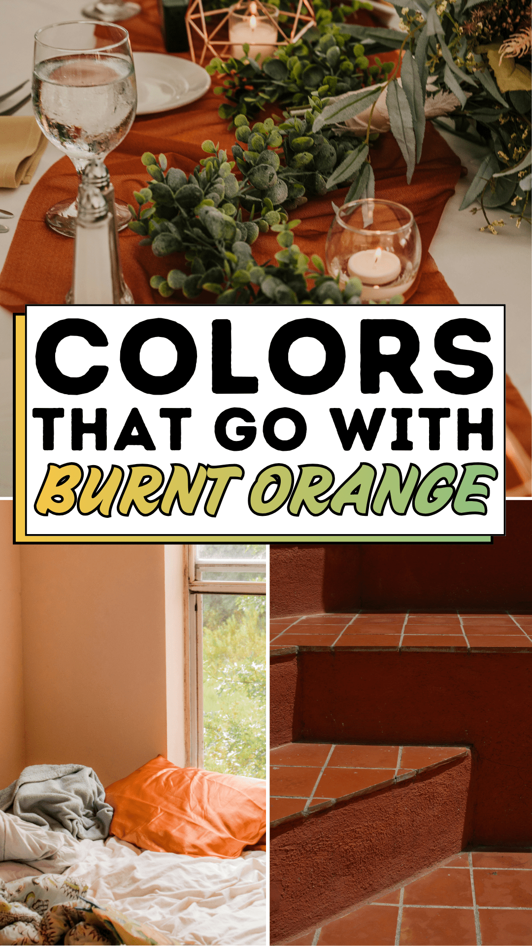
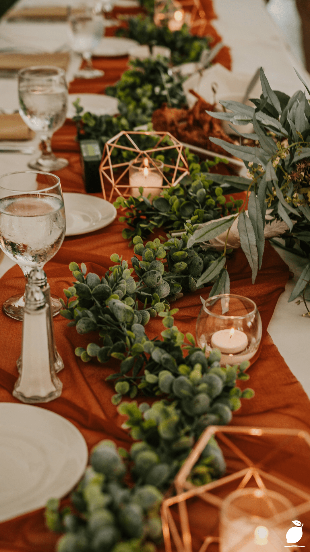
Here’s the thing nobody tells you about decorating with warm, earthy tones: Burnt orange is one of the most forgiving and flattering colors you can bring into a home, but it does ask something of you. It asks for intention. It wants companions that either ground its warmth or let it breathe, and when you get that balance right, the whole room shifts. It stops feeling like a design experiment and starts feeling like a home. Like the bedroom in the image that inspired this post, warm walls glowing against white window frames, lush green foliage outside, and crisp white bedding anchoring everything. That’s not an accident. That’s color harmony doing its quiet, powerful work.
If you’re sitting with a burnt orange accent wall, a rust-toned sofa, terracotta pots, or even just a pile of burnt-orange throw pillows and wondering what on earth goes with them, this guide is for you. We’re breaking it all the way down: from the colors that pair beautifully to the combinations that fall flat to the expert-level tricks that make the whole palette feel pulled together and intentional. Let’s turn that “what was I thinking?” moment into a “this is exactly what I envisioned” room.
The Burnt Orange Blueprint
Step 1: Anchor with Crisp, Clean White
White is the single most powerful partner for burnt orange, and it’s not even close. White window frames, white bedding, white trim, white lampshades, all of these create visual breathing room that prevents the warmth of burnt orange from feeling overwhelming. Think of white as the pause between sentences: it gives the eye somewhere to rest before returning to the richness of the orange. Use at least 30% white in any room featuring burnt orange as a dominant wall or furniture color. Crisp, cool whites (not warm cream) work best because the contrast makes the orange pop without muddying it.
Step 2: Ground the Space with Deep Charcoal or Warm Gray
Gray is burnt orange’s most sophisticated companion. A warm gray or charcoal blanket draped across the foot of a bed, gray area rugs, or slate-toned furniture frames creates an immediate sense of balance. Gray absorbs some of the intensity of burnt orange while adding a modern, grounded quality to the space. Avoid cool blue-grays here; they’ll clash with the warmth of orange. Instead, reach for grays (gray-beige hybrids), mushroom tones, or deep charcoals that have a warm undertone baked in.
Step 3: Invite the Outdoors in with Forest and Olive Green
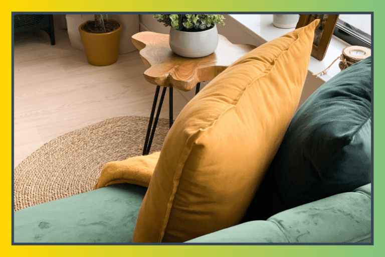
Look out any window near a burnt orange wall on a sunny afternoon and you’ll see what nature already figured out: green and orange are made for each other. Olive green, sage, forest green, and even deep hunter tones all live beautifully beside burnt orange. They share an earthy, autumnal DNA. Use green in textiles, pillowcases, curtain panels, potted plants, or upholstered chairs, to create an organic, nature-inspired palette that never feels forced. The bedroom image in this post is a perfect real-life example: the green foliage through the window acts as a natural accent color that ties the whole scene together.
Step 4: Add Depth with Navy Blue or Ink Tones
For something more dramatic and design-forward, navy blue or deep indigo makes a stunning contrast pair with burnt orange. This is a complementary color relationship on the color wheel, blue and orange sit opposite each other, which creates high visual energy without feeling garish. Keep navy to accent pieces: a patterned throw pillow, a floral duvet cover with dark navy blooms (like the one partially visible in the inspiration image), or a single navy upholstered headboard. Let burnt orange lead; let navy punctuate.
Step 5: Warm the Palette Further with Cream, Caramel, and Natural Wood
Burnt orange belongs to a rich family of warm earth tones, and leaning into that family creates rooms that feel cohesive, cozy, and deeply livable. Cream-colored walls, caramel leather accents, honey-toned wooden furniture, and warm brass or gold hardware all amplify the richness of burnt orange without competing with it. This layered approach, warm tone stacked on warm tone, is the secret behind those Pinterest-perfect rooms that look effortlessly put together.
Step 6: Use Black Sparingly as a Sharp Accent
A touch of matte black, in a lamp base, a picture frame, cabinet hardware, or a candle holder, acts like a full stop at the end of a sentence. It sharpens the entire palette, adds contrast, and prevents the room from reading as too soft or too sweet. The keyword here is “sparingly”: 5 to 10% black goes a long way. More than that, and you risk flattening the warmth that makes burnt orange so inviting in the first place.
Expert Secrets for Success
Pro-Tips for a Better Result
Test your pairings in natural light. Burnt orange changes dramatically depending on the light source. A color that looks perfect under warm indoor lighting might clash in bright daylight. Always hold fabric swatches and paint chips up near your windows before committing. The creamy white that looked beautiful in the store may read as yellow in your specific light conditions.
Follow the 60-30-10 rule. In any room anchored by burnt orange, designate your dominant color (60%), secondary color (30%), and accent (10%) before buying a single item. For example: white walls (60%), burnt orange textiles and accents (30%), deep charcoal or navy (10%). This keeps the palette from spiraling into a chaotic mix of competing warm tones.
Layer textures to add dimension. When you’re working with a warm, rich color like burnt orange, flat surfaces can make the room feel heavy. Break it up with linen, chunky knit, velvet, rattan, and matte ceramics. Varied textures catch light differently and create the visual complexity that makes a room feel professionally styled.
Let nature do some heavy lifting. Houseplants, particularly those with large, dark leaves like rubber trees, fiddle leaf figs, or monstera, are the easiest, most affordable accent “color” you can add to a burnt orange room. They introduce green organically, add life, and soften the intensity of the warm palette.
Common Mistakes to Avoid
Pairing burnt orange with hot pink or bright red. Both of these colors share the warm spectrum with burnt orange, and layering them together creates a visually chaotic, overwhelming space. Burnt orange needs contrast partners, not color relatives that compete for the same visual territory.
Using too many warm tones without a cool anchor. It’s tempting to keep layering earthy warmth, terracotta, rust, caramel, amber, but without a cool-toned anchor (white, gray, navy, or green), the room starts to feel suffocating. Every warm palette needs at least one cool element to create balance.
Choosing the wrong white. Warm or yellow-tinted whites next to burnt orange will muddy the palette and make both colors look dingy. Reach for bright, clean, slightly cool whites to create the crisp contrast that makes burnt orange look intentional and polished.
Ignoring the ceiling and floor. Many decorators nail the walls and furniture and then forget that ceilings and floors are part of the palette too. A stark white ceiling and a mid-toned natural wood floor can harmonize beautifully with burnt orange walls. A dark floor and an off-white ceiling, on the other hand, can throw the entire balance off.
Why Burnt Orange Color Pairing Matters
We don’t talk enough about how much the colors in our homes affect the way we feel inside them. Neuroscience has been quietly confirming what interior designers have known for decades: warm, earthy tones like burnt orange promote feelings of comfort, security, and connection. They signal to the brain that this is a safe, nourishing space, the visual equivalent of a warm meal or a long exhale. But when those tones are paired poorly, surrounded by clashing colors or competing visual noise, that comfort signal gets scrambled. The room feels unsettled, and so do we.
Getting your burnt orange palette right isn’t a vanity project; it’s an investment in your daily well-being. It’s the difference between waking up in a room that energizes and grounds you versus one that quietly drains you before your feet hit the floor. For parents, it matters even more: children absorb the emotional atmosphere of their home environments deeply and consistently. A bedroom or living room with a thoughtful, harmonious color story communicates calm, stability, and care in ways that no amount of tidying can fully replace.
The good news is that you don’t need a designer’s budget or a decorator’s eye to get it right. You need a framework, and now you have one. One intentional color decision at a time, you build a home that doesn’t just look good in photos but also feels good to live in every single ordinary day. That’s what Easy Peasy Life Matters is all about: making the small, meaningful changes that add up to a life that feels genuinely, sustainably good.
Frequently Asked Questions
What color pairs best with burnt orange in a bedroom?
Crisp white is the single best pairing for a burnt orange bedroom. White bedding, white window frames, and white trim create a clean contrast that allows burnt orange to feel warm and inviting without becoming overwhelming. Add warm gray or charcoal as a secondary neutral and pull in soft greens through plants or textiles for a complete, cohesive palette.
Does grey go with burnt orange?
Yes, warm gray and charcoal are excellent companions for burnt orange. The key is to choose grays with a warm or neutral undertone rather than cool blue-grays, which can clash with the warmth of orange. A charcoal gray throw blanket or rug grounds a burnt orange room beautifully and adds a modern, sophisticated edge.
What accent colors work with a burnt orange wall?
The best accent colors for a burnt orange wall are deep navy blue, forest or olive green, warm white, and matte black. Navy creates a complementary contrast; green echoes the natural, earthy quality of burnt orange; white opens the space up; and a touch of black sharpens the entire palette. Avoid pairing burnt orange accent walls with red, hot pink, or bright purple, as these clash on the warm spectrum.
Is burnt orange a good color for small rooms?
Burnt orange can absolutely work in small rooms when balanced correctly. The key is to use it on a single accent wall rather than all four walls and to pair it with plenty of white and light-toned neutrals. Large mirrors, natural light, and minimal clutter help prevent a small burnt orange room from feeling closed in. The warmth of the color actually creates a cozy, intentional atmosphere in compact spaces.
What wood tones go with burnt orange décor?
Warm, honey-toned woods, like light oak, walnut, and teak, pair beautifully with burnt orange because they share the same warm, earthy undertones. Avoid very dark or very cool-toned woods (like ebonized or gray-washed finishes), which can compete with or flatten the warmth of the orange palette. Natural rattan and bamboo accents also work wonderfully in burnt orange rooms.
Can burnt orange work in a modern or minimalist home?
Absolutely. In a minimalist or modern setting, burnt orange works best as a single bold accent, a statement chair, a pair of throw pillows, or one dramatic piece of artwork, against a backdrop of white, concrete gray, or warm cream. The restraint of a minimalist design actually makes burnt orange sing; it becomes the focal point, the eye is drawn to without competition from other decorative elements.