
It started as so many home improvement spirals do, with a single paint chip. You pulled it off the rack at the hardware store because the name sounded right and the color looked perfect in the fluorescent light of the aisle. You brought it home, held it against the wall, and felt immediately uncertain. By the end of the weekend, you had fourteen chips taped to three different walls, each one looking completely different from every other one and nothing at all like what you imagined, and you were no closer to a decision than when you started. Paint color selection should be simple. It is, for most people, genuinely not, and the gap between the color you see on a chip and the color you live with on four walls of a real room is one of the most frustrating disconnects in all of home design.

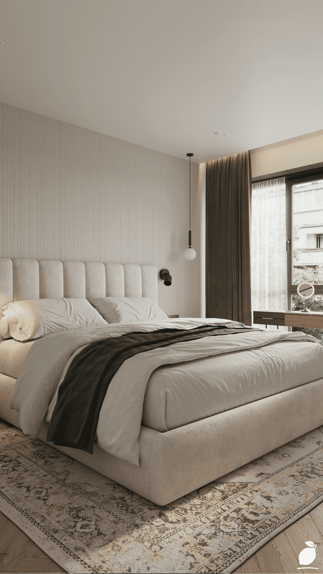
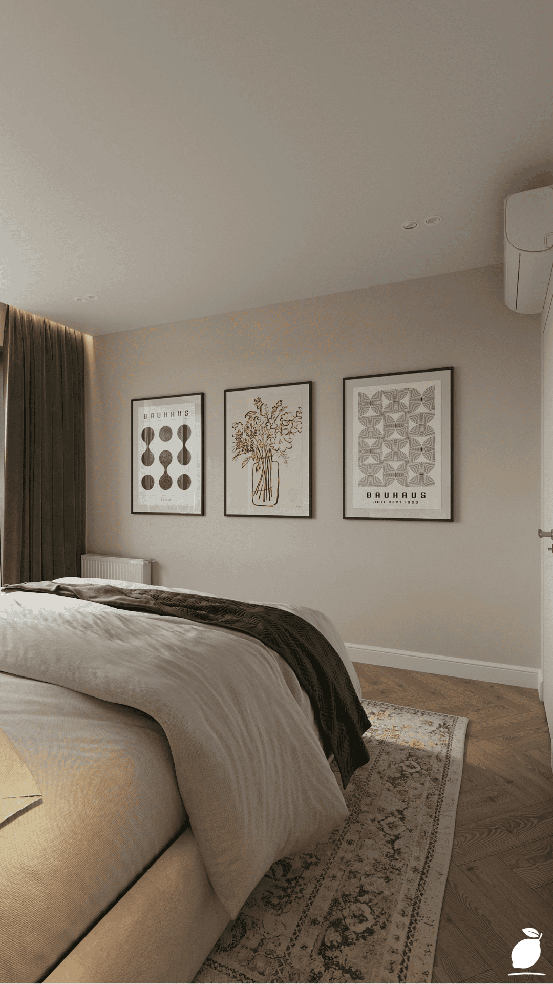
What makes the difference between a paint color that transforms a room and one that just changes it is a combination of factors most people don’t know to look for: undertone, light response, sheen level, and how the color behaves in relationship to the fixed elements already in the room, the floor, the trim, the furniture, the art. The serene, sophisticated bedroom in this guide demonstrates exactly what a well-chosen neutral palette looks like when every element has been considered together: warm beige walls that read as neither yellow nor pink but simply warm, light gray bedding that creates depth without coolness, herringbone wood floors that anchor the room in natural warmth, and layered art that introduces color as an accent rather than a commitment. Every tone in that room is doing intentional work. None of it happened by accident.
Sherwin Williams paint colors are among the most trusted and most extensively tested in the residential design market, and in 2026, the brand’s most popular selections reflect a clear shift toward the kind of grounded, sophisticated neutrals that make rooms feel both beautiful and genuinely livable. Whether you’re painting a single bedroom or planning a whole-house palette refresh, this guide will walk you through the most popular Sherwin Williams paint colors of the year, how to choose between them for your specific space, and the exact process for getting the result right the first time. Let’s get into it.
The Sherwin Williams Paint Colors Blueprint
Selecting and applying Sherwin Williams paint colors successfully is a sequential process. Work through these steps in order, and you’ll move from overwhelmed to confident with a finished room that looks every bit as intentional as the one in this guide.
Step 1: Identify Your Room’s Fixed Elements Before Choosing Sherwin Williams Paint Colors
The single most important step in choosing Sherwin Williams paint colors is one that happens before you look at a single color: identifying the undertones already present in your room’s fixed, unchangeable elements. Your flooring, trim, cabinetry, countertops, and large furniture pieces all carry undertones of subtle warm, cool, or neutral leanings that will either harmonize or clash with the Sherwin Williams paint colors you choose. Light herringbone wood flooring like the room in this guide carries warm yellow and honey undertones. If you paint the walls in a cool blue-gray, those warm floor tones will fight the cool wall, and the room will feel visually unsettled. Paint the walls in a warm beige or greige, and the floor and wall breathe together. Undertone awareness is the foundation of every successful Sherwin Williams paint color selection.
Step 2: Understand the 2026 Most Popular Sherwin Williams Paint Colors
The most popular Sherwin Williams paint colors in 2026 reflect a clear industry trend away from the cool, gray-dominant palettes of the previous decade and toward warmer, more organic neutrals with genuine character. The top performers across bedroom, living room, and whole-home applications include:
- Accessible Beige (SW 7036) is the perennial bestseller among Sherwin Williams paint colors for good reason. A warm, greige tone with subtle yellow-beige undertones that reads as natural and sophisticated in virtually every light condition. Pairs beautifully with white trim and warm wood floors, exactly the combination shown in this bedroom guide.
- Agreeable Gray (SW 7029) has been the most popular Sherwin Williams paint color for the past several years running, and is still one of the top performers in 2026. A warm gray with beige undertones that bridges the gap between classic gray and classic beige, giving you the visual modernity of gray without the coldness that plagues blue-based grays.
- Repose Gray (SW 7015) a slightly cooler, more purely gray option that remains one of the most popular Sherwin Williams paint colors for contemporary and transitional interiors. It photographs beautifully, pairs well with white and black accents, and holds its tone across a wide range of lighting conditions.
- Alabaster (SW 7008) is the most popular of the Sherwin Williams paint colors in the white family. A warm, creamy white with soft yellow undertones that feels far more inviting than stark bright whites while still reading as clean and light-filled. Ideal for trim, ceilings, and doors, as well as main wall color in rooms that benefit from maximum brightness.
- Passive (SW 7064) is a rising star among Sherwin Williams paint colors in 2026. This sophisticated soft gray with subtle green-blue undertones works beautifully in bedrooms and bathrooms where a quiet, serene tone is desired. It shifts elegantly between warm and cool depending on the light source, giving it exceptional versatility.
- Worldly Gray (SW 7043) is positioned between Agreeable Gray and Repose Gray in the Sherwin Williams paint color family. This warm-neutral gray reads as grounded and organic. It pairs particularly well with warm wood tones and natural textile materials, making it one of the most complementary Sherwin Williams paint colors for rooms featuring herringbone or oak flooring.
Step 3: Sample Sherwin Williams Paint Colors on Your Actual Walls
Choosing Sherwin Williams paint colors from chips or digital screens is never sufficient for final decision-making. Purchase sample pots of your top two or three Sherwin Williams paint colors and apply each to a 12″ x 24″ area on at least two different walls in the room, one that receives direct natural light and one that sits in shadow. Observe each sample across morning, midday, and evening light, and under your room’s artificial lighting. Sherwin Williams paint colors can shift significantly between daylight and lamplight. Agreeable Gray, for example, can read as lavender under certain LED temperatures and as warm golden-beige in afternoon sunlight. The sample observation period of 48 hours is the single step most DIY painters skip and the one that causes the most regret.
Step 4: Choose the Right Sheen for Each Application
The sheen level of your chosen Sherwin Williams paint colors affects both how the color appears on the wall and how the surface performs over time. For bedroom walls where a soft, sophisticated finish is the goal, Sherwin Williams’s Matte or Flat finish in their Emerald or Cashmere line produces the most beautiful, photography-ready result. The matte surface absorbs light rather than reflecting it, which makes Sherwin-Williams’s paint colors appear richer and deeper. For trim, doors, and window frames, choose Sherwin-Williams paint colors in a Semi-Gloss finish for durability and the subtle sheen that defines architectural edges. For ceilings, Flat white is always the correct choice; it eliminates brush stroke visibility and prevents the ceiling from competing with the wall color for visual attention.
Step 5: Prepare the Surface Before Applying Sherwin Williams Paint Colors
Sherwin Williams paint colors perform best on properly prepared surfaces, and the gap between a professional-looking result and a mediocre one is almost always in the preparation rather than the painting itself. Fill all holes and cracks with lightweight spackle and sand smooth. Clean walls with a TSP substitute solution to remove grease, dust, and residue that prevent adhesion. Prime any raw drywall, drastic color changes, or stain-prone surfaces with Sherwin Williams’s ProMar 200 or Extreme Block primer before applying your chosen color. Without primer, even the most popular Sherwin Williams paint colors will require additional coats for full coverage and may show bleed-through from underlying colors or stains.
Step 6: Apply Sherwin Williams Paint Colors With the Correct Technique
Apply Sherwin Williams paint colors using a high-quality roller (3/8″ nap for smooth walls, 1/2″ nap for textured surfaces) and a premium synthetic brush for cutting in at edges and corners. Work in sections: cut in the perimeter of each wall with a brush, then immediately roll the field while the cut-in line is still wet. This wet-edge technique prevents lap marks at the transition between brush and roller work. Apply a minimum of two coats of your chosen Sherwin Williams paint colors, allowing full drying time between coats as specified on the can. Do not rush the second coat; applying it before the first is fully dry is the most common cause of uneven, streaky results, even with premium Sherwin Williams paint colors.
Expert Secrets for Success
Pro-Tips for a Better Result
- Use Sherwin Williams’s ColorSnap Visualizer before purchasing samples. The ColorSnap app allows you to photograph your actual room and digitally apply any of the Sherwin Williams paint colors to your walls before committing to a single sample pot. While it doesn’t replace physical sampling, it effectively eliminates obviously wrong choices before you spend money on samples, narrowing your field from hundreds of Sherwin Williams paint colors to the three or four that genuinely work in your space.
- Choose Sherwin Williams paint colors from the same Color Collection for a whole-home palette. Sherwin Williams organizes their paint colors into curated Color Collections where every tone is designed to coexist harmoniously. If you’re choosing Sherwin Williams paint colors for multiple rooms, selecting from a single collection such as the Pottery Barn, Restoration Hardware, or Emerald Designer Edition Collections ensures that your whole-home palette flows cohesively from room to room without jarring transitions.
- Always paint your ceiling color before your wall color. When applying Sherwin Williams paint colors to both ceiling and walls, paint the ceiling first and allow it to dry completely before cutting in the wall color at the ceiling line. Ceiling paint inevitably drips and spatters onto the wall surface during application. Painting the walls second means any ceiling overage is covered cleanly by the wall color rather than requiring touch-up on a finished ceiling.
- Add a second accent color through art and textiles, not paint. The most sophisticated rooms built around Sherwin Williams paint colors use the wall color as the serene, consistent backdrop and introduce personality through framed art, throw pillows, area rugs, and textiles. A red floral print and bold geometric art against a beige wall create a far more dynamic, layered room than three differently colored accent walls, and it’s completely reversible if your taste evolves.
- Buy all your paint from the same production batch. Even within the same Sherwin Williams paint color formula, slight batch-to-batch variation can produce perceptible differences between cans visible as subtle tonal shifts on a finished wall. Purchase all the paint you need for a single room in one trip, from cans produced in the same batch (check the batch number on the bottom of the can), and combine them by pouring them into a large bucket and stirring them together before beginning a professional technique called “boxing” the paint.
Common Mistakes to Avoid
- Choosing Sherwin Williams paint colors based on the chip alone. Paint chips represent the color at full saturation in standardized lighting conditions that exist nowhere in a real home. The most popular Sherwin Williams paint colors look dramatically different in warm incandescent light, cool LED light, north-facing rooms, south-facing rooms, and rooms with colored flooring or furniture. Never make a final decision on Sherwin Williams paint colors without sampling on your actual walls in your actual room.
- Skipping primer when switching from dark to light Sherwin Williams paint colors. The premium quality of Sherwin Williams paint colors does not eliminate the need for primer when making a significant value shift from dark navy to light beige, for example. Without primer, dark undertones bleed through even four coats of light Sherwin Williams paint colors, resulting in an uneven, slightly muted finish that looks nothing like the chip. Sherwin Williams’s High Hide primer is specifically formulated for dramatic color transitions and saves both time and paint.
- Using inconsistent sheen levels on adjacent surfaces. Choosing Sherwin-Williams paint colors in a flat finish for walls but applying them in eggshell or satin on trim within the same color family creates a visual inconsistency that reads as an error rather than a design choice. Sheen transitions should always be intentional: flat or matte on walls, eggshell or satin on doors, semi-gloss on trim and moldings. Applying the wrong sheen is one of the most common DIY mistakes, even when the Sherwin-Williams paint colors themselves are perfect.
- Painting in cold or humid conditions. Sherwin Williams paint colors require temperatures between 50°F and 90°F and relative humidity below 85% for proper adhesion and curing. Painting in cold basements, humid bathrooms without ventilation, or during rainy weather causes extended drying times, poor film formation, and adhesion failures that cause even the best Sherwin Williams paint colors to peel prematurely. Check conditions before beginning and use a dehumidifier or space heater in problem environments.
- Choosing trendy Sherwin Williams paint colors over colors that suit your fixed elements. The annual Color of the Year and trending palette reports are useful for inspiration, but the most popular Sherwin Williams paint colors in a given year may or may not be the right choice for your specific room’s undertones, light conditions, and existing furnishings. A color that trends beautifully in a high-ceiling, south-facing studio loft can look completely wrong in a low-ceiling, north-facing bedroom. Always let your room’s specific conditions lead your selection, using trend reports as a starting point rather than a prescription.
Why Sherwin Williams Paint Colors Matter
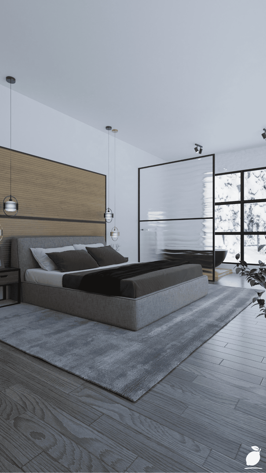
Paint is the single most cost-effective transformation available in any home, a truth that both first-time homeowners and seasoned renovators rediscover every time they stand in a freshly painted room and feel the shift in the space’s entire emotional quality. Sherwin Williams paint colors, chosen with intention and applied with care, do something that furniture and decor cannot: they change the room itself rather than what’s in it. The walls are the largest visual surface in any interior space, and when those surfaces are the wrong color, too cool, too warm, too flat, too stark, no amount of beautiful furniture or carefully styled accessories can fully compensate. When the Sherwin Williams paint colors are right, the room comes into focus. Everything else settles into place around them.
Beyond aesthetics, the right Sherwin Williams paint colors have a measurable effect on how people feel inside a home and how families function within its walls. The warm beige and soft gray tones that dominate the most popular Sherwin Williams paint colors of 2026 are not accidental choices. They reflect decades of environmental psychology research on which tonal environments support relaxation, focus, ease of conversation, and emotional accessibility. A bedroom painted in Accessible Beige or Agreeable Gray is a room where the nervous system is gently cued toward rest the moment you enter. A living room in Worldly Gray or Repose Gray is a room where family conversations are more likely to happen naturally, where children settle into homework, where partners wind down from the day together. The right Sherwin Williams paint colors are not merely decoration; they are the architecture of daily emotional life.
Frequently Asked Questions
What is the most popular Sherwin Williams paint color in 2026?
Agreeable Gray (SW 7029) continues to hold its position as one of the most popular Sherwin Williams paint colors in 2026 for whole-home and bedroom applications. Its warm gray with beige undertones makes it extraordinarily versatile across lighting conditions and complementary to virtually every flooring and furniture tone. Accessible Beige (SW 7036) and Alabaster (SW 7008) round out the top three most popular Sherwin Williams paint colors of the year for residential interiors.
What is the difference between Agreeable Gray and Repose Gray?
Both are among the most popular Sherwin Williams paint colors for neutral interiors, but they have distinct undertone profiles. Agreeable Gray (SW 7029) leans warmer; it has beige and taupe undertones that give it a cozy, organic quality, making it ideal for rooms with warm wood floors and furnishings. Repose Gray (SW 7015) leans slightly cooler and more purely gray, with subtle purple undertones that can emerge in certain lighting conditions. Repose Gray tends to work better in more contemporary, cooler-toned interiors, while Agreeable Gray is the stronger choice for traditional, transitional, and warm-floored spaces.
How do I know if a Sherwin Williams paint color has warm or cool undertones?
The most reliable way to assess undertones in Sherwin Williams paint colors is to hold the chip next to a pure white piece of paper in natural daylight. If the chip reads as slightly yellow, peach, or pink next to the white, it has warm undertones. If it reads as blue, purple, or green, it has cool undertones. You can also compare directly to other Sherwin Williams paint colors in the same value range. Placing Agreeable Gray next to Repose Gray immediately reveals Agreeable’s warmth by contrast. Sampling on your actual wall in your specific room’s light is always the final and definitive test.
Which Sherwin Williams paint colors work best for a bedroom?
The best Sherwin Williams paint colors for a bedroom are those that support nervous system relaxation and complement the room’s fixed elements. The top performers for bedroom walls in 2026 are Accessible Beige (SW 7036) for warm, wood-floored rooms; Agreeable Gray (SW 7029) for transitional spaces with mixed warm and cool elements; Passive (SW 7064) for a quieter, more serene gray tone; and Alabaster (SW 7008) for rooms that benefit from maximum light and brightness. All of these Sherwin-Williams paint colors read as sophisticated and restful in bedroom environments without veering into clinical coolness.
How much paint do I need for a bedroom using Sherwin Williams paint colors?
One gallon of Sherwin-Williams paint covers approximately 350 to 400 square feet in a single coat. For a standard 12′ x 12′ bedroom with 8-foot ceilings, calculate the total wall area (perimeter × ceiling height, minus windows and doors) and divide by 350 for a conservative estimate. Most standard bedrooms require one to one-and-a-half gallons for two coats of wall color. Add a quart of your chosen Sherwin-Williams paint color for touch-ups, and purchase a separate gallon of Alabaster or your chosen white for ceiling and trim. Always buy slightly more than your calculation suggests; running out mid-wall and returning for a new can risks a batch variation that shows on the finished surface.