The paint decision that was supposed to take a weekend has been running for three months. You have eleven sample swatches taped to the living room wall: four versions of what the chips called “warm white,” two that read suspiciously purple in the afternoon light, one that the whole family agreed looked like a hospital corridor, and a grid of beige tones that all looked identical in the store but have somehow become entirely different colors on your actual walls. Every time you think you’ve found it, the light changes, or you hold it against the sofa, or someone says it looks “a bit yellow.” The decision keeps expanding until it’s no longer about paint at all, it’s about commitment, and the fear of getting something permanently wrong in a room you live in every day.

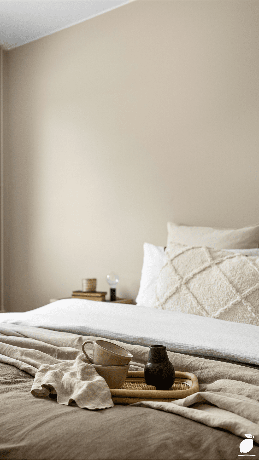
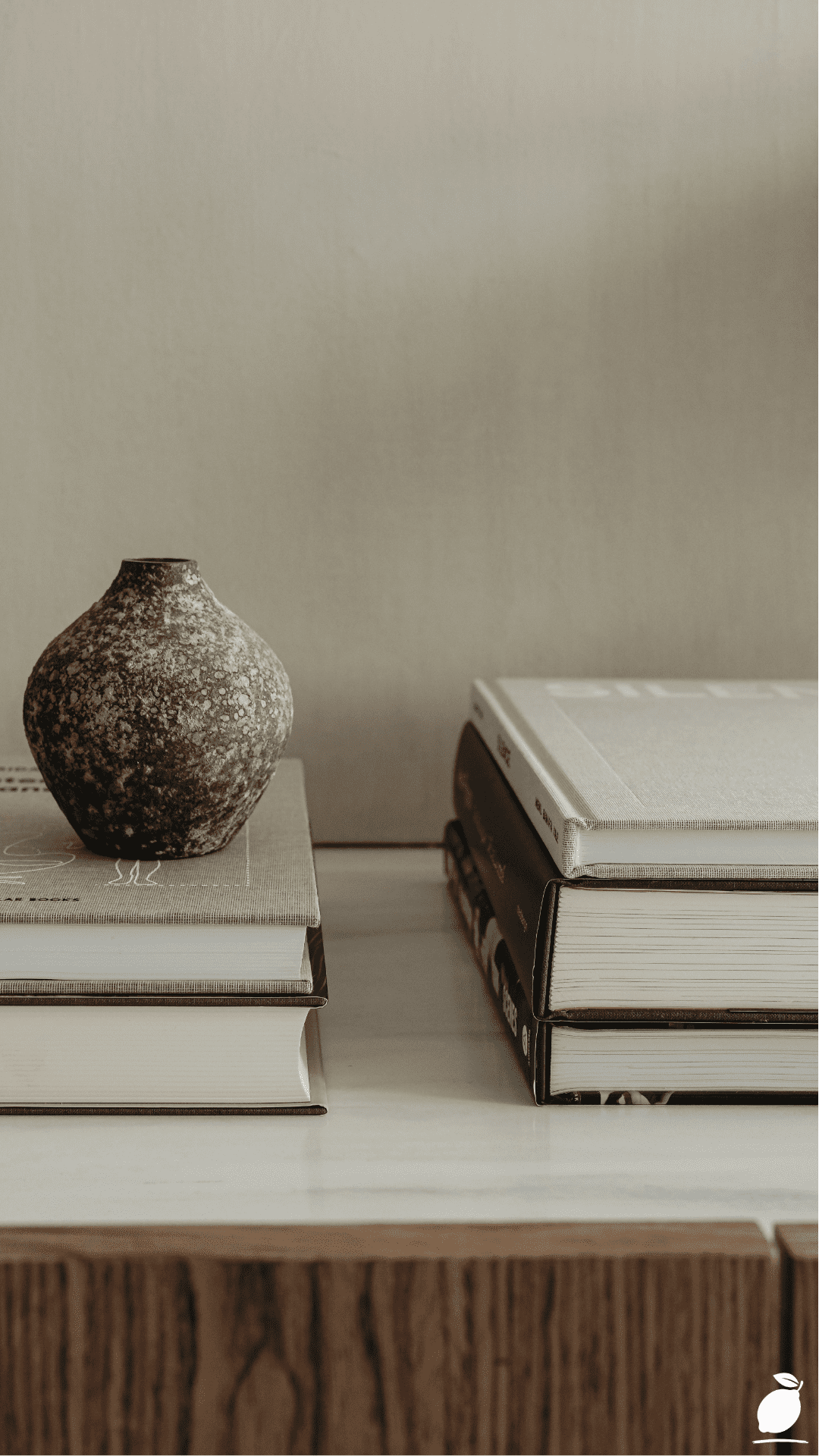
What most people in this spiral eventually discover, often by accident, is that the colors causing the least anxiety are the ones doing the most visual work quietly. The image above captures this principle exactly: a dark grey speckled ceramic vase, a stack of linen and ivory-spined books, warm brown wood grain, an off-white wall behind them, every tone is a variation on the same warm neutral continuum, and the result is a composition so effortlessly calm it barely registers as designed. That palette has a name. It’s greige the family of paint colors that sits at the precise intersection of grey and beige, carrying the cool sophistication of one and the organic warmth of the other simultaneously. Greige paint colors are the reason some rooms feel immediately, inexplicably right.
Understanding how greige paint colors actually work, why they read differently from room to room, which undertones to look for, and which specific shades earn their place on walls as opposed to trim or cabinets removes the anxiety from the decision and replaces it with a framework. The paint chip stops being an act of faith and starts being an informed choice. This guide walks you through every step of selecting, testing, and applying the best greige paint colors for your home, so the room you’ve been staring at for three months finally gets the walls it deserves.
The Greige Paint Colors Blueprint
Step 1: Understand What Makes a Color Genuinely Greige
Not every grey-beige hybrid deserves the greige label, and understanding what separates a true greige from an ambiguous muddy tone is the foundation of every good paint decision that follows. A genuine greige paint color has two defining qualities: a warm beige base that prevents it from reading cold or clinical in low light, and enough grey content to stop it from reading yellow or tan in daylight. The balance point between those two qualities and the specific undertones that carry each shade toward one end of the spectrum or the other is what makes greige paint colors so valuable and so occasionally baffling to select.
Undertones are the starting point. Most greige paint colors carry one of three dominant undertone families: purple-grey (the coolest greiges, which pair best with white trim and modern furnishings), green-grey (the most nature-adjacent greiges, which read as warm in earthy interiors and slightly cool in bright ones), or yellow-grey (the warmest greiges, which shift toward caramel in strong natural light and read as grounding and honey-warm in lamp-lit rooms). Before selecting a specific shade, identify which undertone family your room’s light and existing furnishings favor, then shop within that family rather than across all three simultaneously.
Step 2: Audit Your Room’s Light Before Choosing a Shade
Greige paint colors are more light-sensitive than most neutral families, and a shade that reads as a perfect warm stone in one room can read as a cool lavender-grey or a flat khaki in another. Before committing to any greige paint color, spend a full day observing how light moves through your specific room.
North-facing rooms receive cool, indirect light all day; they need a greige with stronger warm beige content to prevent the color from reading grey-blue or cold. South-facing rooms flood with warm direct light for most of the day; they can handle cooler greige shades that would feel chilly elsewhere, and may make warmer greiges read as distinctly yellow by afternoon. East-facing rooms are warm and golden in the morning, cool and shadowed by midday. A mid-temperature greige with balanced undertones performs best here. West-facing rooms are neutral by day and dramatically warm and amber by evening. Consider how your greige reads under lamplight as much as in daylight, since this room’s character is defined by its evening atmosphere.
Step 3: Select Your Specific Greige Paint Color
With your undertone preference and room light mapped, you’re ready to narrow to specific greige paint colors. Here are the strongest performers across the major paint ranges in 2026, organized by undertone family.
Warm yellow-grey greiges Benjamin Moore’s Pale Oak (OC-20) is the most widely beloved greige paint color in this family: a soft, almost luminous warm stone that shifts subtly throughout the day without ever losing its composure. Farrow & Ball’s Elephant’s Breath delivers a more complex warm grey with just enough beige warmth to anchor a room without heaviness. Sherwin-Williams’ Accessible Beige (SW 7036) leans warmer, still a reliable, crowd-pleasing greige that works in virtually any room with natural light.
Green-grey greiges Benjamin Moore’s Revere Pewter (HC-172) remains the benchmark: a complex, slightly green-inflected greige that reads differently in every light and has furnished more living rooms than any other shade in its category. Farrow & Ball’s Mole’s Breath is the more sophisticated European equivalent, deeper and more moody with a similar green-grey undertone. Sherwin-Williams’ Agreeable Grey (SW 7029) is the accessible, foolproof option in this family, warm without being yellow, grey without being cool.
Cool purple-grey greiges Benjamin Moore’s Classic Grey (OC-23) is the lightest and most versatile of the cool greiges: almost white in bright light, picking up its grey quality in shade and at night. Farrow & Ball’s Purbeck Stone is a refined, slightly lavender-toned greige that reads as strikingly sophisticated in rooms with white trim and high ceilings. Sherwin-Williams’ Anew Gray (SW 7030) sits in the cool-greige category with enough beige content to stay friendly across varied light conditions.
Step 4: Buy Sample Pots and Test on the Actual Wall
This step is non-negotiable, regardless of how confident you are in a shade after research and chip assessment. Paint a minimum 30 x 30cm swatch of each shortlisted greige paint color directly onto the actual wall, not onto a card held against the wall, not onto a separate board moved around the room, but onto the wall itself. Paint two coats to approximate the final opacity. Label each swatch with the paint name and number. Then observe them across three conditions: morning light, midday light, and evening lamplight. The greige paint color that holds its character and warmth across all three conditions is the right one for that room.
Test on at least two walls, the one that receives the most light and the one that receives the least. Greige paint colors shift more dramatically between lit and shadowed surfaces than warm whites or mid-tone colors, and a shade that reads beautifully on a south-facing feature wall can look flat and cold on the north-facing wall opposite.
Step 5: Choose the Right Finish for Each Application
Greige paint colors are sensitive to sheen level in a way that lighter colors are not. The same greige in a flat finish reads as soft, matte, and recessive textured and depth-creating on plaster walls. The same shade in an eggshell reads slightly brighter and more reflective, which can shift a warm greige toward cool grey in indirect light. In a satin finish, greige paint colors can begin to look plasticky or commercial, losing the organic quality that makes them appealing in the first place.
For walls, use a flat or matte finish in low-traffic rooms (bedrooms, living rooms), and eggshell in kitchens, bathrooms, and hallways where washability matters. Reserve satin for woodwork and trim only. If using a greige paint color on kitchen cabinets, a highly effective application that the current cabinetry design moment fully supports, use a purpose-formulated cabinet paint in eggshell or semi-gloss for durability, and test the shade on a door front before committing to the full kitchen.
Step 6: Coordinate Your Greige with Trim and Accent Colors
Greige paint colors perform at their best when the trim, ceiling, and accent choices are made in deliberate relationship to the wall color rather than independently. The most successful greige interiors use one of three trim strategies.
Crisp, bright white trim Benjamin Moore Chantilly Lace (OC-65) or Farrow & Ball All White creates the highest contrast and the most modern, graphic quality. It works best with cooler greige paint colors and in rooms with strong architectural detail. Soft white trim Benjamin Moore White Dove (OC-17) or Dulux Timeless creates lower contrast and a more unified, tranquil effect that suits warmer greige tones and traditional or Scandinavian-influenced interiors. Tonal trim painting the trim in a shade one to two steps lighter or darker on the same greige continuum creates the most sophisticated and intentional effect of all, used frequently in high-end interior design to give a room depth and coherence that mixed neutral families can’t achieve.
Expert Secrets for Success
Pro-Tips for a Better Result
Photograph your shortlisted greige swatches on the wall with your phone at different times of day. What your eye adapts to in person, a photograph captures objectively; the photo shows you the actual color the wall is producing in that light, without the brain’s color-correcting instinct editing the perception. Comparing morning and evening photographs of the same greige paint color swatch is one of the fastest ways to understand how a shade behaves across a full day.
Paint behind furniture and inside built-in alcoves. Greige paint colors behave as mid-tones, which means they darken significantly in areas of low light and enclosed shadow. Paint every wall fully, including behind sofas, inside bookcases, and in the returns of alcoves, not because those areas will be seen, but because the room reads as a unified whole and any unpainted area eventually becomes visible in ways you don’t anticipate when furniture moves, or light sources change.
Use a tinted primer matched to your greige paint color. A primer tinted in the direction of your final greige shade reduces the number of finish coats needed for full opacity, improves the depth and richness of the final color, and eliminates the cold, chalky quality that sometimes appears in the first coat of a greige applied over a stark white primer. Ask your paint supplier to tint the primer to approximately 50% of the final color formula.
Reassess your greige paint color after new flooring or furniture is installed. Greige paint colors are reactive; their perceived tone shifts in response to the dominant colors of the materials surrounding them. A greige that was perfect with your previous oak floor can shift noticeably toward cool grey when pale-toned engineered hardwood goes down, or toward warm tan when terracotta tiles are laid. Retain a small amount of paint from the original application for touch-ups, but be open to the possibility that a room’s greige paint color may need revisiting after major changes to flooring or large furnishings.
Common Mistakes to Avoid
Don’t assess greige paint colors under recessed LED lighting only. Many modern homes are lit primarily by recessed downlights, which cast a directional, high-intensity light that flattens warm undertones and emphasizes cool ones. Greige paint colors assessed only under recessed LED lighting consistently look cooler and greyer than they will in the full, multi-directional light of daytime. Always assess swatches in both natural and artificial light before making a final decision.
Don’t use a greige paint color on every surface without variation. An all-greige room with walls, trim, ceiling, and built-ins all in the same shade can read as flat and monotonous rather than calm and cohesive, particularly in smaller rooms without strong architectural features. Vary the application: walls in your primary greige, trim and ceiling in a lighter or contrasting neutral, and introduce texture through materials, such as linen, wood, ceramics that break up the tonal uniformity and give the greige something to read against.
Don’t assume a greige paint color that worked in a friend’s home will work in yours. Greige paint colors are among the most environment-specific shades in the neutral family. The same shade can read as sophisticated warm stone in a high-ceilinged Victorian terrace with south-facing windows and warm oak floors, and as a cold, undistinguished muddy grey in a low-ceilinged new-build with north-facing windows and grey carpeting. Start from your room’s specific light and material conditions, not from someone else’s successful result.
Don’t skip the second observation window. Most people test greige paint colors over a weekend and make their decision by Sunday. Commit instead to observing your test swatches over a full seven days, including a cloudy overcast day, which is where many greige paint colors reveal their true undertone character most clearly, unfiltered by the warmth of direct sunlight. A greige that holds its warmth on an overcast British or Pacific Northwest Tuesday is a greige that will perform reliably all year long.
Why Greige Paint Colors Matter
Paint decisions feel consequential because they are. The color of the walls you live inside every day is not a decorative detail; it is the persistent visual context for every hour spent at home, influencing mood, perceived room size, warmth of atmosphere, and the way every piece of furniture, art, and textile in the space reads. Research in environmental color psychology consistently identifies warm neutral tones, the precise palette that greige paint colors represent, as among the most reliably calming, space-enhancing, and welcoming wall colors available. Rooms painted in warm neutrals are rated as more comfortable, more spacious, and more conducive to relaxation than rooms in cooler or higher-chroma shades, even when the physical dimensions are identical.
For families, the implications of getting paint right are genuinely practical. A living room that feels warm and settled provides a different quality of rest and togetherness than one that feels slightly off, too cold, too clinical, too beige, too grey. Children do their homework more calmly in rooms that feel right. Couples have better conversations at the kitchen table when the room feels settled. The home that feels cohesive and considered, where the walls support rather than compete with the life happening in front of them, is not a luxury. It is the everyday dividend of one good decision, made with information, applied with confidence.
Easy Peasy Life Matters is built on the conviction that the small decisions compound. Choosing the right greige paint color for your living room is not a trivial aesthetic exercise. It is a material contribution to how your household feels on an ordinary Tuesday evening when nothing particular is happening, and everything that matters is. That is the standard these paint choices are held to, and it is the standard they consistently meet.
Frequently Asked Questions
What is the difference between greige and beige?
Beige is a warm, yellow-brown neutral with minimal grey content. It reads as definitively warm in all light conditions and can shift toward tan or honey in strong sunlight. Greige paint colors contain a significant proportion of grey pigment that moderates the yellow-warmth of beige and introduces a cooler, more sophisticated quality. The practical difference is that greige paint colors read as more complex and versatile, warmer than grey, cooler than beige, which is why they function successfully across a wider range of room conditions and furnishing styles than either pure beige or pure grey alone.
How do I stop my greige paint color from looking purple or lavender?
A greige that reads purple or lavender is carrying dominant cool blue-purple undertones that are being activated by the room’s light conditions. The fix is to select a greige with warmer undertones, specifically the yellow-grey or green-grey families rather than the cool purple-grey family. Pale Oak, Accessible Beige, and Revere Pewter all lean warm enough to resist purple shifts in most light conditions. If you’re already committed to a cooler greige that’s reading purple, introduce warm wood tones, amber lighting, and natural linen textiles into the room; these draw the eye toward warmth and minimize the perception of cool undertones in the wall color.
Are greige paint colors suitable for small, dark rooms?
Yes, with a specific approach. In small, dark rooms, choose a greige paint color that is lighter in value (LRV of 55 or above; most paint brands list the Light Reflectance Value on the chip or website), carries warm rather than cool undertones, and is applied in a matte or flat finish that maximizes the light-reflecting surface quality without creating sheen. Pale Oak, Classic Gray, and Agreeable Gray all perform strongly in darker rooms. Avoid deep, complex greige paint colors in small dark spaces. Shades like Revere Pewter or Mole’s Breath are extraordinary in well-lit rooms but can feel heavy and oppressive when light is limited.
Can I use greige paint colors in a kitchen or bathroom?
Greige paint colors are particularly effective in kitchens and bathrooms where their combination of warmth and sophistication complements the mix of hard materials, tile, stone, metal, and wood that these rooms typically contain. In a kitchen, a greige on the walls behind white or natural wood cabinetry creates a backdrop that makes the cabinetry feel intentionally chosen rather than default. In a bathroom, a warm greige on the walls with white tile and natural stone transforms a functional space into a genuinely restful one. Use eggshell finish in both spaces for washability, and ensure ventilation in bathrooms is adequate to prevent humidity affecting the paint surface over time.
What’s the best greige paint color for an open-plan space?
Open-plan spaces require a greige paint color that holds its character across the varying light conditions that different zones of a large space receive, the kitchen area in direct light from skylights, while the living zone is in shade, for example. Agreeable Gray and Pale Oak are the most reliable open-plan performers because their undertones are warm but not strongly directional, allowing them to read consistently across light and shadow without shifting dramatically in either direction. Test the selected shade in the room’s darkest corner and its brightest window-facing wall before committing. If it holds its character in both locations, it will work across the full space.