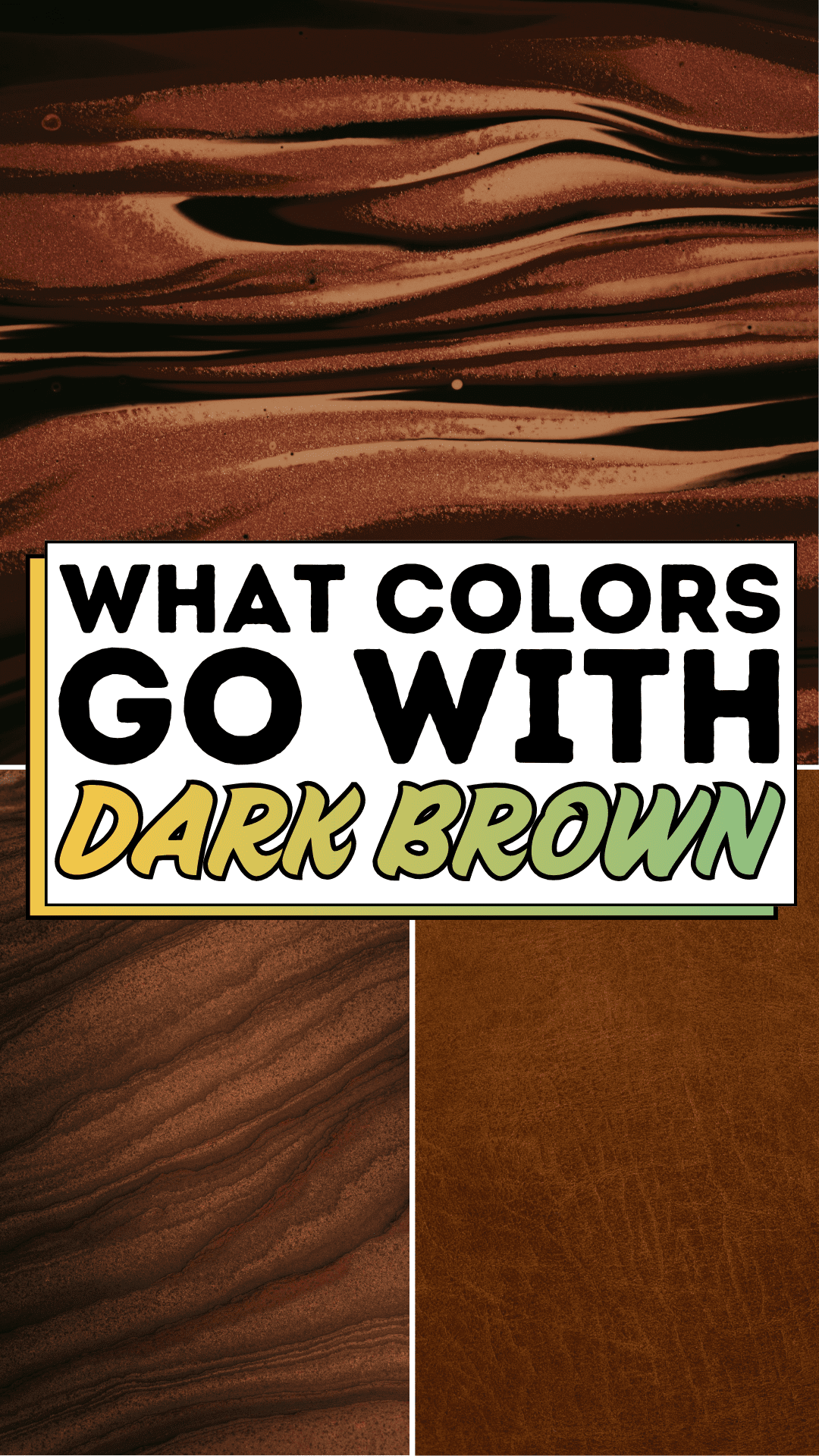
There you are, standing in your living room on a Saturday morning, coffee going cold in your hand, staring at the beautiful dark brown wood floors your family saved up for, and suddenly realizing you have absolutely no idea what to put with them. The walls are a safe, tired beige that makes the whole room feel like a waiting room at a dentist’s office. You’ve pinned a hundred ideas on Pinterest, but every time you hold a paint swatch next to that rich, reddish-brown grain, something feels off. You’re not bad at decorating. You’re just missing a framework, and that’s a completely fixable problem
This feeling is more common than you’d think. Dark brown is one of the most grounding, luxurious tones in any home, but because it reads so deeply and warmly, it can feel “heavy” when paired with the wrong companions. The secret isn’t working against that warmth; it’s working with it. Think about the way natural light dances across polished dark wood: it pulls out honey gold, deep burgundy, and even hints of olive. Your room already has a color story written into its floors and furniture. You just need to learn how to read it.
Once you understand the logic behind color pairing, decorating around dark brown stops being overwhelming and starts feeling almost intuitive. Whether you’re refreshing a single room or reimagining your entire home’s palette, the combinations ahead are practical, beautiful, and, true to the Easy Peasy Life Matters spirit, completely doable on a real-life schedule and budget. Let’s get into it.
The Dark Brown Blueprint
Pairing colors with dark brown isn’t guesswork; it’s a sequence. Work through these steps in order, and you’ll build a palette that feels cohesive, intentional, and uniquely yours.
Step 1: Identify the Undertone in Your Dark Brown
Not all dark browns are created equal. Hold a white piece of paper next to your brown surface in natural daylight. Does the wood or furniture read warmer (red, orange, or gold undertones) or cooler (gray or almost-purple undertones)? Warm dark browns pair best with analogous warm tones and rich neutrals. Cooler dark browns open the door to blue-grays, slate, and muted greens. Knowing your undertone is the single most important step; skip it, and even great colors can clash.
Step 2: Anchor the Room With a Dominant Neutral
Dark brown needs breathing room. Choose a dominant neutral for your largest surfaces, walls, large area rugs, or major upholstery. The best neutrals for dark brown include:
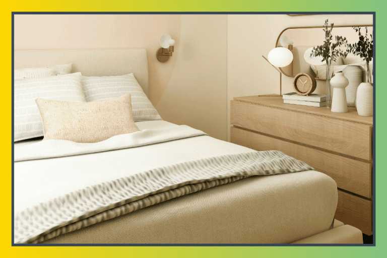
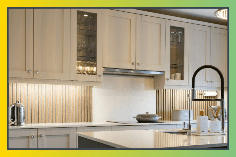
- Crisp white or warm off-white brightens the space dramatically and creates a classic, timeless contrast.
- Warm cream or linen softer than white, it wraps the room in an earthy, organic warmth that flatters wood tones beautifully.
- Light greige (gray-beige) is a modern choice that bridges the gap between the warmth of brown and the coolness of gray.
Paint your walls in this neutral first before introducing accent colors. It gives you a clear canvas to evaluate every next decision.
Step 3: Introduce a Mid-Tone Accent Color
This is where your room gains personality. Mid-tone accents sit between your dominant neutral and your dark brown anchor, visually connecting the two. Top performers with dark brown include:
- Sage or olive green earthy, nature-forward, and incredibly popular in 2026 interiors. Green echoes the organic origins of wood and feels endlessly livable.
- Terracotta or burnt sienna leans into the warmth of brown and creates a rich, global-inspired feel.
- Dusty blue or slate is a cooler contrast that keeps the room from feeling too heavy, especially in smaller spaces.
- Muted mustard or gold picks up the golden undertones often hidden in dark wood grain and makes the whole palette glow.
Step 4: Layer in Textures and Patterns
Color alone doesn’t make a room feel finished; texture does. Once your palette is set, layer in materials that amplify the visual interest: woven jute rugs, linen throw pillows, ceramic vases, brass or matte black hardware. The contrast between smooth, polished dark brown surfaces and rougher organic textures creates a layered, intentional look that no single paint color can achieve on its own.
Step 5: Test Before You Commit
Paint large swatches (at least 12″ x 12″) directly on your walls and live with them for 48 hours across different lighting conditions, morning sun, midday, and artificial evening light. Colors shift dramatically throughout the day, especially against the warm depth of dark brown. Many perfect-looking swatches turn muddy or cold in lamp light. Don’t skip this step. It saves you from expensive repaints.
Expert Secrets for Success

Pro-Tips for a Better Result
- Use the 60-30-10 rule. Let your dominant neutral take 60% of the visual space, your dark brown anchor 30%, and your accent color just 10%. This proportion is what trained interior designers use to create rooms that feel balanced without feeling boring.
- Add metallics as a bridge. Brass, warm gold, and bronze tones act as a natural bridge between dark brown and almost any accent color. A brass lamp or gold-framed mirror can unify what might otherwise feel like competing elements.
- Go light on the ceiling. If your floors or furniture are dark brown, keep your ceiling in the lightest shade of your chosen neutral. A bright ceiling lifts the visual height of the room and prevents the dark tones from closing it in.
- Repeat your accent color at least three times. Interior designers call this “the rule of three.” If dusty blue is your accent, include it in a pillow, a vase, and a piece of artwork at a minimum. This creates visual rhythm and makes deliberate choices look intentional rather than accidental.
- Use dark brown as an accent wall, not just a floor. A dark brown feature wall (via wood paneling, limewash paint, or wallpaper) paired with lighter surroundings is a stunning 2026 design move that anchors the room without overwhelming it.
Common Mistakes to Avoid
- Pairing dark brown with cool grays without a warm bridge. Cool gray and dark brown can feel stark and disconnected. If you love gray, warm it up with cream accents or introduce a warm metallic to bring the two tones into conversation.
- Choosing too many accent colors at once. More than two accent colors alongside dark brown create visual chaos. Commit to one dominant accent and one secondary pop then stop. Restraint is a decorating superpower.
- Ignoring natural light levels. Dark brown absorbs light. In a north-facing room with limited natural light, very dark walls will make the space feel oppressive. In low-light rooms, lean toward lighter neutrals and brighter accents to compensate.
- Matching brown to brown. Many people instinctively pair dark brown furniture with tan or beige upholstery, thinking it’s “safe.” This often creates a flat, monochromatic look that reads as unintentional. Contrast is your friend.
- Forgetting the ceiling and trim. Wall color alone doesn’t define a room. Bright white trim against a darker neutral wall with dark brown floors creates a layered, finished look. Ignoring trim is one of the fastest ways to make a beautifully designed room feel incomplete.
Why Dark Brown Matters
Here’s something designers understand that most of us don’t talk about enough: your home’s color palette directly affects how you feel inside it. Dark brown, when paired with intention, is one of the most grounding color anchors you can build a home around. It communicates stability, warmth, and permanence, the visual equivalent of a long exhale after a complicated day. When your space feels cohesive and cared for, you feel it too. Kids settle into homework more easily. Conversations at the dinner table stretch longer. Weekends feel more like rest and less like catch-up.
There’s real science behind this. Warm, earthy tones like dark brown and their complementary colors have been shown to lower cortisol levels and create a sense of psychological safety. When you walk into a room that feels visually harmonious, where the colors seem to belong together, your nervous system relaxes before you’ve even sat down. That’s not a small thing. That’s the difference between a house and a home. Taking the time to get your color story right isn’t vanity; it’s an investment in your daily quality of life and the well-being of everyone you share your space with.
Frequently Asked Questions
What is the best wall color to go with dark brown floors?
Warm whites, off-whites, and soft cream tones are the most universally flattering wall colors for dark brown floors. They create a bright, clean contrast without competing with the richness of the wood. If you want something more dramatic, sage green and warm greige are excellent choices that complement dark brown’s earthy undertones beautifully.
Does gray go with dark brown furniture?
Yes, but with care. Cool grays can clash with the warm undertones often present in dark brown furniture. The key is to choose a warm gray (one with yellow or beige undertones) rather than a blue-based cool gray. Adding warm metallic accents like brass or copper helps bridge the gap between the two tones.
Is dark brown going out of style in 2026?
Absolutely not, dark brown is having a major moment. The shift away from all-gray and all-white interiors has made rich, warm wood tones more desirable than ever. Dark brown floors, furniture, and wood-paneled walls are among the top interior design trends of 2026, particularly when paired with earthy greens, cream, and natural textures.
What accent colors make a small room with dark brown furniture feel larger?
Lighter, cooler accent colors like soft dusty blue, pale sage, and crisp white can make a small room feel more open. Mirrors, reflective surfaces, and adequate lighting are equally important. The key is to keep walls light and let the dark brown furniture be the visual anchor rather than surrounding it with additional dark tones.
Can I use black with dark brown?
Yes, and it can look incredibly sophisticated. Black works best with dark brown when used sparingly as an accent through hardware, light fixtures, or framed artwork. The contrast between the two deep tones adds a sharp, modern edge. Just be sure to balance them with a generous amount of lighter tones (white, cream, or a light neutral) so the room doesn’t feel too heavy.