You finally committed to sage green. You painted the accent wall, or ordered the sofa, or picked the kitchen cabinet color, and for about forty-eight hours, you felt like you’d cracked some kind of design code. Then you stood back and looked at the room and felt that creeping, uncomfortable uncertainty: what goes with this? The rest of the space suddenly looked wrong. The existing furniture seemed to clash. The rug felt off. The throw pillows you ordered online arrived and looked nothing like the website. You’re not alone in this. Sage green is one of those colors that looks undeniably beautiful in isolation and genuinely confusing in context until you understand the palette it belongs to and the colors that make it sing

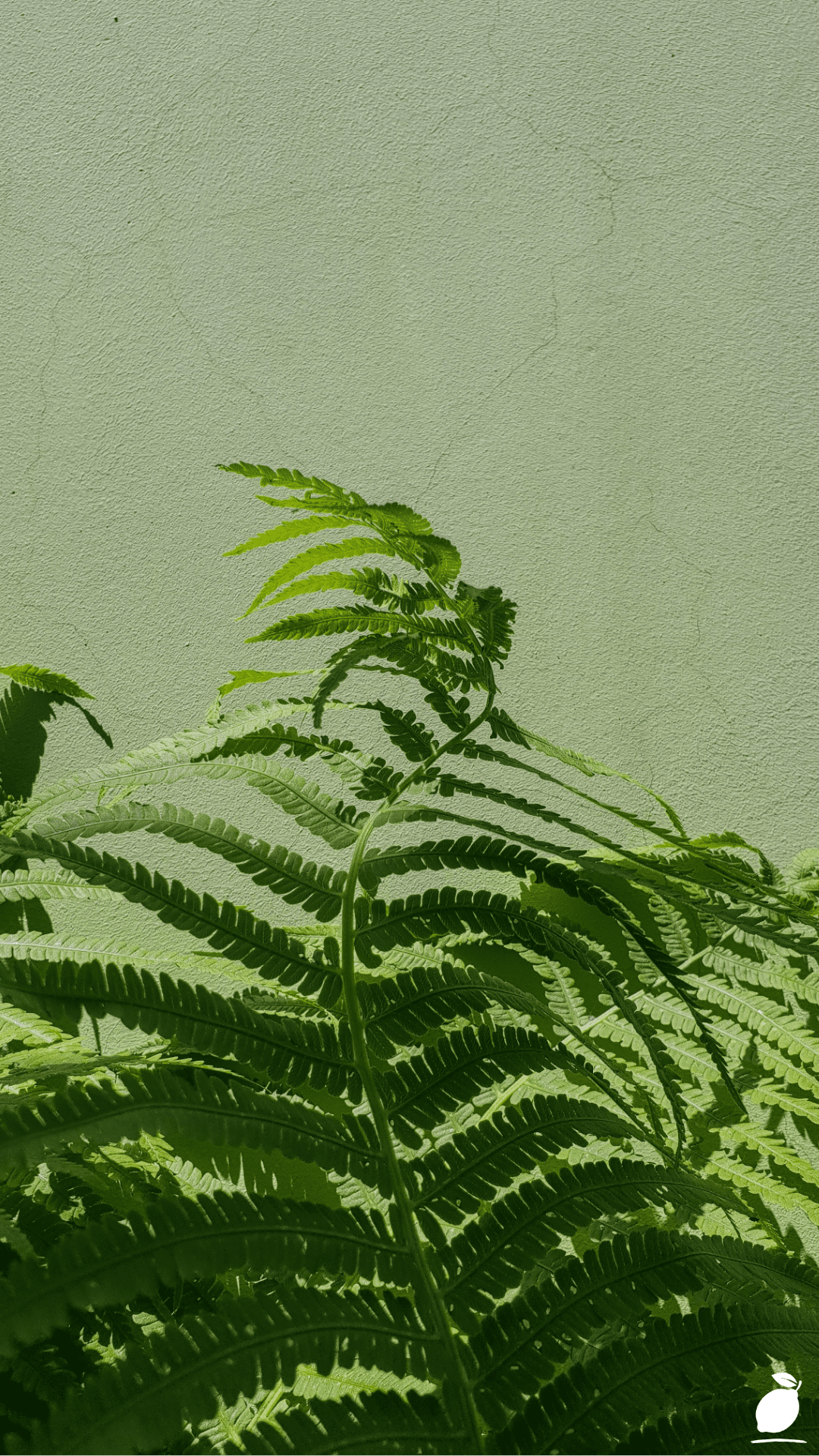
Look at that banana leaf above. That deep, rich forest green with its ridges and subtle tonal variations, the way the light catches the waxy surface and creates warmth within a single shade of green. Nature doesn’t struggle with color combinations. It knows instinctively that green belongs alongside warm neutrals, soft creams, earthy terracottas, and the quiet sophistication of muted blues. Sage green works the same way it is nature’s own neutral, a color with roots literally in the earth, and it pairs with the same palette that the natural world has always known how to assemble. The problem was never the sage green. The problem was not yet knowing its companions.
At Easy Peasy Life Matters, we’ve watched sage green become one of the most searched and most misunderstood colors in home design. It’s a color that deserves a proper guide, not a vague mood board, but a real, step-by-step strategy for building a palette around it that feels intentional, cohesive, and genuinely beautiful. Whether you’re decorating a living room, a bedroom, a kitchen, or a single accent corner, this is your complete guide to the colors that go with sage green and exactly how to use them.
The Colors That Go With the Sage Green Blueprint

Building a color palette around sage green isn’t guesswork; it follows a clear logic. Work through these steps in order, and your space will come together with the kind of effortless cohesion that looks professionally designed.
Step 1: Identify Your Specific Shade of Sage Green
Before you can confidently choose colors that go with sage green, you need to know exactly which sage green you’re working with. Sage exists on a spectrum; some lean warm and yellow-gray, others lean cool and blue-gray, and others sit in the middle with a distinctly earthy, dusty quality. Hold a paint chip or fabric swatch in natural daylight. Does it read warmer (almost olive) or cooler (almost slate)? This undertone determines everything. Warm sage greens pair best with warm companions, creamy whites, terracotta, brass, and warm wood. Cool sage greens harmonize with cooler partners: crisp white, dusty blue, silver, and stone gray. Get this wrong and even the most beautiful pairings will feel slightly off.
Step 2: Anchor With a Primary Neutral
Every successful sage green palette needs one dominant neutral to anchor it. This is the color that will appear most frequently in the space on walls, large furniture, or flooring, and it needs to work seamlessly alongside your sage. The three best anchoring neutrals for sage green are warm white (creamy, not stark), soft linen or putty beige, and warm greige. Avoid cool grays as your anchor; they strip the life from sage’s earthy warmth and make a space feel flat and clinical. Think of your neutral as the breath between the colors, it gives the sage green room room to be itself without competing.
Step 3: Introduce Warm Earth Tones as Secondary Colors
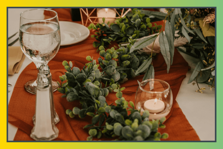
Once your neutral is established, warm earth tones are the most natural and reliable colors that go with sage green as secondary accents. Terracotta is the classic pairing; the combination of dusty orange-red and muted green is directly lifted from nature and reads as grounded and sophisticated in equal measure. Warm caramel, rust, burnt sienna, and sandy ochre all work within this family. These tones work best in medium quantities: a terracotta throw pillow, a rust-colored ceramic lamp base, a caramel leather chair. They add warmth and visual contrast without overpowering the quiet restraint of sage.
Step 4: Layer in Soft Whites and Creams for Contrast and Light
Crisp, bright white rarely works alongside sage green; it reads too cold, too stark, and makes the green feel muddy by comparison. But soft whites and warm creams are among the most essential colors that go with sage green in any room. Use them on trim, ceilings, built-in shelving, linen curtains, and bedding. The slight warmth in cream prevents the contrast from feeling harsh while still providing the visual separation that makes sage pop. Ivory, antique white, and warm off-white all fall into this category. Think of cream as the light in the palette; it lifts the space without disrupting the calm.
Step 5: Add Depth With Deeper Greens or Moody Neutrals
A palette built entirely on sage green and soft neutrals can start to feel washed out and timid. Depth comes from introducing at least one darker, richer tone that gives the eye somewhere to land. Deep forest green, like the banana leaf in the image above, is the most harmonious choice, as it shares sage’s DNA while providing dramatic contrast. Deep charcoal, warm chocolate brown, and navy blue are also excellent choices. Use these in smaller, more deliberate ways: a dark green velvet cushion, a charcoal throw, a deep-toned artwork, or a picture frame. Depth is what separates a flat palette from one with genuine dimension.
Step 6: Incorporate Dusty Blues and Muted Mauves for Sophistication
One of the most underused colors that goes with sage green is dusty, muted blue, think slate blue, French blue, or soft duck egg. These tones share sage’s quiet, desaturated quality and sit beside it without competing, creating a palette that feels cohesive, calm, and quietly luxurious. Similarly, muted mauves and dusty roses bring a soft femininity to sage green palettes without reading as pink or overly sweet. These work beautifully as accent colors in bedrooms and living rooms in soft furnishings, artwork, or a painted piece of furniture. The key with both blue and mauve alongside sage is to keep all tones equally desaturated, no bright or saturated versions.
Step 7: Choose Your Metal Finish to Tie the Palette Together
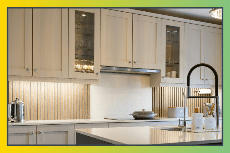
Hardware, light fixtures, faucets, and decorative objects are the punctuation marks of a color palette, and the metal you choose has a significant impact on how the colors that go with sage green read as a unified whole. Brushed brass and antique gold are the warmest and most popular pairings with sage; they enhance the earthy, botanical quality and feel at home with terracotta and cream. Brushed copper brings a similar warmth with slightly more depth. For a cooler, more contemporary palette, brushed nickel or pewter complements sage without the warmth. Avoid polished chrome; it reads too cold and modern against sage’s inherently natural, organic character.
Step 8: Test the Full Palette Together Before Committing
The most critical step in the entire process and the most skipped. Once you’ve identified your colors that go with sage green, gather physical samples of every element side by side: paint swatches, fabric swatches, tile samples, hardware finishes, and flooring samples. Place them together in the actual room, in natural light, at different times of day. Photograph them. Live with them for 48 hours. Colors behave differently in morning light versus evening lamplight, and what looks perfect at the paint store can feel entirely wrong at dinner time. This test step costs nothing and prevents enormously expensive mistakes.
Expert Secrets for Success

Pro-Tips for a Better Result
- Follow the 60-30-10 rule. In any room using colors that go with sage green, distribute as follows: 60% dominant neutral (walls, flooring, large furniture), 30% sage green (accent wall, sofa, cabinet color, curtains), 10% accent colors (cushions, artwork, hardware, plants). This ratio prevents any one color from overwhelming the space.
- Use real plants to bridge the palette. Living greenery, particularly large-leaf plants like fiddle-leaf figs, monsteras, or banana plants, connects your sage green palette to nature and makes the color choice feel inevitable rather than decorative.
- Repeat each accent color at least three times. A single terracotta cushion looks like an accident. Three terracotta elements, a cushion, a ceramic pot, and a piece of artwork look like a decision. Repeat every accent color in at least three places throughout the room.
- Layer textures with the same color. Sage green in linen reads differently from sage green in velvet, which reads differently from sage green in painted wood. Layering textures within a single tone adds richness and prevents a palette from feeling flat.
- Natural materials are your best friend. Rattan, jute, linen, raw wood, and ceramic all sit beautifully alongside sage green and reinforce its natural, organic character. Wherever possible, choose natural over synthetic materials in a sage green palette.
Common Mistakes to Avoid
- Pairing sage with bright, saturated colors. Sage is a muted, desaturated green. Bright colors, vivid red, royal blue, sunshine yellow clash with its quiet character. Every color in a sage green palette should share its desaturated, toned-down quality.
- Using too many greens. It’s tempting to double down on green when building around sage, but too many green tones without contrast create a flat, monochromatic space. Use deep green as a depth accent sparingly, not as a repeated motif.
- Choosing cool white instead of warm white. This is the most common mistake in sage green rooms. Stark, bright white makes warm sage look yellow and dull. Always choose warm white, cream, or ivory for trim and contrast in a sage palette.
- Ignoring the undertone of your sage. A warm sage paired with cool blue-gray accents will feel subtly wrong without the homeowner being able to identify why. Always match the temperature of your accents to the temperature of your specific sage green.
- Overdoing the terracotta. Terracotta is a beautiful partner to sage, but it’s a strong color. Used in large quantities, it overwhelms sage’s quietness. Keep terracotta as a genuine accent, never more than 10% of the total palette.
- Skipping the sample stage. Colors that look perfect on a screen or in a magazine can look entirely different in your specific room with your specific lighting. Never skip physical sampling in the actual space before purchasing.
Why do Colors That Go With Sage Green Matter
Color is not decorative, it’s physiological. The colors that surround you every day have a measurable effect on your mood, your stress levels, your sleep, and your sense of calm. Sage green, in particular, has been consistently associated in environmental psychology research with rest, restoration, and connection to the natural world. When you get the colors that go with sage green right when the palette is cohesive, warm, and grounded, you’re not just making a room look beautiful. You’re creating an environment that actively supports your wellbeing.
For families, a home that feels visually settled and calm creates a different quality of daily life. When there’s no visual noise, no clashing colors, no spaces that feel unresolved and unsettled, the energy in the home changes. Children are calmer. Conversations are easier. The kitchen table feels like a place to linger rather than escape from. This isn’t mystical; it’s the straightforward result of an environment that doesn’t create low-grade stress with every glance. Getting your color palette right is one of the highest-leverage investments you can make in the daily experience of your home.
At Easy Peasy Life Matters, we believe that understanding the colors that go with sage green, really understanding them, not just pinning pretty pictures, is an act of genuine self-care. It means choosing, with intention, the visual environment your family will live inside every single day. Sage green, done right, is one of the most calming and enduring palettes in interior design. It rewards patience, rewards attention to detail, and rewards the willingness to get the foundation right before adding anything else. The result is a home that feels, from the moment you walk through the door, like exactly where you were meant to be.
Frequently Asked Questions
What are the best colors that go with sage green in a living room?
The most successful living room palette built around sage green combines warm white or cream walls, natural linen or jute textiles, terracotta or rust accents, and brushed brass hardware and lighting. Deep forest green or charcoal adds depth through cushions and artwork. This combination is warm, grounded, and endlessly livable.
Does gray go with sage green?
Warm gray, greige, taupe, or putty works beautifully alongside sage green. Cool, blue-toned grays are more challenging and can make sage feel flat or muddy. If you want to use gray alongside sage, always choose a gray with warm or neutral undertones rather than a distinctly cool blue-gray.
What color curtains go with sage green walls?
Linen or cream curtains are the most cohesive choice alongside sage green walls; they provide contrast without competing. Dusty white, warm ivory, or even a subtle stripe incorporating both cream and sage work beautifully. For a more dramatic look, deep forest green or charcoal curtains in a heavy fabric like velvet create rich contrast.
Can you pair sage green with pink?
Yes, but the pink must be muted and desaturated. Dusty rose, blush, and muted mauve all pair beautifully with sage green, sharing its quiet, toned-down character. Bright or hot pink clashes with sage’s earthy softness. Think vintage rose rather than bubblegum and you’ll find a pairing that feels soft, romantic, and surprisingly sophisticated.
What wood tones go with sage green?
Warm, medium wood tones, such as honey oak, walnut, teak, and warm pine, are the most natural companions for sage green. They reinforce the botanical, earthy character of the color and feel grounded and organic. Very dark wood can overpower sage’s softness, and very light, whitewashed wood can read as too cool. Aim for warm and medium rather than extreme in either direction.
Is sage green a good color for a bedroom?
Sage green is one of the best colors for a bedroom. Its muted, earthy quality is inherently restful and has been associated with reduced stress and improved sleep quality in color psychology studies. Paired with warm white bedding, natural linen, soft wood tones, and warm lighting, a sage green bedroom creates a genuinely restorative sanctuary.