You’ve repainted the same bedroom wall three different shades of gray in two years, and it still feels like something is missing. The furniture is nice enough. The bedding is fresh. But every time you walk in, the room feels like it belongs to no one, a pleasant, forgettable backdrop instead of a space that actually feels like you. You’ve scrolled through enough interior design accounts to know that other people’s rooms have something yours doesn’t, but you can’t quite name what it is. What you’re seeing in those beautifully composed photos isn’t expensive furniture or rare vintage finds. It’s commitment to a full, fearless, intentional use of color that makes a room feel finished down to its bones

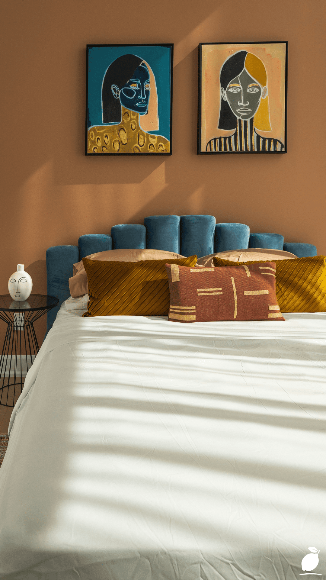
That feeling of visual “almost-there” is exactly what color drenching solves. Imagine walking into a bedroom where the terracotta on the accent wall doesn’t just sit behind the bed; it converses with the burnt sienna in the throw pillows, the honey warmth of a jute rug underfoot, and the earthy glow cast by afternoon sunlight. The teal headboard pops with confidence because everything around it was chosen to let it. That’s not an accident, and it’s not the result of a massive renovation budget. It’s the result of understanding how to use color as a full design language, not just a single decorative note.
Color drenching is one of the most talked-about interior design strategies of 2026 and for good reason. It’s accessible, it’s transformative, and it works in apartments, rental homes, and lived-in family spaces just as powerfully as it does in designer showrooms. If you’ve been playing it safe with your walls and wishing your home felt more alive, this post is your permission slip and your practical guide. Let’s build something beautiful together.
The Color Drenching Blueprint
Color drenching isn’t about painting everything one single color; it’s about building a room where every element is intentionally chosen from a cohesive color story, so the whole space feels immersive and resolved. Follow these steps to do it right.
Step 1: Choose Your Anchor Color With Intention
Your anchor color is the dominant tone that will set the emotional temperature of the entire room. In color drenching, this color doesn’t just appear on one wall; it informs your furniture choices, your textiles, your art, and your accessories. Terracotta, forest green, deep navy, dusty rose, and burnt amber are all incredibly popular anchor colors in 2026 because they carry warmth and personality without veering into the extreme. When choosing yours, ask: how do I want to feel in this room? Grounded and cozy? Energized and creative? Serene and elegant? Let that answer guide your anchor color selection before you ever open a paint deck.
Step 2: Map Out Your Color Family, Not Just One Shade
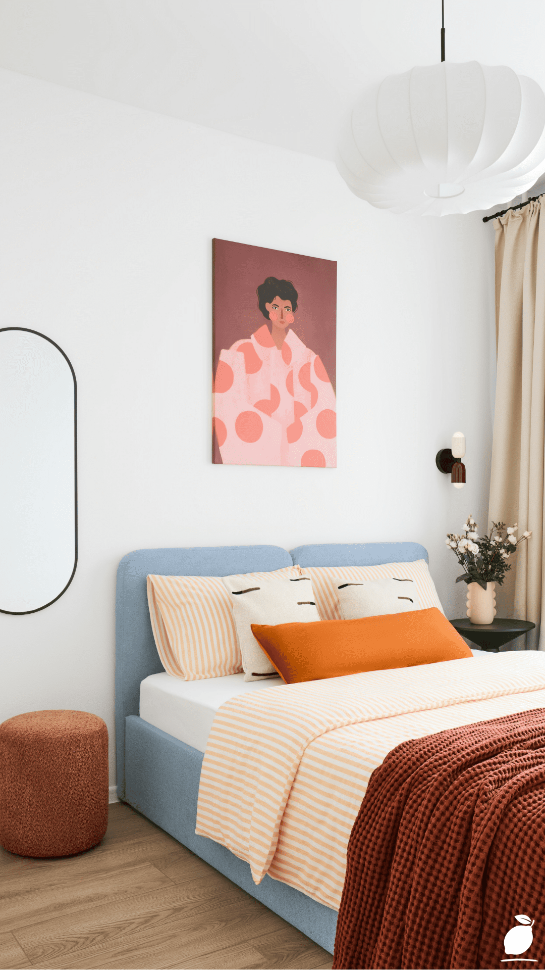
True color drenching draws from a family of tones rather than a single flat hue. If your anchor is terracotta, your color family might include rust, burnt sienna, warm sand, deep brown, and dusty gold, all related, all harmonious, all adding layers of depth. Identify three to five tones within your anchor’s family and assign each one a role: dominant (walls, large surfaces), secondary (headboard, large furniture), and accent (pillows, art, vases, trim details). This layering is what separates color drenching from simply “painting a room orange” and makes the result look professionally designed.
Step 3: Select One Intentional Contrast Color
Here’s where color drenching earns its drama. Every well-drenched room includes one carefully chosen contrast color that makes the dominant palette sing. In the bedroom featured here, teal does exactly that work; it pops against the terracotta with vibrancy and confidence, and its cool depth prevents the warm tones from feeling overwhelming. Your contrast color should appear in only one or two key places (a headboard, a single accent chair, a pair of curtains) so it functions as a focal point rather than a competing palette. Look to the color wheel: analogous contrasts (colors adjacent to each other) feel harmonious, while complementary contrasts (opposite on the wheel) feel bold and energized. Choose based on the mood you’re building.
Step 4: Drench the Details Go Beyond the Walls
This is the step most people skip, and it’s the step that makes all the difference. Color drenching means extending your palette into every corner of the room: the art on the walls should pull from your color family; the throw pillows should carry your accent tones; the rug should anchor the palette in texture and warmth; even the hardware on your furniture and the ceramic on your nightstand should feel like they belong to the same color story. When you walk through the room, and every single object speaks the same visual language, the space feels designed, not decorated.
Step 5: Control the Light and Test Every Choice
Rich, saturated colors behave very differently under different lighting conditions. A terracotta wall that glows warmly in afternoon sunlight can look muddy and flat under cool overhead LEDs. Before finalizing any color drench, test large swatches of your anchor color and accent colors in your actual space across morning, midday, and evening light. Invest in warm-toned bulbs (2700K–3000K) to complement earthy, jewel-toned, and warm palettes. They make a dramatic difference in how a color-drenched room feels after dark. Lighting is the final layer of your color story, and it deserves the same intentional attention as every paint color and fabric swatch.
Expert Secrets for Success
Pro-Tips for a Better Result
- Start with one room. Color drenching is immersive by design, and it’s easiest to commit fully when you’re working on a single, contained space. A bedroom is the perfect starting point; it’s personal, it’s primarily for you, and it doesn’t require the buy-in of every person in the household, the way a living room does. Master the concept in one room before expanding the approach.
- Use art as a color map. Before buying a single paint sample, find a piece of artwork you love and use its palette as your color-drenching blueprint. The painting or print you’re drawn to intuitively already reflects the emotional tone you want the room to carry. Pull the dominant color for your walls, the secondary for your large furniture, and the accent for your statement pieces. The artwork becomes both your inspiration and your guide.
- Layer matte and sheen finishes strategically. Color drenching doesn’t mean every surface looks the same. Using a matte finish on walls, an eggshell on trim, and a satin on furniture creates subtle tonal variation within the same color family, adding visual sophistication without introducing new colors. Sheen differences make a monochromatic drench feel rich and layered rather than flat.
- Bring in natural textures to break up saturation. Jute rugs, linen cushions, woven baskets, and raw wood accents are a color drencher’s best friends. Natural textures introduce organic variation that prevents highly saturated palettes from feeling overwhelming, and they photograph beautifully in color-drenched spaces.
- Embrace negative space in your accessories. Not every surface needs to be filled. Let white ceramic vases, clear glass, or simple black wire furniture provide visual rest within a richly colored room. The contrast of an unadorned object against a deeply saturated wall creates elegant breathing room that makes the color feel even more intentional.
Common Mistakes to Avoid
- Drenching without a cohesive color family. Picking one bold wall color and then filling the room with unrelated tones is decorating, not drenching. Every element in the room, from your largest furniture to your smallest accessory, needs to trace back to your defined color family. If it doesn’t belong to the story, it doesn’t belong in the room.
- Choosing too many contrasting colors. One strong contrast color creates drama and focus. Two competing contrast colors create confusion. Color drenching is about curated abundance, not chaos. Commit to a single contrast tone and use it with restraint it will be far more impactful for its rarity within the palette.
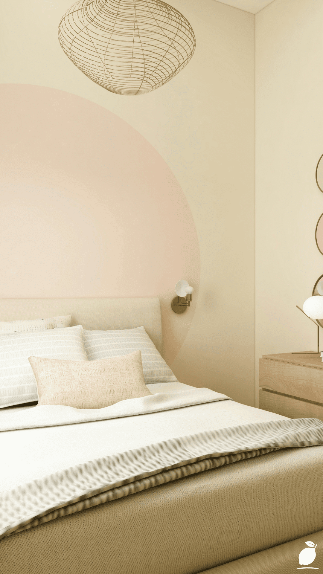
- Ignoring the ceiling. In true color drenching, the ceiling is part of the palette. Leaving it bright white while the walls are deeply saturated creates a visual “lid” that cuts the room off and makes the space feel shorter than it is. Consider painting the ceiling in a lighter tint of your anchor color, or even the full anchor tone in rooms with high ceilings, for a genuinely immersive effect.
- Going too dark in a light-starved room. Deep, saturated color drenching requires adequate natural or artificial light to feel enveloping rather than suffocating. In rooms with limited windows, choose lighter or mid-toned versions of your anchor color and compensate with warm, layered lighting. A dark terracotta drench in a sun-filled bedroom is stunning; the same choice in a dim north-facing room can feel oppressive.
- Rushing the process. Color drenching is a layered, intentional practice. Buying everything at once and hoping it all works together is the most common and most expensive mistake. Build the room in stages: anchor color first, then large furniture, then textiles, then accessories. Each layer should feel right before you move to the next.
Why Color Drenching Matters
A home that feels visually cohesive and intentional does something quietly powerful for the people living inside it: it signals that someone cared. Not in a fussy, untouchable way but in the way that a well-made meal signals care, or a tidy desk signals readiness. When you walk into a color-drenched bedroom where every tone is in conversation with every other, your brain stops processing visual noise and starts to simply rest. That shift is not trivial. It is the difference between a room you sleep in and a room that actually restores you.
There is growing evidence that our physical environments have a profound effect on mental clarity, mood regulation, and even our relationships with the people we live with. Spaces that feel chaotic or unresolved, even subtly so, keep our nervous systems lightly activated, as though something is perpetually unfinished. Spaces that feel intentional and complete do the opposite: they cue the body to relax, and they create a container in which family life can unfold more gently. Color drenching, at its best, is an act of care for yourself, for the people you love, and for the daily quality of the life you’re building inside your four walls. It doesn’t require a designer or a renovation budget. It requires intention, a plan, and the willingness to commit.
Frequently Asked Questions
What exactly is color drenching in interior design?
Color drenching is an interior design technique where a cohesive color palette is applied across all elements of a room, walls, furniture, textiles, art, and accessories, so the space feels completely immersive and intentional. Rather than using one bold wall as an isolated statement, color drenching envelops an entire room in a unified color story, creating a richly layered effect.
Is color drenching only for large rooms?
Not at all, in fact, color drenching can be especially powerful in smaller spaces. A richly drenched small bedroom or powder room feels intimate and intentional rather than cramped. The key in smaller rooms is to choose lighter or mid-toned anchor colors, use mirrors to amplify light, and keep the contrast color restrained to one or two focused moments.
What are the best colors to use for color drenching in 2026?
The most popular color drenching palettes in 2026 center on earthy, nature-inspired tones: terracotta, warm sage, deep olive, dusty rose, rich teal, and warm caramel. These colors have the depth and warmth to feel immersive without becoming overwhelming, and they pair beautifully with natural textures like jute, linen, and raw wood.
Can renters do color drenching without painting the walls?
Absolutely. Color drenching is achievable without touching a single wall. Focus on a richly colored headboard or sofa as your anchor, layer in textiles (rugs, curtains, throw pillows, and blankets) from your chosen color family, and use artwork and accessories to complete the palette. Removable peel-and-stick wallpaper in your anchor color is also a renter-friendly option that makes a dramatic impact.
How is color drenching different from a monochromatic color scheme?
A monochromatic scheme uses multiple tones of a single color. Color drenching is broader; it builds a full color family (which may include two to four related colors) and applies them comprehensively across every surface and object in the room. Color drenching includes the intentional use of a single contrasting color for focal drama, which a strictly monochromatic scheme does not.