You fell in love with a blush pink sofa at the store. The color was soft, sophisticated, almost architectural, and you bought it with complete confidence. Then you got it home. Suddenly, the warm beige walls looked yellow next to it. The gray rug looked cold and wrong. The dark wood coffee table felt like it wandered in from a different house entirely. What looked effortless in the showroom now looked like a decorating accident in your living room, and you found yourself wondering if pink was simply “too difficult” to work with. It isn’t. You just needed a system, and that’s exactly what was missing.
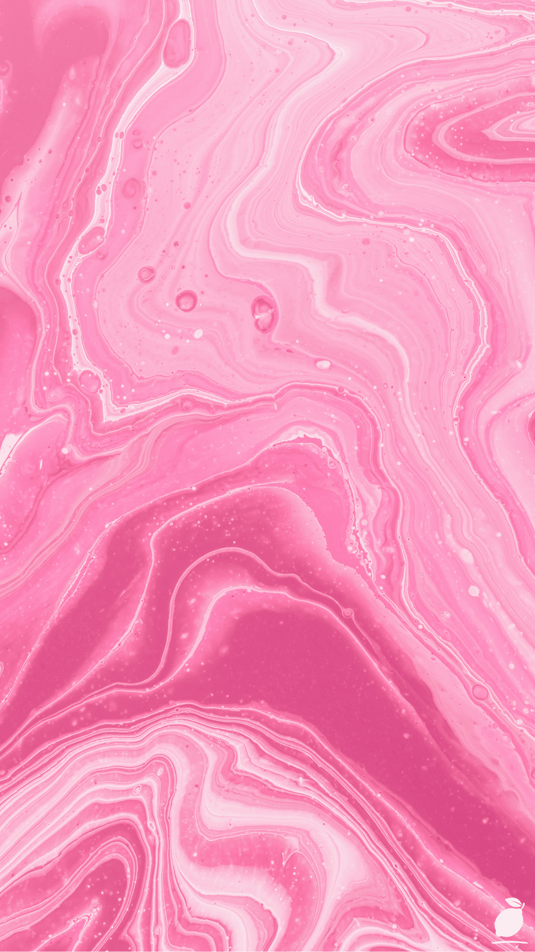
Pink is one of the most misunderstood colors in interior design. People either avoid it entirely out of fear of it reading as juvenile, or they dive in without understanding how to anchor it and end up with something that feels unfinished. But when you look at pink the way a designer does, as a warm neutral with an extraordinary range, not a single predictable tone, everything changes. Think about the way pink and magenta swirl together in marbled paper: each shade distinct, each one amplifying the others, the whole composition fluid, organic, and quietly stunning. That’s exactly how a well-paired pink palette works in a real home.
The truth is that pink may be the single most versatile color in the spectrum when you know how to use it. From barely-there blush that functions like a warm white, to deep dusty rose that anchors a room as powerfully as terracotta, pink plays beautifully with an enormous range of companions. This guide will walk you through exactly which colors to pair with every shade of pink and how to build a cohesive, confident room around them, one intentional step at a time.
The What Colors Go With Pink Blueprint

Building a palette around pink is a layered, sequential process. Work through these steps in order, and you’ll move from uncertainty to a fully resolved, designer-quality color story.
Step 1: Identify Which Pink You’re Actually Working With
Before you can choose what goes with your pink, you need to know exactly what your pink is. Pink is not one color; it’s a family that spans from the palest champagne blush to saturated magenta, and each member of that family behaves differently in a room. Hold your pink element (paint swatch, fabric, or furniture) next to a white piece of paper in natural daylight. Does it read warmer (peachy, salmon, or coral undertones) or cooler (lavender, fuchsia, or blue-based)? Warm pinks pair best with earthy neutrals, gold, and warm wood tones. Cool pinks open the door to crisp white, silver, gray, and deep jewel tones. This single distinction will guide every decision that follows.
Step 2: Ground the Palette With the Right Neutral
Every pink room needs a grounding neutral, a calm, foundational tone that gives the pink room to breathe and prevents the palette from reading as relentlessly sweet. The neutral you choose should respond directly to your pink’s undertone:
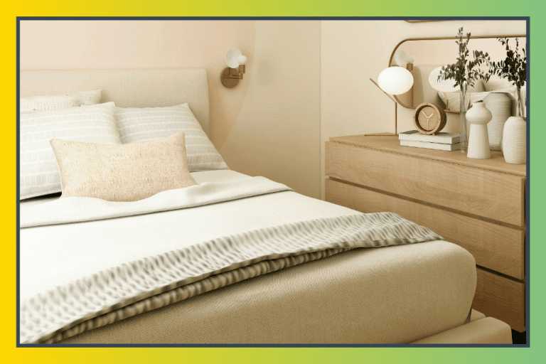
- Warm whites and cream are the most universally flattering choices. They amplify the softness of blush and dusty rose without competing. Ideal for bedrooms and living spaces that need to feel simultaneously warm and airy.
- Warm greige or tan grounds, deeper, earthier pinks like rose and terracotta-pink. Creates a sophisticated, natural palette that feels especially current in 2026’s trend toward organic interiors.
- Charcoal or deep slate a bold pairing that works exceptionally well with bright or saturated pinks, particularly fuchsia and magenta. The high contrast creates a graphic, modern energy.
- Cool white or soft gray best with cool-toned pinks. Clean, modern, and minimal, this pairing has real architectural confidence when executed with restraint.
Let your neutral claim the largest surfaces (walls, large upholstery, or flooring) so pink can step forward as the star without overwhelming the room.
Step 3: Add a Complementary Color for Depth and Drama
A neutral alone won’t make your pink palette sing; you need a third color that adds dimension and visual intention. These complementary pairings are the most powerful and proven in 2026 interiors:
- Forest green or sage the single most beloved partner for pink. The contrast between the organic warmth of pink and the natural cool of green is endlessly fresh and never clichéd when the tones are chosen thoughtfully.
- Deep navy or slate blue creates a striking, sophisticated palette that feels elevated and contemporary. Navy grounds pink in a way that reads as genuinely adult and refined.
- Warm gold or brass is not a wall color but a critical accent tone. Brass hardware, gold-framed mirrors, and amber glass accessories add warmth and luxury to any pink palette, bridging the gap between feminine softness and architectural weight.
- Warm terracotta or rust an unexpected but brilliant pairing for deeper dusty rose tones. Both colors share earthy, clay-based DNA and together create a palette that feels globally inspired and naturally cohesive.
- Lavender or dusty violet a tonal, analogous pairing that stays within the pink family while adding dreamy depth. Ideal for bedrooms meant to feel serene and softly romantic.
Step 4: Bring In Texture to Prevent Flatness
Color palette alone doesn’t make a room feel finished; texture is what gives a pink-forward space its dimensional richness. Velvet throw pillows, a chunky knit blanket, a linen duvet, a jute or wool area rug, and ceramic or stone accessories all add tactile variation that prevents a soft palette from feeling flat or insubstantial. In pink rooms, especially, where the color can risk reading as a delicate texture, it adds a crucial sense of groundedness and materiality. Think: silky smooth surfaces next to matte rough ones, glossy against woven, soft against structural.
Step 5: Distribute Your Colors With the 60-30-10 Rule
Once your palette is set, your neutral, your pink, and your complementary accent, distribute them with intention. The 60-30-10 rule is the framework professional designers use: 60% dominant neutral (walls, main upholstery, flooring), 30% your pink (headboard, accent chair, large textile), 10% complementary accent (throw pillows, art, hardware, vases). This proportion is what makes a bold color feel designed rather than overwhelming. It keeps the room from tipping into single-note monotony while ensuring every color has a clear visual role.
Expert Secrets for Success

Pro-Tips for a Better Result
- Think of blush as a warm neutral, not a color. The most common mistake in pink decorating is treating blush as a “statement” when it’s actually one of the most versatile neutrals available. Blush walls function almost like a warm white; they can anchor virtually any complementary color and age beautifully in every room of the home.
- Use pink in unexpected places for a sophisticated result. Instead of defaulting to pink on the main wall, try it on a single piece of statement furniture (a velvet sofa, an upholstered headboard, a painted bookcase), and let neutral walls frame it. This approach reads as curated and editorial rather than decorative.
- Introduce pink through art first. If you’re unsure how much pink you can commit to, start with a large piece of artwork that features your desired pink tone alongside its ideal companions. The artwork tells you exactly what the full palette should look like, and it’s reversible if you change your mind.
- Test your pink in both natural and artificial light. Pinks shift dramatically across lighting conditions. Blush can turn peachy or even orange under warm incandescent light. Cool pinks can go lavender under certain LEDs. Test your paint or fabric in the room at different times of day before committing. Lighting is the invisible hand that shapes every color decision.
- Layer multiple shades of pink within the same palette. Like the swirling gradations in marbled paper, rooms that use two or three tonal shades of pink, say blush, rose, and dusty mauve within the same space, feel richer and more considered than rooms that use only one flat version of the color. Tonal layering is the mark of a confident color story.
Common Mistakes to Avoid
- Pairing pink with stark, cool gray without a warm bridge. Cool gray and warm pink are not natural allies. Without a warm bridging element, a brass accent, a wood tone, or a cream textile, they clash rather than complement. If you love gray with pink, make sure your gray leans warm (toward greige) rather than cool (toward blue or slate).
- Using too much saturated pink without relief. Deep magenta and bright fuchsia are powerful tones that need visual breathing room. If these are your chosen pink, keep your neutral truly neutral and your complementary accent restrained. Too much saturation with no relief creates visual fatigue, the decorating equivalent of a room that’s shouting instead of speaking.
- Assuming pink only works in bedrooms. Pink is as powerful in a kitchen (think dusty rose cabinetry or a blush backsplash tile), a home office (a warm rose accent wall promotes focus without the aggression of red), or a living room (a blush sofa is one of the most sophisticated choices of 2026) as it is in a bedroom. Don’t let convention limit a genuinely versatile color.
- Forgetting about the floor. A beautiful pink palette can be undercut by a floor that reads discordantly. Warm honey wood tones, natural jute, and warm stone all work beautifully with pink. Cool gray tile or dark charcoal flooring requires careful palette calibration to avoid making pink feel isolated and unanchored.
- Buying all your pink elements at once before testing the full palette. Build your pink room in stages. Commit to your neutral first, then introduce pink in one large element, then test your complementary accent. The palette reveals itself layer by layer, rushing the process leads to expensive mistakes that feel impossible to undo.
Why What Colors Go With Pink Matters
The rooms we build around ourselves are not just backdrops; they are daily experiences. A space that feels harmonious and intentional, where every color seems to belong, and every element has its reason, works on you in ways you might not consciously notice. You sleep better in it. You work more clearly in it. You argue less in it. That might sound like a big claim to make about paint colors and fabric choices, but it’s supported by decades of environmental psychology research: our surroundings shape our nervous systems, and visual coherence signals to the brain that it is safe to relax. When your home feels resolved, you feel more resolved.
Pink, in particular, carries a specific emotional quality that makes it worth understanding and using well. Warm pinks and dusty roses have been shown to create feelings of comfort, warmth, and emotional safety, making them especially valuable in bedrooms, family rooms, and any space meant to serve as a refuge from the pace of daily life. When you take the time to understand what colors go with pink and build a palette that honors the color’s full potential, you’re not just decorating. You’re choosing consciously and lovingly the emotional quality of the time your family spends inside those walls. That is a quiet, powerful act of care, and it is always worth doing well.
Frequently Asked Questions
What is the most timeless color combination with pink?
Pink and green is the most enduringly beloved color pairing in interior design, and it shows no signs of fading in 2026. The natural contrast between the warmth of pink and the organic coolness of green feels perpetually fresh. For a timeless result, pair dusty rose with sage or forest green, add warm cream as a grounding neutral, and finish with brass or gold accents.
Does pink work with brown?
Yes, and beautifully. Warm dusty rose or blush pink paired with chocolate brown, caramel, or warm tan creates a rich, earthy palette that feels sophisticated and grounded. Brown anchors the softness of pink with real visual weight, and the combination reads as genuinely adult and considered. Add gold accents and natural textures to complete the look.
What colors should I avoid pairing with pink?
The most challenging pairings for pink are cool, blue-based grays (which can make warm pinks look muddy), stark black without a warm bridge (which can feel harsh against softer pinks), and orange or red tones (which compete with pink’s warmth rather than complementing it). These combinations aren’t impossible, but they require careful calibration and strong bridging elements to work.
Is pink a good color for a living room in 2026?
Absolutely. Blush and dusty rose are among the most popular choices for living room accent walls, sofas, and large upholstered pieces in 2026. The shift away from all-gray and all-white interiors has made warm, personality-rich tones like pink more desirable and more mainstream than ever. A blush sofa paired with cream walls, warm wood floors, and forest green accents is one of the defining living room looks of the year.
Can I use pink in a room with a lot of natural wood?
Yes, and warm wood tones are actually one of the best natural partners for pink. Honey oak, walnut, and light ash all bring out the warm, peachy undertones in blush and dusty rose, creating a palette that feels organic, livable, and effortlessly put-together. Keep your remaining palette in warm cream and muted green for a result that feels both current and deeply natural.