It starts as a small question with the feeling of a large one. You are standing in the paint aisle holding two sample cards, one for the walls, one for the trim, and someone asks whether the interior doors should match the walls or the trim or something else entirely, and you realize you do not have a confident answer. You repaint the living room and leave the doors in their existing white-against-now-colored-walls situation, which looked fine for about a week and now looks like the doors belong to a different room than the one they are installed in. You try matching the doors to the walls in the hallway, and the hallway suddenly looks as though it ends before it actually does. Every house you visit where the doors look obviously right, you find yourself unable to articulate why, and every house where the doors look slightly wrong, including your own, you cannot identify the specific decision that produced that wrongness. The interior door color question is the home decor question that most people spend the most time avoiding because it sounds simple and turns out to involve the entire visual logic of a home.
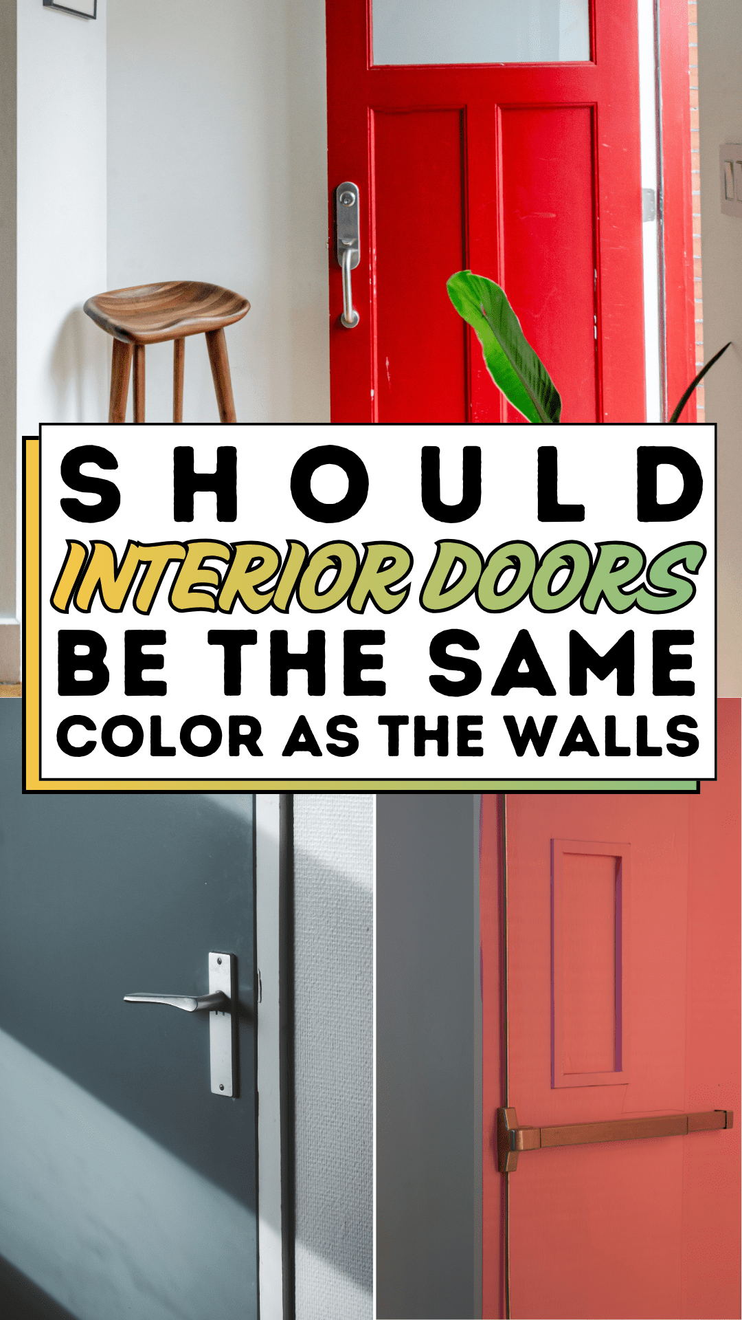
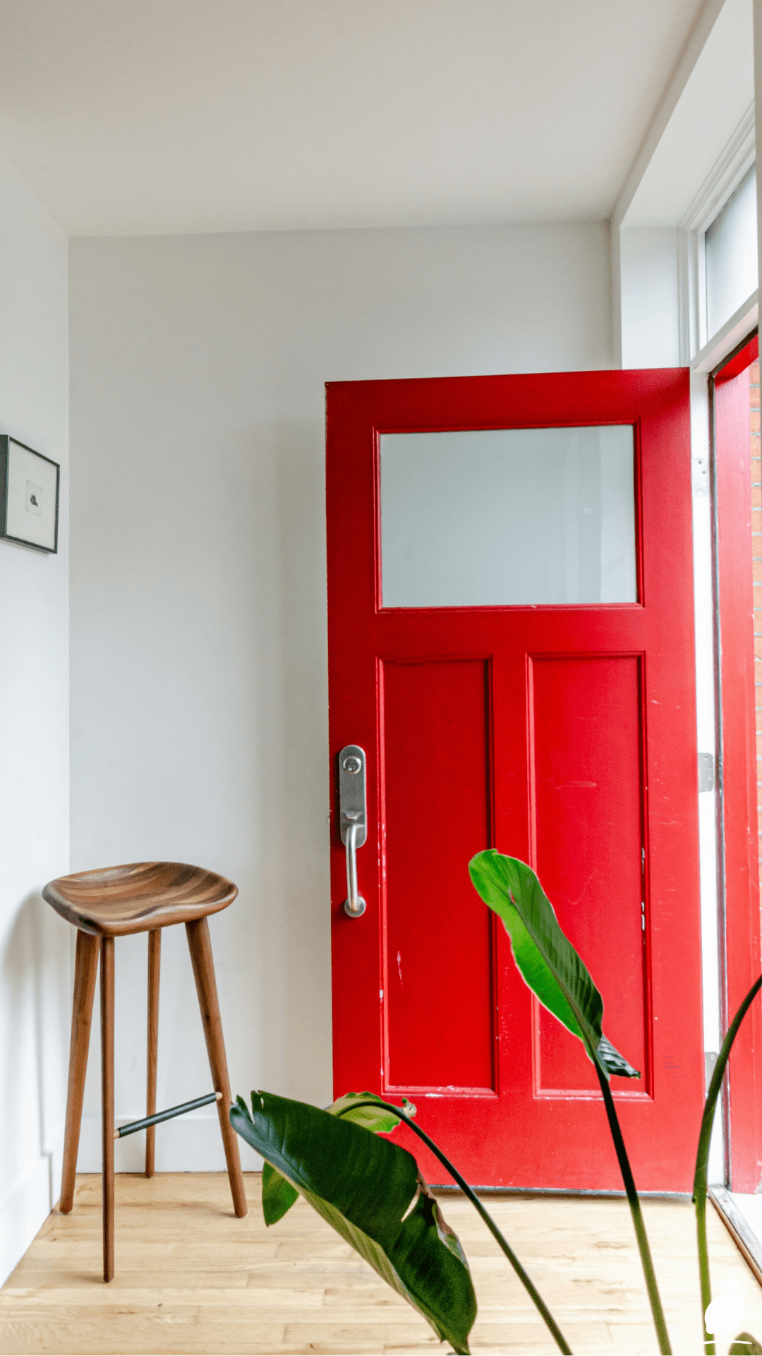
The image above provides the clearest possible answer to that question, not as a rule, but as a demonstration of a principle. A salmon-pink door set against a dark slate gray wall, meeting at a sharp vertical corner with the precision of two surfaces that were chosen in full awareness of each other. The interior door is not the same color as the wall. It is not the conventional white interior door against a colored wall. It is a third option, the one that treats the interior door as a designed element in its own right, with its own color and its own relationship to the wall that frames it, and the result is a composition so visually resolved that the salmon-pink and the dark gray look inevitable together, as though any other combination would have been a mistake. The brushed gold-bronze handle against the pink door surface completes the palette with the warm metallic note that elevates the interior door from a functional architectural element to a designed one. This is what interior doors that are neither matching the wall nor defaulting to white can achieve when the color relationship between door and wall is chosen with intention.
The answer to whether interior doors should be the same color as the walls is neither yes nor no; it is a conditional answer that depends on the specific design outcome you are building toward, and understanding those conditions is what makes the difference between interior door color decisions that feel confident and ones that feel like guesses. This guide gives you the complete framework for making interior door color decisions in any room, at any stage of a home renovation or refresh, with the specific knowledge of when same-color, contrasting-color, and white-door approaches each produce their best results. The interior door color decision that used to feel arbitrary will feel, by the end of this guide, like one of the most purposeful design choices in the house.
The Interior Doors Blueprint
Step 1: Understand the Three Interior Door Color Relationships
Every interior door color decision falls into one of three structural relationships with the wall it opens from, and identifying which relationship you are building toward before choosing any color is the step that makes every subsequent interior door decision more purposeful and less arbitrary. The three relationships are same-color (door matches wall, creating a unified, architecturally minimalist effect), contrasting-color (door is a distinct color from the wall, creating a composed, statement-making effect as in the image), and neutral-door (door in white, black, or off-white against any wall color, creating the conventional interior door treatment most homes currently use).
The same-color interior door approach, painting the door in the exact wall color, so that the door reads as part of the wall plane rather than as a distinct element, works best in rooms where the goal is visual continuity and maximum perceived space. A hallway painted in a warm taupe with interior doors in the same taupe recedes visually into the wall surface, making the hallway feel wider and longer because no vertical interruption draws attention to the passageways. Bedrooms where the interior door is on the same wall as the headboard can benefit from the same-color treatment because it prevents the door from competing with the bedroom’s primary visual element. The same-color interior door is a receding choice; it asks the room’s other elements to carry the visual interest while the door disappears into the architectural background.
The contrasting-color interior door approach, as demonstrated in the image, treats the door as a designed object within the room’s composition rather than as an architectural component to be minimized. This approach works best when the wall color is strong enough to create a meaningful contrast relationship with the door color, and when the door is positioned on a wall that is visible from the room’s primary vantage point. The salmon-pink door against the dark gray wall in the image works because both colors are fully saturated, similar in value weight (neither dramatically lighter than the other), and positioned at a corner that frames them together as a compositional unit. The contrasting interior door is an advanced choice; it asks the door itself to contribute to the room’s visual identity.
Step 2: Assess the Interior Door’s Position and Visual Role in Each Room
Before applying any interior door color decision, assess the specific position of each interior door in the room and its visual role from the room’s primary viewing point. An interior door on the far wall of a room visible immediately upon entering functions as a focal point and benefits from the contrasting-color treatment that gives it intentional presence. An interior door on a side wall visible only when directly facing it is a secondary visual element that benefits from the same-color treatment that allows the room’s primary focal point to draw attention without competition. An interior door on a wall behind the room’s primary seating, rarely seen in daily occupation,pation is a background architectural element that can receive either treatment with minimal impact on the room’s dominant visual character.
This positional analysis prevents the common interior door color mistake of applying the same treatment to every door in a home, regardless of each door’s specific visual role. A home where every interior door is painted the same accent color, regardless of whether each door’s position warrants the visual emphasis that a contrasting color provides, produces a room-by-room effect of visual competition where the eye has no clear hierarchy to follow. A home where interior door color decisions are made on the basis of each door’s positional role produces a series of rooms where attention flows naturally to the intended focal points and recedes where it should recede.
Walk through each room in the home and photograph each interior door from the room’s primary occupancy position: the chair in the living room, the bed position in the bedroom, the table position in the dining room. The photographs reveal the interior door’s actual visual weight in each context, which is often different from what standing directly in front of it suggests.
Step 3: Choose the Interior Door Color Palette in Relationship to the Wall
Interior door color selection works most successfully when the door color is chosen after the wall color is confirmed, because the door color’s quality depends on its relationship to the wall, and a door color chosen in isolation from the wall it will be set against is chosen without the most important piece of information available. The salmon-pink and dark gray in the image were almost certainly chosen together, or the gray was chosen first and the salmon-pink selected specifically for the contrast relationship it would create against that specific gray.
For contrasting interior door colors, the most consistently successful palette relationships are: warm against cool (a warm salmon or terracotta door against a cool gray or blue wall, as in the image), dark against light (a forest green or navy door against a cream or white wall), and saturated against neutral (a rich color door against a greige or warm white wall). In each case, the relationship creates the visual tension that makes the interior door read as a designed element rather than an incidental architectural component.
For same-color interior doors, the practical consideration is the finish rather than the color. Use the same color as the walls, but in a semi-gloss or satin finish on the door versus eggshell or matte on the walls. The finish difference creates a subtle but visible distinction between the door and wall surfaces that prevents the same-color treatment from looking like an unpainted door rather than a deliberate design decision. The door’s semi-gloss surface catches light differently from the wall’s matte surface, creating the slight dimensional interest that makes the same-color interior door read as intentional rather than unfinished.
Step 4: Select the Interior Door Hardware Finish as a Palette Completing Element
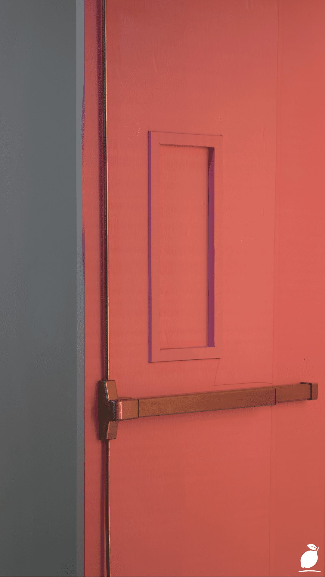
Interior door hardware, the handle, the latch plate, and any visible hinges are the detail layer that completes the interior door’s color composition and determines whether the door reads as fully considered or partially resolved. The brushed gold-bronze handle in the image is the salmon-pink door’s completing element: it introduces the warm metallic tone that the pink surface implies and the gray wall cannot provide, and it does so in a hardware design with a long horizontal bar, a clean rectangular profile that matches the door’s modern, minimal character. Remove the gold handle from the image and replace it with a chrome lever, and the interior door’s palette relationship with the wall becomes less resolved technically, still a contrasting-color treatment, but without the third material tone that gives the composition its finished quality.
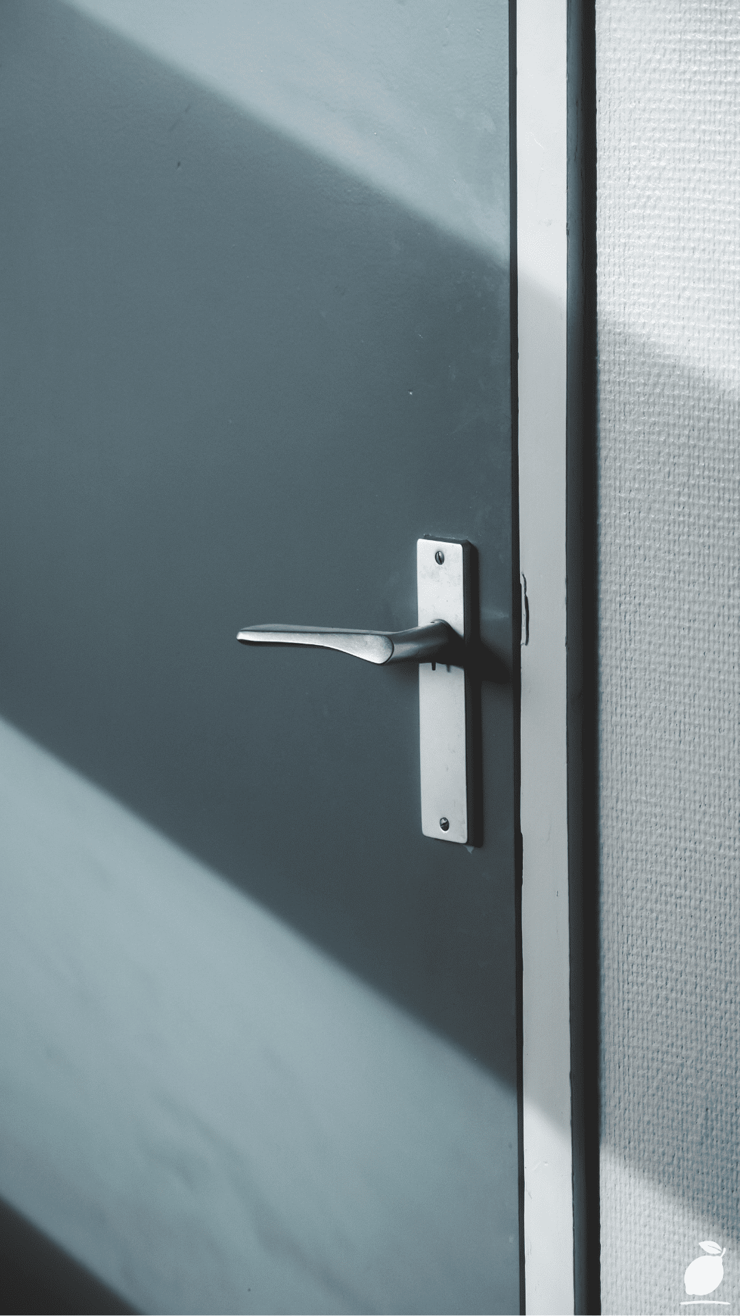
For contrasting-color interior doors, choose hardware in a finish that responds to the door color’s warmth or coolness: warm-toned hardware (brushed brass, unlacquered gold, aged bronze, dark bronze) for interior doors in warm colors (salmon, terracotta, warm green, warm yellow); cool-toned hardware (brushed nickel, chrome, matte black) for interior doors in cool colors (cool blue, cool green, gray). Apply the chosen hardware finish consistently across every interior door in the room or, ideally, across the entire home. Hardware finish inconsistency between interior doors is among the most commonly cited details that make a home feel not-quite-finished.
Step 5: Apply Interior Door Paint With the Correct Preparation and Technique
The quality of an interior door’s painted finish is the element that most determines whether a bold interior door color choice reads as professional or as a DIY attempt that fell short of its ambition. Interior doors are touched, opened, and closed hundreds of times each week, a surface that receives more physical contact than almost any other painted surface in the home, and a paint application without proper preparation and appropriate finish selection will show wear, fingerprints, and edge chipping within months of application, regardless of how well chosen the color itself was.
Remove the interior door from its hinges for painting. Wherever practical, a horizontal door supported on sawhorses allows all four faces and all edges to be painted in full without the drip and sag issues that vertical door painting produces, and it allows the door’s recessed panel details (the double-line border visible in the image) to be painted with full brush access to the panel’s inner edges. Sand the entire door surface with 150-grit sandpaper to degloss the existing finish and create adhesion for the primer, then with 220-grit sandpaper for final smoothness before topcoat application.
Apply one coat of water-based bonding primer to all surfaces, allow to dry fully, and sand lightly with 220-grit before applying the topcoat color. Use a semi-gloss or satin finish interior door paint, not wall paint, which lacks the hardness for door-contact surfaces, in two thin coats applied with a high-density foam roller for the flat panel areas and a 50mm brush for the recessed panel detail edges. The foam roller produces the smooth, near-spray-quality finish that makes interior door colors read with the clarity and depth that bold choices like the image’s salmon-pink require.
Step 6: Extend the Interior Door Color Decision Across the Home Consistently
A single beautifully executed contrasting interior door in a home where all other interior doors remain conventional white creates a one-room success and a whole-home visual inconsistency that reads as an experiment rather than a design decision. The interior door color approach chosen for the first room should be evaluated for its applicability across the home before that first room’s application is treated as final, because the full effect of an interior door color strategy is only visible when it operates at the scale of the whole home rather than a single room.
A home where all interior doors are painted the same accent color creates a through-narrative, the color threads from room to room, connecting spaces and creating a visual identity for the whole home. A home where interior door colors vary by room, the bedroom door in a color that responds to the bedroom’s palette, the study door in a color that responds to the study’s palette, creates a more complex but more personalized interior door color strategy that requires more planning and more restraint to execute without visual chaos. Both approaches are legitimate interior door color decisions. The decision between them should be made at the whole-home scale before the first room is painted, not discovered room by room as a home is refreshed over time.
Expert Secrets for Success
Pro-Tips for a Better Result
Paint interior door panel recesses in a slightly deeper tone of the door color for dimensional quality. The recessed rectangular panel detail visible in the image’s salmon-pink door creates its subtle three-dimensional effect because the panel’s inner surfaces, the vertical and horizontal recesses of the double-line border, catch light differently from the flat panel faces. Enhancing this effect by painting the recessed surfaces in a tone two shades deeper than the main interior door color amplifies the panel’s dimensionality and gives the door a visual depth that flat-painted doors cannot achieve. This is a particularly effective technique for interior doors in bold colors, where the increased visual interest of the panel detail prevents the large flat color surface from reading as uniform and flat.
Test interior door colors on a primed foam board held against the wall in the actual position before painting. An interior door color sample tested on a piece of cardboard lying flat on a table is evaluated in neutral conditions, no wall context, no room light, and no adjacent color relationship. An interior door color sample tested on a primed foam board held against the actual wall the door will be set against, at the door’s actual height and position, is evaluated in the exact conditions that will determine its quality in the finished room. The difference in the color’s apparent saturation, warmth, and contrast relationship with the wall between these two testing conditions is frequently significant enough to change the color decision.
Use the door frame and architrave as a third palette element. The door frame, the architectural molding surrounding the interior door opening, is the transitional element between the wall color and the door color, and its finish determines whether the transition between the two reads as abrupt or composed. For contrasting-color interior doors, painting the door frame in the wall color (not the door color) extends the wall’s visual field to the door’s edge and makes the transition from wall to door read as a deliberate compositional boundary. For same-color interior doors, painting the frame in the same color as both the wall and door creates the most complete architectural continuity. For white interior doors against colored walls, a white frame is conventional and correct.
Apply three thin coats of interior door paint rather than two heavier ones. Interior door paint applied in heavy coats sags in the recessed panel areas and builds up at the panel edges, producing a soft, rounded profile that makes the door’s panel detail look filled-in and imprecise. Three thin coats of the same total paint volume, each coat allowed to dry and lightly sanded with 220-grit before the next, produce a harder, more even, more dimensionally precise finish that allows the panel detail lines to remain sharp and the color to read at its full depth.
Common Mistakes to Avoid
Don’t choose an interior door color from the same paint card as the wall color. Paint cards display colors in a tonal sequence from light to dark within the same hue family. Selecting a darker shade from the wall color’s paint card for the interior door produces a color relationship that reads as a value contrast rather than a true color contrast. The interior door looks darker than the wall, but not different from it, which produces a slightly oppressive quality rather than the composed, intentional quality of a genuinely distinct interior door color choice. Choose the interior door color from a different hue family than the wall color, then assess the contrast relationship between the two separately.
Don’t paint interior doors the same finish as the walls. Same-finish application of wall paint and interior door paint is the most common interior door painting mistake made by people who are matching the door color to the wall color. The same color in the same finish produces a surface that looks continuous in flat light and patchy in raking light. The different absorbency of the door’s wood or MDF surface versus the wall’s drywall or plaster surface means that the same paint color dries to a subtly different appearance on each surface. Use eggshell or matte on walls and semi-gloss or satin on interior doors, regardless of whether the colors match, and the finish differentiation will create the visual coherence that an identical-finish application cannot produce.
Don’t install new interior door hardware before the door is painted. New hardware installed on an unpainted door and then masked during painting produces hardware adjacent paint edges that are never as clean as edges produced by painting before hardware installation. The masked tape edge sits against the hardware surface and produces a micro-gap in coverage that collects dirt over time and shows visible inconsistency in the painted edge. Remove all existing hardware, paint the door completely, allow full cure, and reinstall hardware on the cured, painted surface for the cleanest interior door finish result.
Don’t apply an interior door color decision without considering the door’s visibility from the adjacent room. An interior door that is set between two rooms is visible from both sides, and the color chosen for the door’s room-facing side will be seen against the adjacent room’s wall color when the door is open. An interior door painted salmon-pink in a living room with dark gray walls will appear salmon-pink against whatever color the adjacent hallway or kitchen wall is when the door stands open, a relationship that needs to be assessed before the interior door color is applied, not discovered after.
Why Interior Doors Matter
Interior doors are among the most frequently seen and least frequently considered architectural elements in a home. Every person who moves through the house passes through or past every interior door multiple times each day, registering its color, its hardware, and its relationship to the surrounding walls in the peripheral visual field, even when no conscious attention is directed at it. The aggregate of those peripheral registrations accumulates into an impression of the home’s visual coherence or incoherence that is never articulated but is always felt: the sense that the home is finished or unfinished, considered or assembled, designed or defaulted into. Interior doors that were chosen that reflect a real decision about their color relationship to the walls around them contribute to the finished quality of that impression in every room they inhabit.
The interior door color decision matters at a family well-being level because it is among the home maintenance improvements most directly visible to every household member in daily life without requiring any specific attention. A freshly painted interior door in a color chosen with intention changes the quality of daily movement through the home in the same way that a newly planted garden changes the quality of daily movement through the front yard, not dramatically, not explicitly, but accumulating quietly into a home that feels tended to rather than merely occupied. Research in environmental psychology has documented the specific effect of deliberate domestic maintenance on household members’ sense of stability and belonging: the home that shows evidence of ongoing care produces a felt sense of security in the people who live in it that extends beyond aesthetics into something closer to psychological safety.
Easy Peasy Life Matters is built on the conviction that the decisions that matter most in a home are often the ones that are never highlighted in design publications because they are too specific, too small-seeming, and too dependent on individual circumstance to produce the kind of universally applicable content that generates clicks. The interior door color decision is exactly that kind of decision, specific, individually conditioned, and consequential in a way that is felt daily but rarely articulated. The image at the top of this guide shows what it looks like when that decision is made with full confidence and full knowledge: a salmon-pink door against a dark gray wall, a gold-bronze handle against the pink surface, a composition so right that it looks inevitable. Your home has the same potential. These interior door decisions are how you reach it.
Frequently Asked Questions
Should interior doors match the wall color or the trim color?
Neither matching the wall nor matching the trim is a universal rule; each produces a different design outcome appropriate for different rooms and design goals. Interior doors painted the same color as the walls create maximum visual continuity and are most appropriate in spaces where the door’s presence should be minimized: hallways, spaces with multiple doors on one wall, and rooms where the door competes with a primary focal element. Interior doors painted the same color as the trim create visual consistency with the room’s architectural framework and are the most conventionally correct interior door treatment in traditional or transitional design styles. Interior doors in a distinct color, neither wall nor trim, as in the image, create the strongest design statement and are most appropriate for spaces where the door is a visible focal element.
What is the most popular interior door color in 2026?
Bold, personality-forward interior door colors have continued to dominate interior design attention across 2026, with deep forest green, warm terracotta, dusty salmon and pink, and rich burgundy the most requested interior door colors in professional residential design projects. The trend away from builder-white interior doors, accelerated by the broader shift toward maximally personalized home interiors, has produced a market in which paint suppliers now dedicate specific interior door color collections to the category. Among the most consistently purchased interior door colors are Farrow & Ball’s Incarnadine No. 248 (a warm, complex red), Benjamin Moore’s Newburyport Blue HC-155 (a saturated coastal blue), and Sherwin-Williams’ Sage SW 2870 for interior doors in warm, nature-adjacent palettes.
How do I choose an interior door color that will work with multiple adjacent rooms?
For interior doors visible from multiple rooms simultaneously, hallway doors that are seen from the living room, kitchen, and bedroom in the same sightline, choose a color that reads as a composed accent against the most visible adjacent wall color, rather than trying to coordinate with every wall the door is seen against. The interior door color that works with dark gray (as in the image) may not work with every color in the adjacent rooms, and attempting to find an interior door color that satisfies every adjacent wall simultaneously typically produces a compromise tone that serves no relationship well. Make the primary design decision and allow the secondary visual relationships to be acceptable rather than optimal.
Can I paint just one interior door an accent color without painting all doors the same?
Yes, and the one-door accent approach is a fully legitimate interior door color strategy when the single door chosen for accent treatment occupies a position of sufficient visual prominence to carry the design statement on its own. A front-facing interior door at the end of a hallway, a study door in a room where the door is the focal wall, or a bathroom door with a distinctive architectural frame are all strong candidates for single-door accent color treatment. The key is choosing the door whose position gives it enough visual prominence that the accent color reads as intentional rather than as an incomplete project where only one door has been painted so far.
What finish should I use for interior door paint?
Semi-gloss is the most durable and most widely recommended finish for interior door paint because it cures to a hard, washable surface that withstands the frequent contact that interior doors receive. Satin finish is a softer-sheen alternative that provides adequate durability with a less reflective surface quality appropriate for interior door colors in the warm, matte-adjacent palette range, where high-gloss reflectivity would work against the color’s character. Avoid eggshell and matte finishes on interior doors regardless of the color; these finishes lack the hardness to withstand door-contact wear and will show scuffs, fingerprints, and edge wear within months of application.